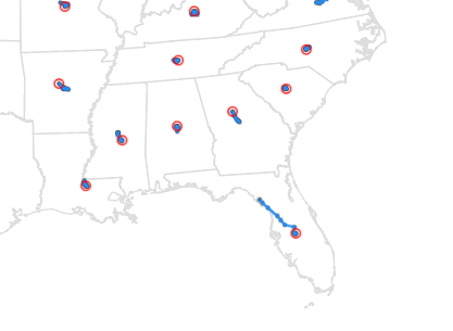
If you have plotted data on a map, you have probably tried to estimate the geographical (or visual) 'center' of map areas, to place labels there. But have you ever given any thought to the "center of population"? This is one of the myriad of statistics the US Census Bureau
Tag: demographics
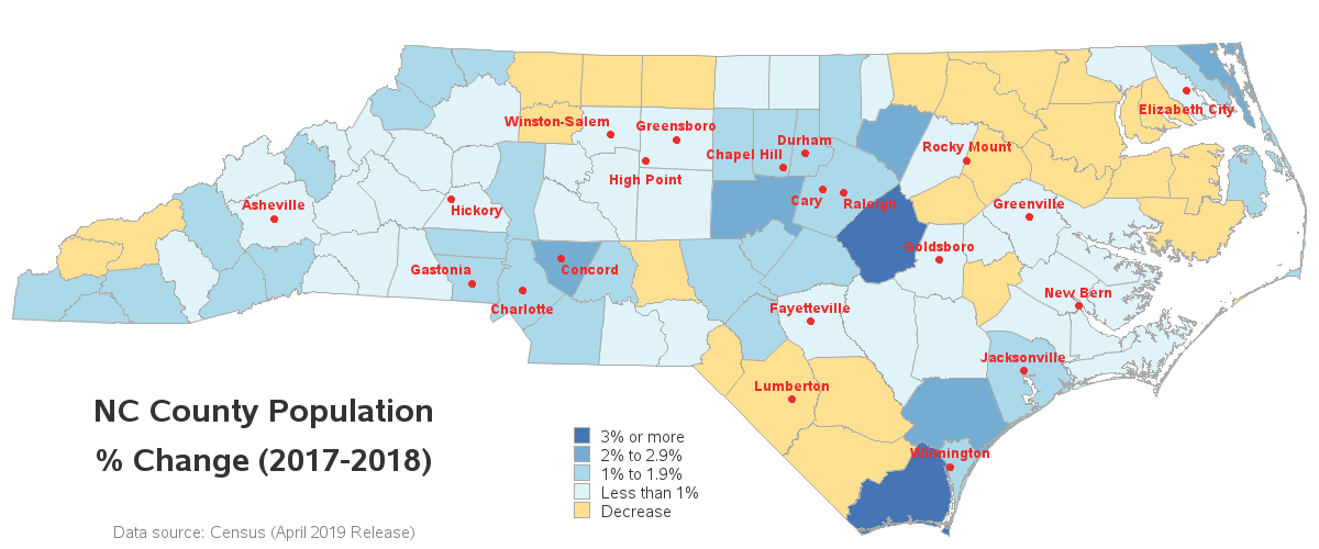
I can tell that my area (Wake county, NC) has a growing population, because the traffic keeps getting worse and worse. But it's a little difficult to quantitatively gauge growth by looking at traffic congestion. Therefore let's have a look at a more direct measurement - the actual population data!
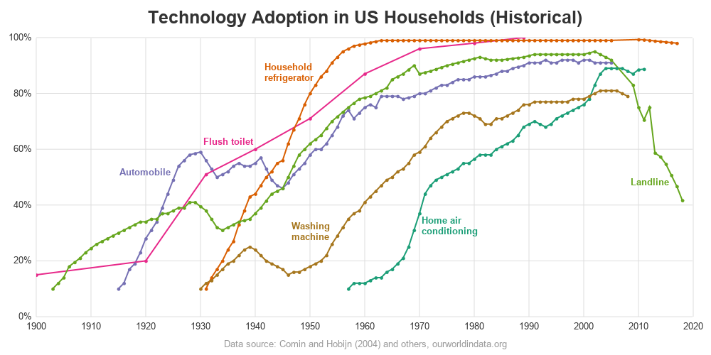
We've had record high 90+ degree temperatures here in the southeast US this past week (September / October), and it has made me appreciate having an air conditioner. Indeed, air conditioners were pretty much invented here in North Carolina (see Eric Cramer). They are used in pretty much every building
During the year 2020, many countries and areas will be conducting their decennial census, and making projections to estimate what their population will be in the future. Therefore I decided to dust off one of my old SAS/Graph samples based on the 2010 census, and rewrite it using more modern
With the US census coming in 2020, I've decided to sharpen my skills at graphing census data. And today I'm working on creating a population pyramid chart to analyze the age and gender distribution. Follow along if you'd like to see how to create such a chart ... or jump
As we're approaching the anniversary of Hans Rosling's passing, I fondly remember his spectacular graphical presentations comparing the wealth and health of nations around the world. He certainly raised the bar for data visualization, and his animated charts inspired me to work even harder to create similar visualizations! What better way
The other day I was playing around with the voter registration data for all ~8 million registered voters in North Carolina (yes - this guy knows how to have fun!), and I got to wondering what last names were the most common. I summarized the data by county, and the
I can recognize several languages when I hear people speaking them (mostly because I lived in the Alexander International Dorm at NC State University). Therefore when I found a map of the most common languages spoken in each US state, it caught my attention, and I decided to try creating my
I recently read an interesting article that claims "a single cremation emits as much carbon dioxide as a 1,000-mile car trip." This got me wondering about cremation data, and I ended up on the Wikipedia page about cremation rates. They had a map of the US cremation rates by state ... but the more
Have you ever lied about your age? When you were younger, perhaps you exaggerated your age to watch an R-rated movie, buy cigarettes, get into a night club, or drink alcohol? And when people reach their 30s or 40s, they might subtract a few years when people ask their age.
How old was the oldest person in your family, or the oldest person you personally know? And how do they compare to the oldest people in the world? ... Perhaps you can easily make the comparison, with this cool graph! But before we get started, here's a picture of my
If countries have a similar median age, does that mean they are also similar in other ways? My best guess at an answer is - probably. Perhaps if we plot the data on a map, we'll be able to see the answer more clearly. I first started thinking about this
They say age is a relative thing. With this graph, you can tell how old (or young) you are, relative to everyone else. (I'll let you decide whether this is a good thing, or a bad thing, hahaha!) Nathan Yau recently posted a graph on flowingdata.com that allows you to
Are you from Yankeedom, The Far West, or somewhere in between? In this blog, I use SAS maps to explore some fun data about regional cultures in the U.S. I recently ran across an interesting article about Colin Woodward's book "American Nations: A History of the Eleven Rival Regional Cultures
A couple of years ago, I blogged about the most popular baby names in the US over the past 100 years. This time, I focus on the most recent year, and take it to the state level! But before we get started, here's a picture of my friend Jennifer's daughter,
Find out which state you'll live in, if the US state borders are redrawn so we have 50 states with equal population! (Don't worry! - This is just a fun/hypothetical "what if" blog!) To get you in the mood for this topic, here's a picture of one of the many
They say "Imitation is the most sincere form of flattery"... Therefore when I imitate Hans Rosling's famous world-data animation, it's not that I'm jealous, but that I'm paying homage to him! (OK, and maybe also a little bit jealous! LOL) Well, anyway, for those of you who haven't seen it,
I'm sure that most of you have seen the really cool interactive Baby Name Voyager, right? If not, go have a look and try it out (be sure to plug in your name, and the names in your family, and so on). Here's a screen-capture: That's a pretty cool application! ...