I can tell that my area (Wake county, NC) has a growing population, because the traffic keeps getting worse and worse. But it's a little difficult to quantitatively gauge growth by looking at traffic congestion. Therefore let's have a look at a more direct measurement - the actual population data!
How did I decide on this topic? Well, I was browsing through the NC reddit group, and saw a headline about "Two North Carolinas: Cities grow at record pace while rural counties fall behind". The linked article was behind a paywall so I couldn't read it, but the nearly 200 comments contained some interesting information. One of the more useful comments was from reddit user melodykramer - she works at Carolina Demography, one of the sources cited in the article, and she posted some links to related studies on their website. I went to their site and found an interesting article on net migration, with a map that piqued my interest:
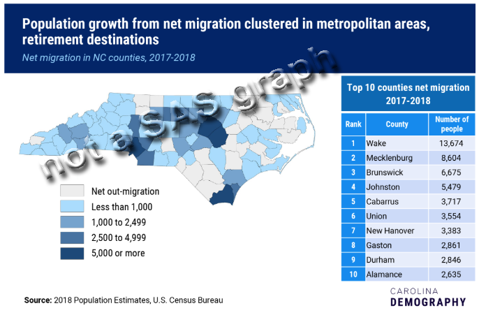
Changes
I liked Carolina Demography's map, but I decided to make my own version ... with a few changes:
- Rather than showing net migration in/out of the counties, I wanted to show total population change (this also includes things like births).
- I wanted my map to be larger and the main focus of my graphic (whereas the map above is probably less than 1/3 of the graphic).
- I wanted to add some visual reference points, so the map doesn't rely so much on people being able to recognize the counties by their shape.
- And I wanted to add mouse-over text.
The Data
The original map indicated that they got their data from the US Census Bureau, therefore I looked there for the similar data I wanted. I quickly found the NC county population estimates for 2017 and 2018 by going to this factfinder page, and selecting North Carolina.
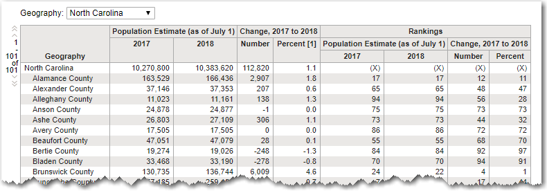
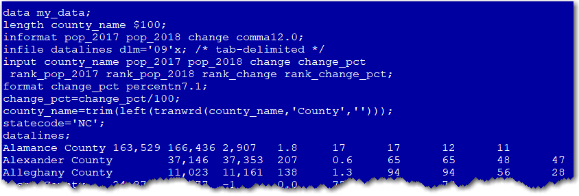
I copy-n-pasted the table text into 'datalines' in my SAS job (to make the code all-inclusive, and easy to share), and used the following code to import the tab-delimited data. If you'd like to experiment with the SAS job, here's a link.
My Map Iterations
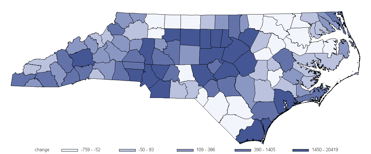
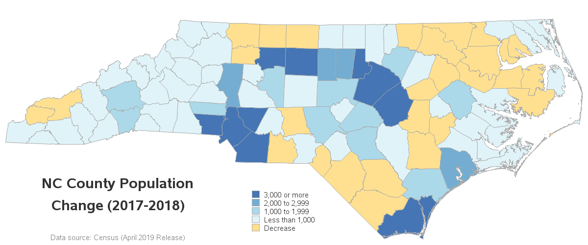
I build up my maps one change, or layer, at a time, and I think it's educational to discuss those iterations. In this first map, I simply plotted the change in population, using 5 levels (quintile binning) and 5 gradient colors. This gives me a good general feel for the population change in the counties.
But with data like this, I really wanted a bit more control over the binning and the colors. I wanted the lowest bin to just represent negative growth, and I wanted that to be a different color from positive growth. And I wanted to control the start and end values for each color bin of the positive growth values. To do this, I programmatically assigned the data values to 5 'bins' or 'buckets' and then used a user-defined format so those bins would show the detailed range information in the legend.
proc format;
value chg_fmt
1='Decrease'
2='Less than 1,000'
3='1,000 to 1,999'
4='2,000 to 2,999'
5='3,000 or more'
;
run;
data my_data; set my_data;
format change_bucket chg_fmt.;
if change <0 then change_bucket=1;
else if change<1000 then change_bucket=2;
else if change<2000 then change_bucket=3;
else if change<3000 then change_bucket=4;
else if change>=3000 then change_bucket=5;
else change_bucket=999; /* shouldn't get here! */
run;
The colors in the original Carolina Demography map were visually pleasing, but I found it a little difficult to differentiate a couple of the colors. Therefore I used the colorbrewer website to help pick my colors - they put a lot of thought and testing into choosing colors that are good for analytics. I also customized the layout and location of the legend, and then annotated some title text so I could get it into a non-standard title location.
Final Map
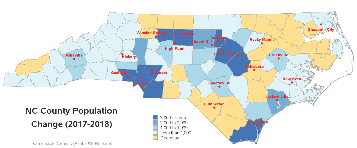
My map above is at about the same level of functionality as the original Carolina Demography map. But I wanted to add one final visual enhancement - reference points. Having lived in NC all my life, I'm pretty familiar with the counties, and I know which ones have big cities, etc. But even for me, the map would be a lot easier to quickly grasp if it showed the locations of the major cities on it. Therefore I annotated markers and labels for the major cities. The red color might seem a little 'harsh,' but I wanted to use a color that would be totally different from the colors used in the legend.
Interactive Enhancement
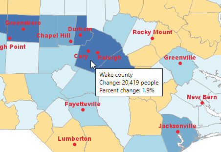
I also wanted to add a non-graphical enhancement - I wanted to add interactive mouse-over text, so you can hover your mouse over each county to see the county name and data values. Below is a screen-capture showing the mouse-over text for Wake county. Click here to see the interactive map, where you can mouse-over any county you want.
But Wait - There's More!
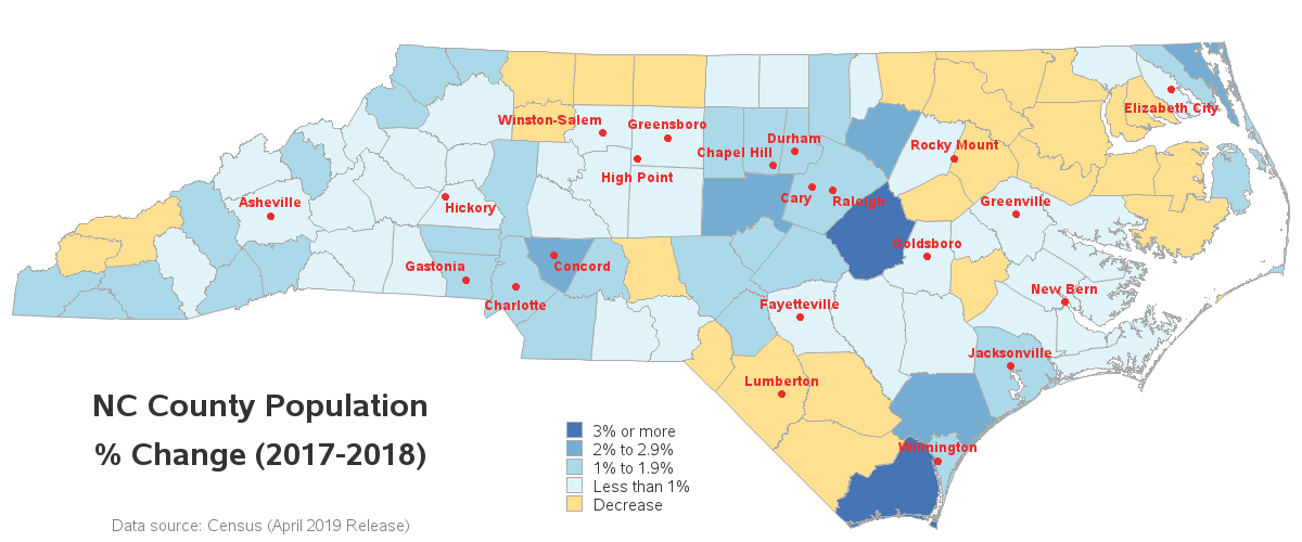
So you might be saying to yourself "Self - adding 20k people to Wake county in 1 year seems like a lot ... but what do these numbers look like as a percentage of the county population?" Good question! Therefore I created a second map by percent population change. I think the % change is as important as the total change (probably even more important, to the individual counties with a large % change). I always recommend looking at the data in multiple ways!
Final Thoughts
So, is the population increasing around the big cities? How about 'retirement' locations? Around the jobs? How about areas with/without snow, hurricanes, floods? Around military bases? Around fast Internet and similar infrastructure? Feel free to share your theories in the comments!
My theory? ... Well, I have noticed that several of my friends seem to be having a *lot* of babies. Just sayin'! For example, I think my friend Mary might have single-handedly increased the population of Wake county by about 1%, LOL! Here's a picture of Mary, and her passel of kids (thanks for letting me use this photo, Mary!) 🙂


4 Comments
As always, great article and great graphs!
I had trouble accessing the FactFinder page though. It sent me to a page with this note:
"As of July 1, 2019 data.census.gov is now the primary way to access Census Bureau data, including the latest releases from the 2018 American Community Survey and 2017 Economic Census and the upcoming 2020 Census and more. American FactFinder will be decomissioned in 2020.
Read more about the Census Bureau's transition to data.census.gov"
Kathleen
Hmm ... it appears they've made a change within the last 24 hours!
I can't get to the data page now either. :\
Glad you like it!
This is so useful and easy to interpret. Thank you!