Technological advancements in connectivity and global positioning systems (GPS) have led to increased data tracking and related business use cases to analyze such movements. Whether analyzing a vehicle, an animal or a population's movements - each use case requires analyzing underlying spatial information. Global challenges such as virus outbreaks, deforestation and climate change all benefit from deeply analyzing location and movement data.
This year's IEEE Visual Analytics Science and Technology (VAST) Challenge covered such a scenario and a team of SAS volunteers decided to put SAS® Viya® to the test and submit a solution for both Mini Challenges 2 and 3. The mission was to analyze movement and tracking data for several employees of a fictitious company named GAStech. Two weeks' worth of data was provided before a disappearance (kidnapping) of some of the company's employees. Mini Challenge 2 involved using provided credit card and loyalty card usage data to identify any anomalies and suspicious behavior leading up to the disappearance. Mini Challenge 3 required further analysis of social media and text information to determine any changes in risk levels during the night of the disappearance.
The process
We used SAS® Visual Analytics to track the area's vehicle traffic and to analyze financial and loyalty data. We detected popular locations and points of interest by analyzing credit card transaction records. The data also revealed employees' classification given their movement profile at different times during the day. We utilized SAS Viya's support for machine learning (ML) and decision tree scoring to determine actual credit card owners based on location visits and frequency.
We also utilized SAS Visual Text Analytics to tackle Mini Challenge 3 by extracting useful information from provided social media posts to detect risk levels using natural language processing (NLP).
The tools
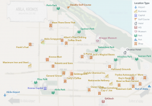
The majority of work was done using SAS Studio and SAS Visual Analytics. We leveraged some core capabilities in SAS data steps to prepare and adjust the provided data for easier analysis. In particular, we calculated aspects like vehicle speeds and credit card owner scores in SAS Studio with greater flexibility. We also used Esri's ArcGIS mapping tools to geo-reference a provided image of the city streets and tourist map. Some shop and business locations were determined by inspecting both the map and provided Esri shape files.
The Solution - Mini Challenge 2
The first step in discovering meaningful patterns was to analyze provided credit and loyalty card data. Each employee was issued a company card and the challenge was to determine the actual card owner based on anonymized transaction data. Knowing who made which purchases at what time of the day allowed not only for the classification of shops and businesses, but also revealed some anomalies in the data (e.g., wrong/missing transaction timestamps, purchases at exact noon times, etc.).
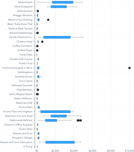
Further cluster analysis using SAS Visual Analytics allowed us to categorize locations into three natural groupings based on the purchase frequency, price and busiest time.
We also added vehicle data into our analysis of the credit and loyalty card data. Using Esri ArcGIS mapping tools, we georeferenced both the city streets and tourist map and created a list of all known locations including their exact GPS location.
Taking the actual vehicle tracking data into account, we could then determine where vehicles were at a given point in time. Clustering GPS data also allowed the creation of travel hotspots grouped by an employee's department. This showed that some employee groups visit some areas more frequently than others.
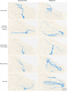
From the general movement patterns GAStech employees can be classified into two broad types:
-
-
-
- General staff who visit all stores in Abila except Abila Airport, Carlyle Chemical Inc. and Nationwide Refinery (which are all locations involved in industrial interactions with GASTech).
-
-
- Truck drivers that typically drive between industrial locations and GASTech headquarters with only a few exceptions.
We also identified 25 credit card transaction locations geo-referenced from the Abila tourist map to plot on the provided shape files. The other 9 locations were not geo-referenced as there was no associated place on the provided map. Additional non-credit card locations were included in the analysis such as parks, shops and other popular points of interest.
GPS data was used to determine a vehicle’s speed (mph) and time spent between waypoints. Knowing when a vehicle was parked is essential to determine potential store visits. We were also able to track a vehicle's motion by animating its travel pattern on a geographical map using SAS Visual Analytics:
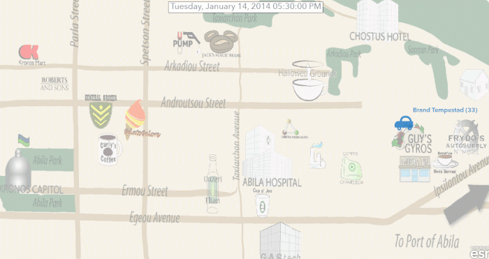
A closest known point of interest was assumed if it was less than 0.25 miles away from a parked vehicle (speed less than 5 mph). Taking into account the time of travel revealed that some employees were active all day including night hours. Others show recurring events such as executives playing golf on the weekends.
Utilizing geographic polyline visualization within SAS Visual Analytics also allows the visualization of trajectories and helps when comparing routes taken on different days or cars driven by different employees.
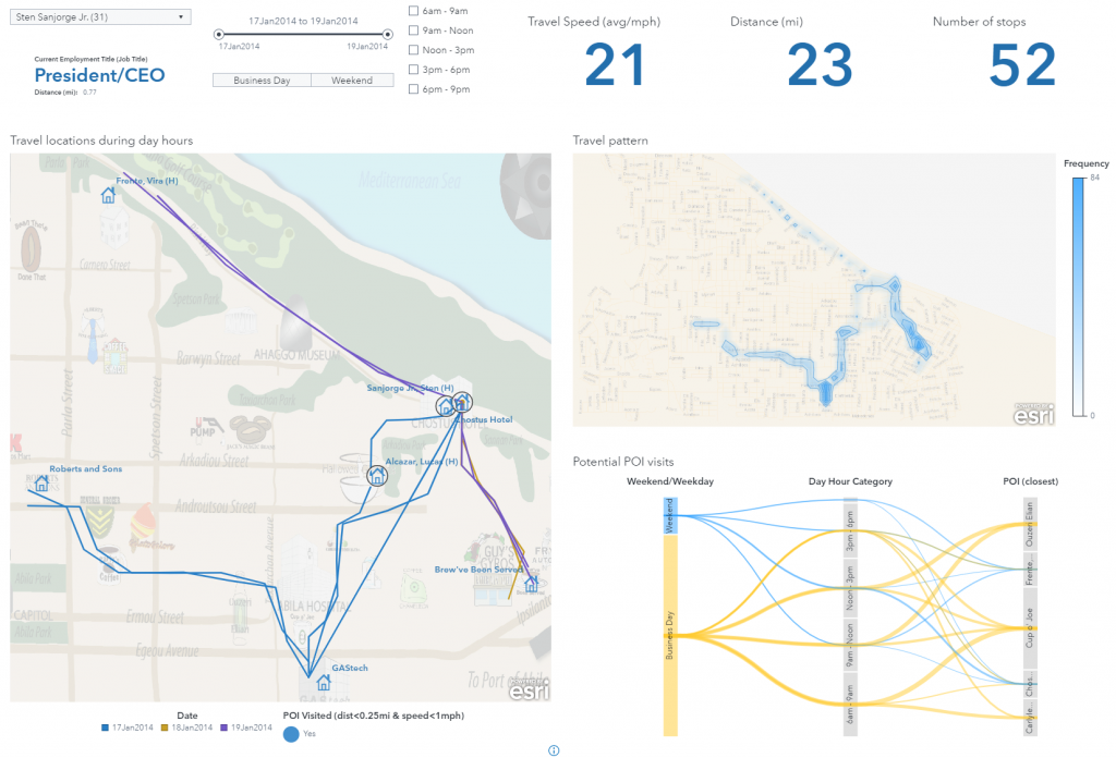
To infer the owners of each credit card, we utilized the previously calculated stop locations of each car. If a given car was near a location at the time of a card transaction, the employee assigned to the car represents a potential match. This method's accuracy decreases if there are multiple candidates for a given transaction.
In order to rank candidates, we used two different approaches:
- Machine learning / decision tree scoring.
- Manual modeling and calculation for ranking and scoring.
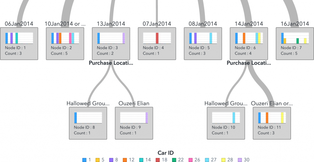
With the knowledge about which employee made which purchase, we were able to create purchase profiles. Knowing an individual's credit card transaction history allowed us to validate outlier purchases and highlight anomalies.
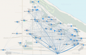
Analyzing vehicle movement data allowed the identification of travel routes and related stops. Knowing each start and stop location of a given trip allowed us to create a network showing popular travel routes. Comparing visit times (start/stop) and the duration of the stay across employees reveals commonly visited locations like the GAStech headquarters, but also subsets of employees that visit the same location at the same time.
If an employee visits a POI at the same time as someone else we consider this as a meeting event. These meeting events include living in the same household or working together.
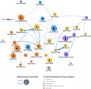
If we consider all possible meetings across all employees we can create a scheduling matrix and identify potential relationships if employees meet regularly. This social network reveals strong relationships between the executives as well as some individuals in the Engineering department.
The final steps in the analysis included the comparison of meeting events. Comparing meeting duration and location not only reveals when individuals arrived at a given location, but also the route they took and other POIs they visited while traveling. This analysis revealed that some employees share a common household, have common social activities (e.g. executives playing golf) or work unusual hours at HQ. A Friday night party just one day before the disappearances is particularly interesting given many employees from both the Engineering and IT department met at the same location.
The Solution - Mini Challenge 3
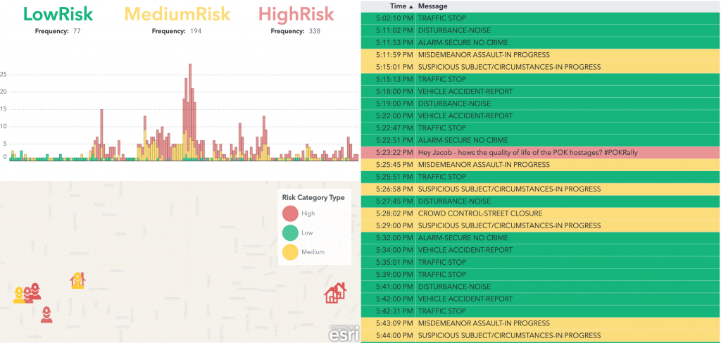
Solving Mini-Challenge 3 required a deep analysis of social media and documents published during the time of the disappearance. The team used SAS Visual Text analytics to classify text messages into low, medium and high-risk categories depending on whether they relate to emergencies or other generic events. We also uncovered noteworthy events using our automated categorization process (a rally, a fire, an explosion, reckless driving, running a red light, bicycle/pedestrian hit and run and a hostage situation).
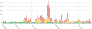
We used a risk level model to pinpoint when the risk was rising or falling. The peaks in the visualization represent the fire (first peak), a car being hit (second peak), a hostage situation (all remaining peaks in the latter half of the timeline), and an explosion (the very last peak).
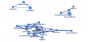
Some messages come from microblogs and contain informative reports (from government, media accounts, and eyewitnesses, for example) as well as chatter/junk/spam. There are re-posts for both types of messages. One way to distinguish between those two types is to identify usernames that may be more trustworthy than others. The term scores from the top 25 authors allowed for the creation of a network that shows pockets of similarity.
As part of our solution, we team also compiled a visualization dashboard to provide first responders a way to monitor potential needs and to prioritize their activities.
Results
We compiled our findings in one video highlighting some of the approaches taken when analyzing the VAST challenge data:
The VAST Challenge provides a great opportunity to validate our software against real-world scenarios using complex data sets. Not only do we learn from these projects, but we also send feedback to our development teams to further improve product capabilities for customers.
The team
Spending time on VAST challenges is always fun but also requires a lot of commitment and technical knowledge in various areas of technology. Submitting a solution for these challenges wouldn't have been possible without the help of Riley Benson, Cheryl LeSaint, Rajendra Singh, Don Chapman (MC2) and Biljana Belamaric Wilsey, Russell Albright (MC3). Falko Schulz used SAS Visual Analytics to explore and visualize the data to tell a complete story and focus on the Mini Challenges' questions. Also huge thanks to Rachel Nisbet and Chelsea Mayse for the willingness and thoroughness in producing a beautiful video summary. None of this would have been possible without each of you.
Thanks again to the entire SAS team!
References
- VAST Challenge 2021
- Visual Analytics Benchmark Repository
- YouTube - Submission Video
- SAS Institute Inc. SAS Visual Analytics. (Online.) 2021.


1 Comment
Pingback: Analyzing demographics and patterns-of-life using SAS Visual Analytics - The SAS Data Science Blog