The DO Loop
Statistical programming in SAS with an emphasis on SAS/IML programs
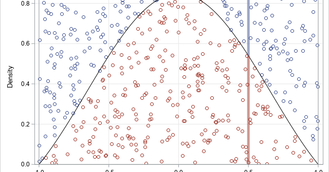
The acceptance-rejection method (sometimes called rejection sampling) is a method that enables you to generate a random sample from an arbitrary distribution by using only the probability density function (PDF). This is in contrast to the inverse CDF method, which uses the cumulative distribution function (CDF) to generate a random

There are dozens of common probability distributions for a continuous univariate random variable. Familiar examples include the normal, exponential, uniform, gamma, and beta distributions. Where did these distributions come from? Well, some mathematician needed a model for a stochastic process and wrote down the equation for the distribution, typically by

Let X be any rectangular matrix. What is the trace of the crossproducts matrix, X'*X? Interestingly, you do not need to form the crossproducts matrix to compute the answer! It turns out that tr(X'*X) equals the sum of the squared elements of X. Theorem: For any matrix, X, the trace
