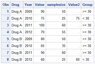
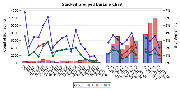
A Bar Line graph is commonly used in many domains. The SGPLOT procedure makes it easy to create bar line graphs where the user can customize it in many different ways. This post is prompted by a recent question on the communities page on creating such a graph, with one bar and
Tag: SGPLOT procedure
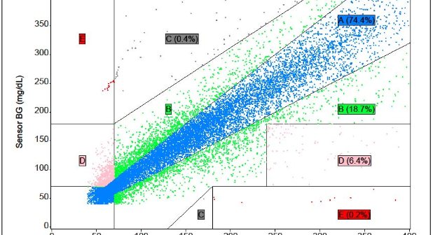
The SAS Global Forum conference last week was awesome. From the perspective of graphics, there were more papers from uses on graphics and ODS graphics then in recent times. I will post a summary shortly. One of the interesting papers was "#113-2013 - Creating Clark Error Grid using SAS/GRAPH and Annotate..."
Recently a reader chimed in with a question on the Do Loop article by Rick Wicklin on how to create a bar chart with percent statistics. Rick used SAS 9.3 and the reader wanted to do the same with SAS 9.2. For the basic (non-grouped) bar chart, the process is the
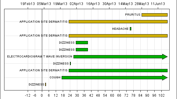
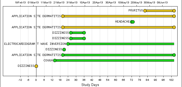
In my previous article on Adverse Event Timeline Graph, I wrote about how to create the AE timeline using SAS 9.2 code, using VECTOR plot and the MARKERCHAR option in SCATTER plot. I described a better way to place the labels at the lower end of the vectors. SAS 9.3 provides an easier way
A commonly requested graph is a bar chart with response and targets. With SAS 9.3, the SGPLOT procedure supports new "parametric" plot statements called HBARPARM and VBARPARM. These statements are special versions of the HBAR and VBAR statements and they expect summarized data for each category or category+group combination. Also,
A recent question by a user lead led me to experiment with what is often referred to as conditional highlighting. The user wanted to display a bar chart of response by year, where each bar is colored by year, and show a cross hatch pattern on the bars where the
Back in February, I posted an article on creating Adverse Event Timeline Graph. In the SAS 9.2 version (first one), one item that was less than ideal was the way to position the AE names to the left of the event. The AE names are displayed using the scatter plot statement
A few weeks ago I wrote an article on using the non breaking space character to prevent stripping of leading and trailing blanks in a string. Since then, I have discovered a few more instances where the nbsp can be a useful tool for creating graphs. One such instance came up last week
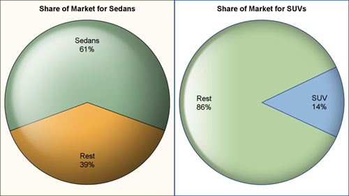
Pie charts have been the subject of some criticism when they are used to compare measures across multiple categories. It is generally accepted that comparison of magnitudes represented as angular measures from varying baselines is not effective. However here are some use cases where a pie chart does quite well. When it comes
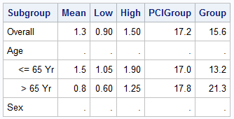
Forest plots come in many flavors. An example of a Forest plot using GTL is available on the SAS support web site. Simple forest plots can also be created using SGPLOT procedure by using the SCATTER statement with MARKERCHAR to display data aligned with the plot by study names. One issue