Tag: SGPLOT procedure

Data Visualization
Sanjay Matange 0
Extended Bands

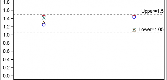
In the Clinical Research domain, there is often the need to display lab values by treatment or test and it is often useful to view this data along with reference lines showing the normal ranges.  The obvious way is to use reference lines to denote the normal ranges. SGPLOT Code: proc sgplot data=band; scatter x=x y=y

Data Visualization
Sanjay Matange 3
Butterfly plots

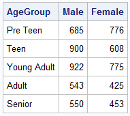
When comparing results by category and group,  putting the items to be compared close together usually leads to a graph that is easier to decode.  Take the case of the data (simulated) shown below. Here we have population by age group and sex.  To compare the population by sex, it is

Data Visualization
Sanjay Matange 0
Spark lines made easy

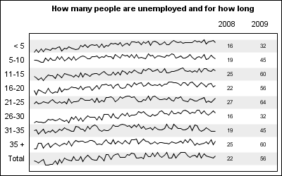
Spark lines, made popular by Edward Tufte, provide a way to visualize trends in a concise space, often inline with the rest of the narrative or data. Previously, I posted an article on Spark Plots in which I created different plot types, some of which included multiple graphs and data in each row.  For such

Data Visualization
Sanjay Matange 6
Bar chart with response sort

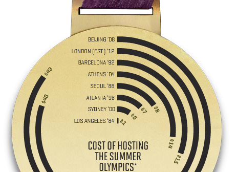
A graph in a recent article in Fortune magazine caught my eye.  The graph shows the cost of hosting the Summer Olympics over the past eight events.  Here is what I termed the "Medal" graph. Now, practitioners of the art of Effective Graphics would likely find some shortcomings in the graph.  Clearly

Data Visualization
Sanjay Matange 2
Axis values and hint

Getting the axis values just right generally requires some work, and the values you want can change from case to case.  One such example was discussed by Dan Heath in his post on custom axis values.  Here Dan shows the usage of non uniform axis values using the VALUES option on

1 4 5 6 7