Graphically Speaking
Data Visualization with a focus on SAS ODS Graphics
Last week I posted an article on creating Infographics using SAS. The interest shown by the SAS community in this topic came as a surprise. Also, it so happened by coincidence, a SAS users also called into Tech Support just about the same time with a query about creating Infographics type graph

Last week a question was posted on the communities page about creating Box Plots where the width of each box is proportional to the frequency for the category. The comment was that PROC BOXPLOT can create such a graph, but there seems no way to do this using the SGPLOT

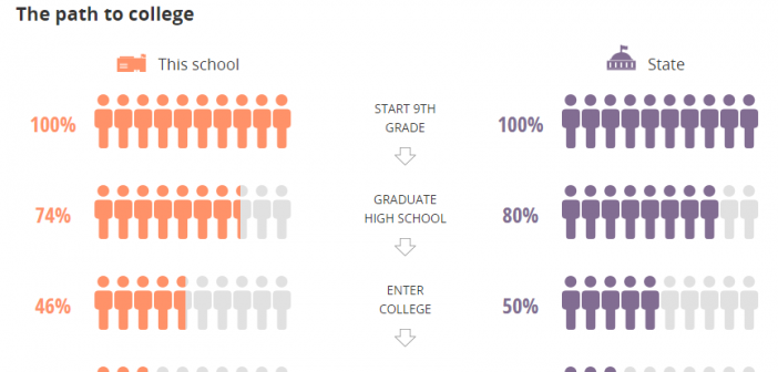
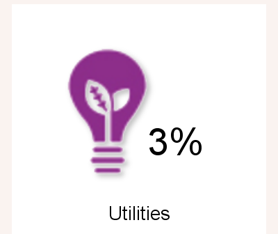
Infographics are all the rage today. Open any magazine or newspaper and we see data and numbers everywhere. Often, such information is displayed by adding some graphical information to add context to the data. A couple of good examples are Communicating numeric information, and Facts about Hot Dogs. Riley Benson, our UX
