Graphically Speaking
Data Visualization with a focus on SAS ODS Graphics
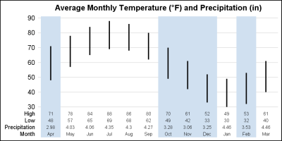
One key aspect of graphs used in the statistical or clinical research domains is the need to display numerical or textual information aligned with the data in the plot. Examples of such graphs are the Survival Plot or the Forest Plot. These graphs use the AXISTABLE statements available with SAS

In this post, I will review some of graphs from previous posts while concentrating on just the axes, grid lines, and reference lines. They might not be the most exciting parts of a graph, but there are multiple options that when properly used can turn a good graph into a great graph.

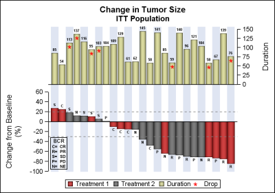
Waterfall plots have gained in popularity as a means to visualize the change in tumor size for subjects in a study. The graph displays the reduction in tumor size in ascending order with the subjects with the most reduction on the right. Each subject is represented by a bar classified by

