Graphically Speaking
Data Visualization with a focus on SAS ODS Graphics![Clinical Graphs: A1c Plot](https://blogs.sas.com/content/graphicallyspeaking/files/2016/08/A1C_1_GTL-702x336.png)
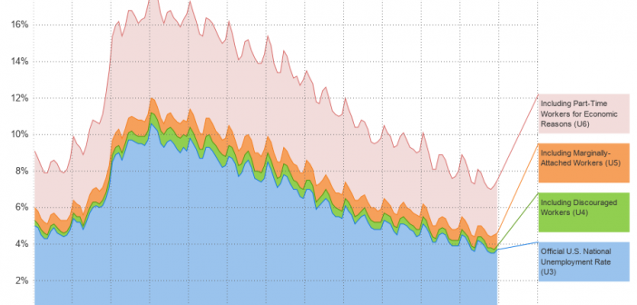
Last week I was visiting San Diego for the SANDS conference. I always enjoy this conference as I get to interact closely with the users to hear of their pains and innovative solutions to creating Clinical Graphs. In the conference Ed Barber asked about displaying A1c data along with some
![Outline cells in a table using a heat map](https://blogs.sas.com/content/graphicallyspeaking/files/2016/08/HeatMapToeplitz2-1-450x336.png)
There are many ways to use a heat map. For big data sets, heat maps provide a substitute for scatter plots. Heat maps can also be used to enhance small tables. Several of my colleagues (Sanjay Matange, Pratik Phadke, Rick Wicklin, Chris Hemedinger, and probably others) have posted about using
![Likert Graph Revisited](https://blogs.sas.com/content/graphicallyspeaking/files/2016/08/America100CollegeStudents-702x336.png)
A few weeks back I posted an article on ways to create a WindRose Graph using SGPLOT procedure. The process is relatively simple. Create (R, Theta) data with both numeric axes where the Theta is a value in the data range is 0-360, and R is the corresponding response value. Then
!['Unbox' Your Box Plots - part deux](https://blogs.sas.com/content/graphicallyspeaking/files/2016/07/SGRender4-640x336.png)
There was a recent comment on the original 'Unbox Your Box Plots', where a user wants to see the original data for the box, but only label the outliers. As noted in the comment, labeling all the scatter markers and turning on the outlier display is not ideal. But there
![Stock Plots](https://blogs.sas.com/content/graphicallyspeaking/files/2016/07/FB_2016_2A-702x336.jpg)
This weekend I was reviewing my portfolio of stocks as usual. Yes, I do have a small stock portfolio with a few stocks, and normally I use free stock charting software to review the stock plots. These sites allow you to view the daily stock prices along with many technical
![Graph Table with Class](https://blogs.sas.com/content/graphicallyspeaking/files/2016/07/BoxPlotTables_3-702x336.png)
As often is the case, this article is prompted by a recent post on the SAS/GRAPH and ODS Graphics page communities page. A user wanted to create a Graph Table showing a bar chart with tabular data for each of the category values along the x-axis. The user was creatively using