Graphically Speaking
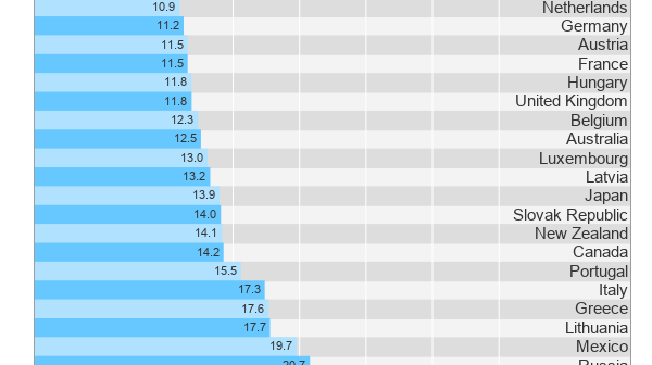
Data Visualization with a focus on SAS ODS GraphicsDisplaying nicely rendered axis values reduces clutter and makes the graph more readable. With SAS 9.4, we added the ability for splitting x-axis tick values on white space to create a nice and readable x-axis as shown in the graph on the right. It is always a challenge to fit
Some observant readers may have noticed a new icon on the right sidebar of this blog announcing the release of the new SAS Press book on the ODS Graphics Designer, written in collaboration with Jeanette Bottitta. Jeanette is a Technical Writer at SAS and has worked on various SAS Graphics products
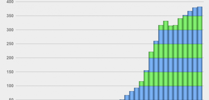
Browsing on the web, I ran into a simple but visually interesting graph of financial data. Really, it could be any data, but this one showed up under "Financial Graphs". I thought this would give me an opportunity to speak about an interesting new feature added to SERIES plot with
This is the 3rd installment of the Getting Started series, and the audience is the user who is new to the SG Procedures. Experienced users may also find some useful nuggets here. The Tukey box plot is popular among statisticians for viewing the distribution of an analysis variable with or without
Index of articles on "Getting Started with SGPLOT Procedure". Getting Started with SGPLOT - Part 1 - Scatter Plot. Getting Started with SGPLOT - Part 2 - VBAR. Getting Started with SGPLOT - Part 3 - VBOX. Getting Started with SGPLOT - Part 4 - Series Plot. Getting Started with
One of the key benefits of creating graphs using GTL or SG Procedures is their support of plot layering to create complex graphs and layouts. Most simple graphs can be created by a single plot statement like a Bar Chart. Complex graphs can be created by layering appropriate plot statements to