Graphically Speaking
Data Visualization with a focus on SAS ODS Graphics
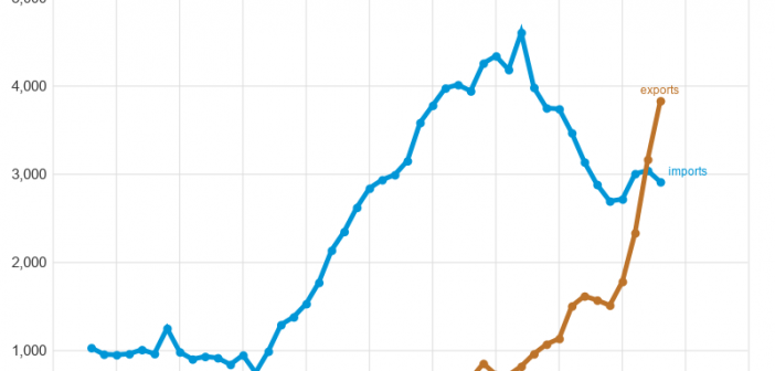
You might have seen in the news that US exports of natural gas to Europe are up 300%. And we recently crossed the threshold where we export more natural gas than we import. This seems like a momentous occasion, and worthy of a graph! But first, let me make sure

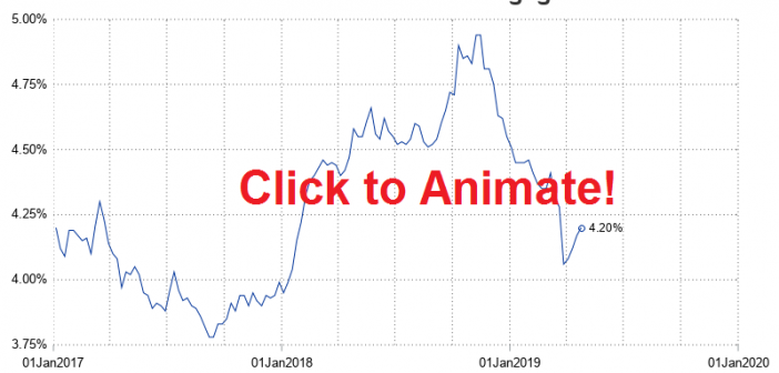
I always recommend looking at data in several different ways to get a more complete mental picture. And when the data is changing over time, one great way to view it is using an animation. Follow along for some tips & tricks to animate your own data over time. I'll

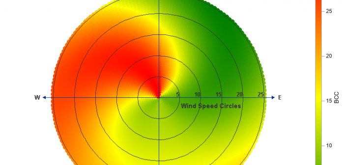
A few years ago Sanjay showed how to create a polar graph by creating a gtl template, and then plotting it using Proc SGRender. These days, Proc SGPlot has all the functionality you need to create this graph, therefore I've rewritten the example to just use SGPlot. And while I
