Graphically Speaking
Data Visualization with a focus on SAS ODS Graphics
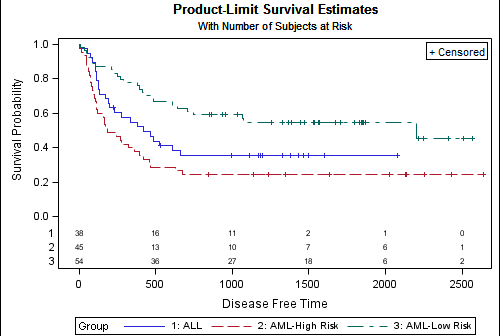
A frequently asked question about the Survival Plot is: "How can I display the 'At Risk' data outside the plot area?". The survival plot rendered by the LIFETEST procedure displays the at risk data inside the plot data area. The reason for this is the potential for varying number of treatment groups. Here

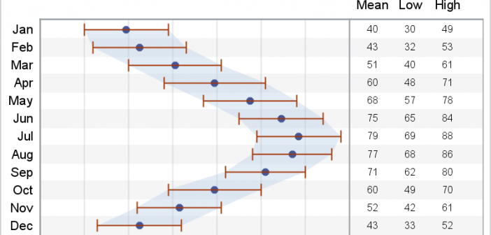
In a previous article we discussed how to add axis aligned statistics table to a Lipid graph using GTL. Other graphs such as the Survival Plot also utilize the same technique to display the "at risk" statistics aligned by time or visits along the X axis. Often, we also need to display

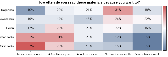
The heatmap is a graphical representation of a table where colors are used to represent the values in the table. This is an effective graphic for finding the minimum and maximum values across the table and may surface patterns in the data. With the addition of the HEATMAPPARM statement to

