Graphically Speaking
Data Visualization with a focus on SAS ODS Graphics
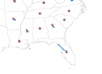
If you have plotted data on a map, you have probably tried to estimate the geographical (or visual) 'center' of map areas, to place labels there. But have you ever given any thought to the "center of population"? This is one of the myriad of statistics the US Census Bureau

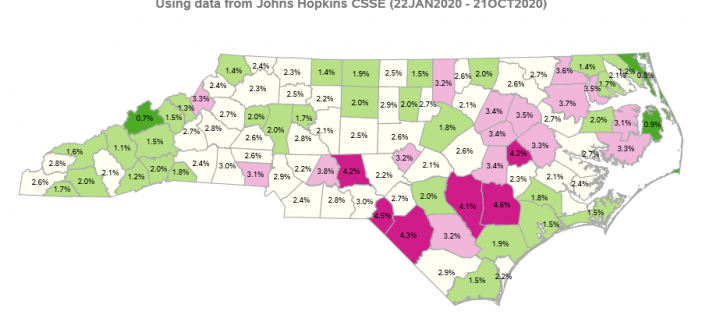
A user commented on one of my previous maps ... "How can there be 820 cases of Coronavirus per 100,000 people? - There aren't even 100,000 people in my county!" Well, when you want to compare something like the number of COVID-19 cases between two areas that have differing populations,

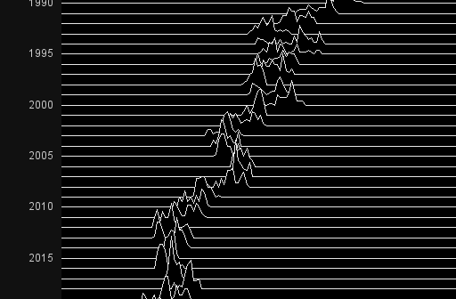
When it comes to plotting mortgage rate data, I often look to Len Kiefer for inspiration. He recently posted a retro-looking graph on twitter that caught my eye ... and of course I had to see if I could create something similar using SAS. For lack of a better term,
