Graphically Speaking
Data Visualization with a focus on SAS ODS Graphics
ODS Graphics components like GTL and SG procedures are designed to work with Styles to create graphs that are effective in the delivery of information and aesthetically pleasing out of the box. You no longer have to tweak the colors to ensure a nice graph. The graph derives all the

CTSPedia.org is a website of Knowledge Base for Clinical and Translational Research. On this site you can find sample graphs for statistical analysis of safety data for Clinical Research. Graphs included in this resource have been submitted by contributors, and include a graph for Liver Function for different tests by treatment.

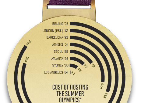
A graph in a recent article in Fortune magazine caught my eye. The graph shows the cost of hosting the Summer Olympics over the past eight events. Here is what I termed the "Medal" graph. Now, practitioners of the art of Effective Graphics would likely find some shortcomings in the graph. Clearly
