Graphically Speaking
Data Visualization with a focus on SAS ODS Graphics
This SESUG conference was a very energetic and rewarding experience, with many user presentations on graphics using SAS/GRAPH and ODS Graphics. One standout presentation for me was on "Data Merging and Exploration to Identify Associations Between Environmental Factors and Disease Outbreaks" by Neeta Shenvi, et. al. The key part of

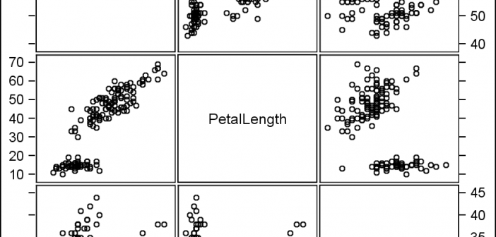
The Scatter Plot Matrix statement supports a couple of different configurations. The basic is the N x N panel of cells, with each cell showing scatter plots plot for a pair of variables at a time. Here is an example of a 3 x 3 scatter plot matrix for the

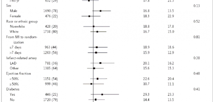
During SAS Global Forum 2012, I had conversations with many SAS users who wanted to create Forest Plots. However, there was one new twist. The study names were subgrouped by categories like 'Age', 'Sex', etc., with multiple entries under each subgroup. The name of each study within the subgrouped was indented
