Graphically Speaking
Data Visualization with a focus on SAS ODS Graphics
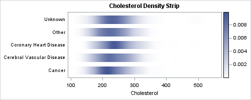
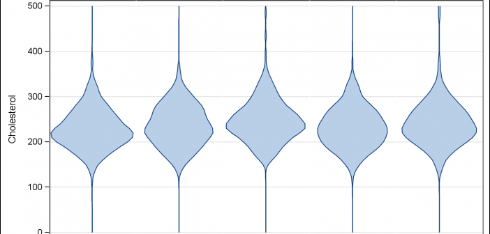
In the previous post on Violin Plots, we discussed the process to create custom density plots. This work was done in collaboration with SAS user James Marcus. This is the second installment on the same topic - Creating Density Strip Plots. We will use the same data and process to compute

Over the past month or more, I have been in a conversation with SAS user James Marcus, on creation of some new displays for visual communication of uncertainty. These include display of densities using a "Violin" plot, "Density Strips" and more. With his permission, I can share some of the

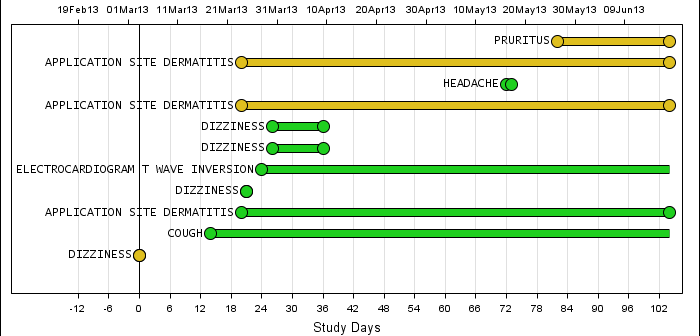
Back in February, I posted an article on creating Adverse Event Timeline Graph. In the SAS 9.2 version (first one), one item that was less than ideal was the way to position the AE names to the left of the event. The AE names are displayed using the scatter plot statement
