Graphically Speaking
Data Visualization with a focus on SAS ODS Graphics
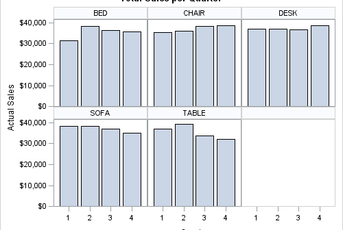
The SGPANEL procedure is used to create panelled graphics based on classification variables. The panelled cells are generated starting from either the top left (the default) or the bottom left of the panel, controllable by the START option. Currently, the ordering of the cells is determined by two criteria: 1.

Naomi Robbins has posted a contest, part 1 of which is to submit alternative representations for the following graph: Clearly, usage of two pie charts to represent the share of the B2B and B2C referrals will invite many responses. To create the graph, I took the data shown in the Pie Charts themselves, so we are using percent

In addition to the Forest Plot with Subgroups, another popular graph in the clinical research space is the Most Frequent Adverse Events Sorted by Relative Risk graph. Recently, I worked with folks from some pharmaceutical companies to contribute SAS code for this graph to the CTSPEDIA resource for statistical graphics. The data for number

