Graphically Speaking
Data Visualization with a focus on SAS ODS Graphics
One of the most popular graph amongst clinical and pharmaceutical users is the Survival Plot as created from the LIFETEST Procedure. This is one graph that users most often want to customize. See Creating and Customizing the Kaplan-Meier Survival Plot in PROC LIFETEST - Warren F. Kuhfeld and Ying So, SAS Institute

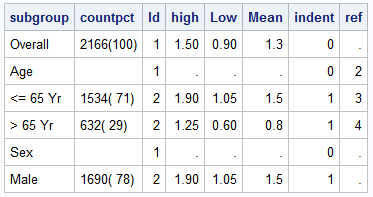
Most simple graphs generally include graphical representation of data using various plot type such as bar charts, scatter plots, histograms, box plots step plots and more. Both SG procedures and GTL provide many easy ways to create such graphs. However, for many real world use cases, we need to display related textual data in

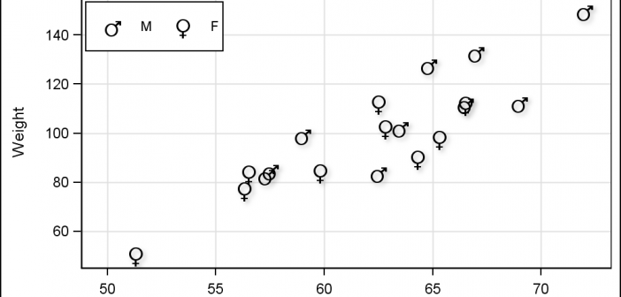
Users have often expressed the need for more marker symbols. ODS Graphics supports over 30 scalable marker symbols, both filled and empty. As mentioned in an earlier article, with SAS 9.4, filled markers can now have outlines and fills, and can also have special effects. Also with SAS 9.4, now you
