Graphically Speaking
Data Visualization with a focus on SAS ODS Graphics
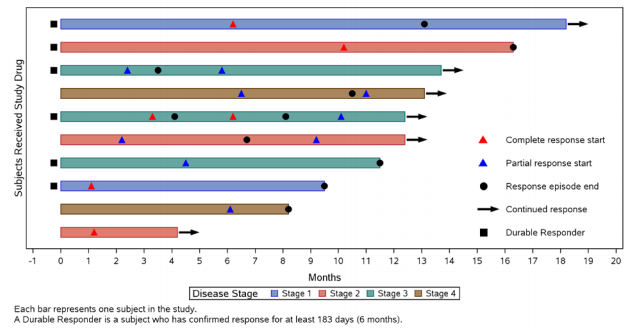
At PharmaSUG 2014 in San Diego, I had the pleasure of attending "Swimmer Plot: Tell a Graphical Story of Your Time to Response Data Using PROC SGPLOT", by Stacey Phillips. In this paper, Stacey presented an interesting graph showing the effects of a study drug on patients' tumor size. Stacey

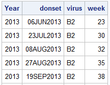
Recently, a user posed a question on how to plot stacked frequencies on a time axis. The data included frequencies of different viruses by week. The data is modified to preserve confidentiality and is shown below. The user's first instinct was to use a bar chart with stacked groups. This works for automatically computing frequencies

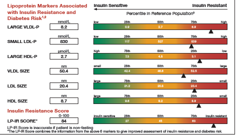
It was almost two weeks ago that I got started making a display for lab tests for a subject, based on a graph I saw on the web for an article on this blog. This graph is a part of a larger panel display of the lab values for a
