Graphically Speaking
Data Visualization with a focus on SAS ODS Graphics
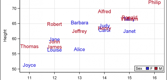
For far too long we have been using the venerable Scatter Plot to do the work of placing text strings in the graph. For far too long we have used the Scatter Plot or the Block Plot to place axis aligned text in the graphs. It is time to

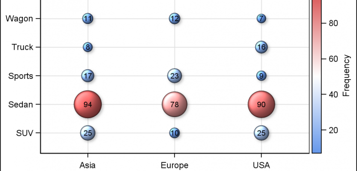
SAS 9.4 maintenance release M2 was released early in August. This release contains some exciting new features in GTL and SG Procedures. In this article, I will describe some of the new options added to the existing plot statements. Note, I will use the SG examples here, but these are

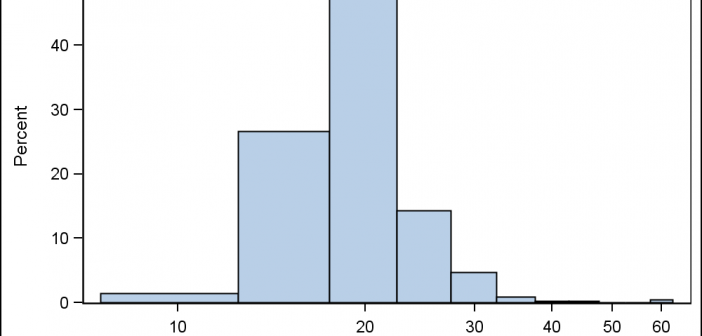
Often there are questions from users on creating histogram using a Log X axis. One such question came up this weekend, where a user wanted a histogram of her data using log axis. Before we get into her specific case, let us first clarify what we may want to see
