Graphically Speaking
Data Visualization with a focus on SAS ODS Graphics
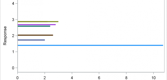
Often, we have data where most of the observations are clustered within a narrow range, with a few outliers positioned far away. When all the data is plotted, the axis is scaled to accommodate all the data, thus skewing the scale. Techniques to handle such data have been addressed earlier

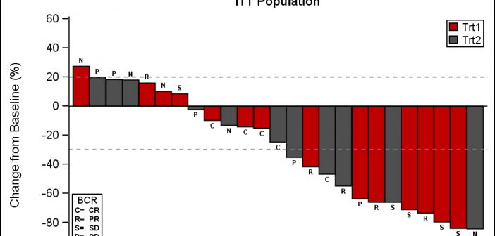
This week I had the opportunity to present a 1/2 day seminar on creating clinical graphs using the SG procedures during an In-House SAS Users' group meeting. I have presented this seminar quite a few times now, and I always learn something. The audience was very receptive, with some people

Have you ever wondered why sometimes a SGPLOT or GTL graph has markers drawn beyond the extreme tick and value on an axis and sometimes not? And, if you prefer your graphs to always have tick values on the axis that cover the whole range of data, how can you
