Graphically Speaking
Data Visualization with a focus on SAS ODS Graphics
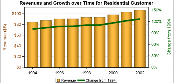
Often we need graphs that display two or more responses by the same category values. In many cases it is useful to plot both responses on the same response (Y) axis. This can be helpful to understand the data and compare the magnitudes side by side. This works when the scales

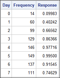
A common scenario is where we have a table of multiple measures over time. Here we have a simple example of Frequency and Response by Day. The Response is a linear function of the Frequency, as shown in the table on the left below. The shape of the data is

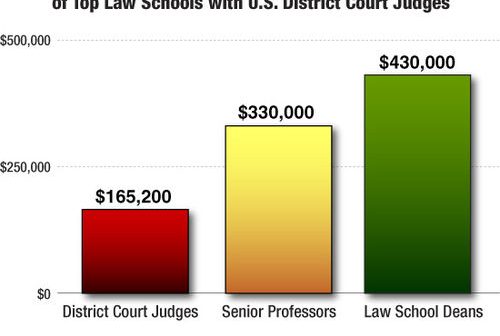
As Sheldon Cooper would say, this is the first episode of "Fun with Charts". I did not find a cool term like "Vexillology" and "Cartography" is taken by map making, so let us go with "Chartology". Yesterday, I saw a couple of interesting bar charts as shown on the right. I thought
