Graphically Speaking
Data Visualization with a focus on SAS ODS Graphics
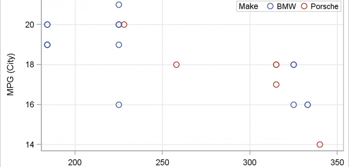
There has been much discussion on the SAS Communities page on usage of different symbols in a graph. The solutioin can vary based on the SAS release. New features have been added at SAS 9.4 releases to SG Procedures and GTL that make this very easy. With SAS 9.4M1, almost any combination is

Over the Christmas Holidays I saw an graph of agricultural exports to Russia in 2013. The part that caught my eye was the upper part of the graph, showing the breakdown of the trade with Russia as a horizontal stacked bar with custom labels. The value for each region / country

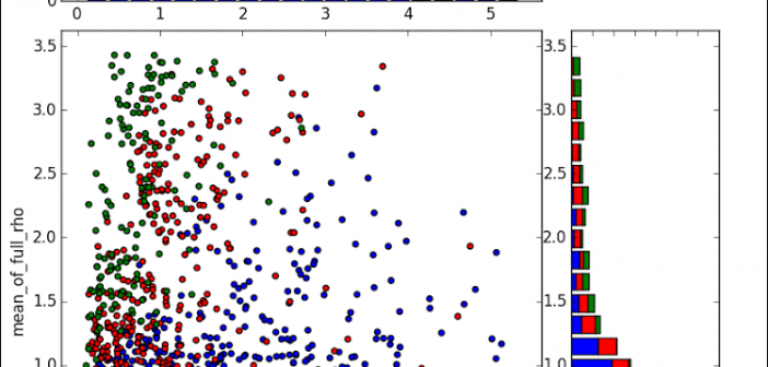
Last week a user expressed the need to create a graph like the one shown on the right using SAS. This seems eminently doable using GTL and I thought I would undertake making this graph using SAS 9.3. The source data required to create this graph is only the
