Graphically Speaking
Data Visualization with a focus on SAS ODS Graphics
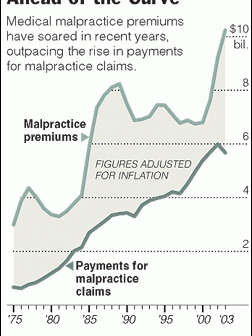
A very common type of graph contains two series plot, where the user is expected to evaluate the difference visually. I saw one such plot on the web today shown on the right. This graph has two curves, one for malpractice premiums and one for claims, with a shaded band

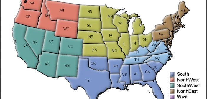
MicroMaps are a powerful way to display data where the display includes small, lightweight maps to provide geographical information regarding the data. This geographical information gives clues to the relationship between the data that could lead to more insight. The SAS SG Procedures and GTL do not currently have built-in

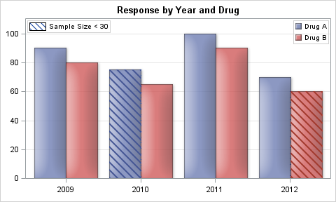
Back in late 2012 I discussed a technique for Conditional Highlighting, where additional attributes can be displayed in a graph. In the previous article the goal was to display a graph of Response by Year by Drug. We used a cluster grouped bar chart to create the bar chart. We
