Graphically Speaking
Data Visualization with a focus on SAS ODS Graphics
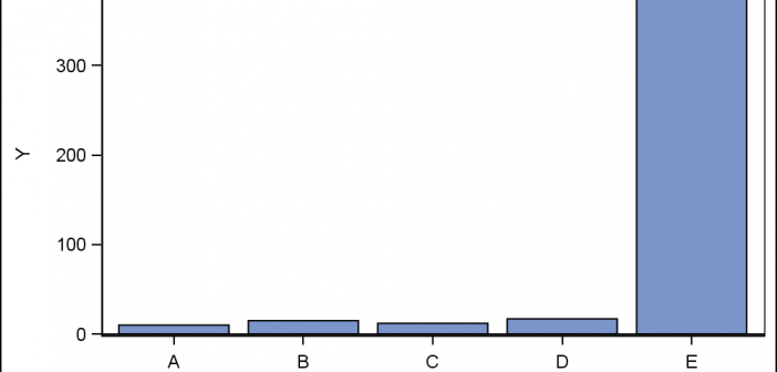
Often when the data includes some extreme difference in measures or some outliers, the plot of the data points can get skewed due to the need to accommodate the extreme outliers. The bulk of the observations get squeezed into a smaller region of the plot. While this may be useful

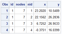
A few weeks back I saw a couple of posts on the Communities page from users wanting to find ways to compute the area of an general polygon and also the center of the area. I felt such features likely existed somewhere in the SAS/GRAPH set of procedures, so I asked our resident

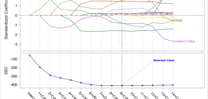
In the past few weeks, I have written two posts on SG annotation and on saving and then modifying the graphs that analytical procedures produce: Modifying dynamic variables in ODS Graphics Annotating graphs from analytical PROCs Today, I finish this series with one more post. This one shows how you

