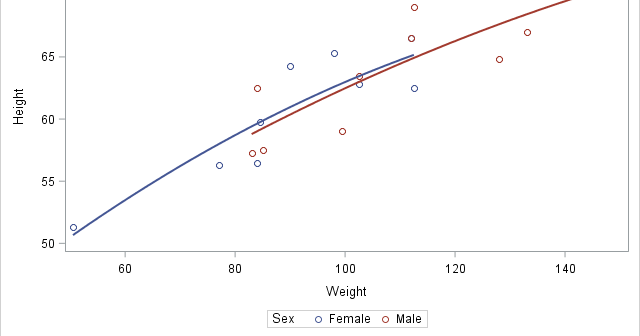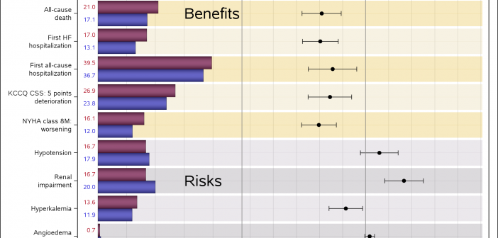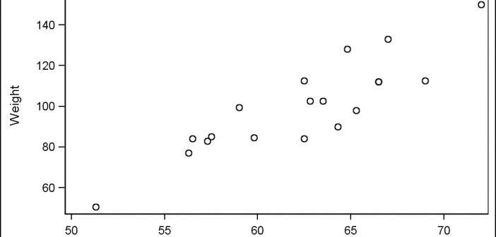
Last week I had the pleasure of presenting my paper "Graphs are Easy with SAS 9.4" at the Boston SAS Users Group meeting. The turn out was large and over 75% of the audience appeared to be using SAS 9.4 back home. This was good as my paper was focused on the cool new
English
In the area of graphical visualization of data, Edward Tufte is a thought leader and has put forth many innovative ideas that enhance the understanding of the information in the graph with minimal distractions and potential for misinterpretation. One of his ideas has been the use of "Spark" plots. As per my
In this post, I will show you how to control the order of the entries in a legend and explicitly control the correspondence between groups and style elements in PROC SGPLOT. In many cases, the colors that are used to differentiate groups do not matter--the graph simply needs to display
Often I have written articles that are motivated by some question by a user on how to create a particular graph, or how to work around some shortcoming in the feature set to create the graph you need. This time, I got a question about Clinical Graphs that were mostly working
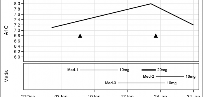
Last week I was visiting San Diego for the SANDS conference. I always enjoy this conference as I get to interact closely with the users to hear of their pains and innovative solutions to creating Clinical Graphs. In the conference Ed Barber asked about displaying A1c data along with some
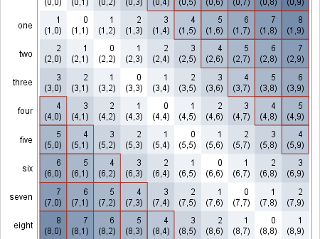
There are many ways to use a heat map. For big data sets, heat maps provide a substitute for scatter plots. Heat maps can also be used to enhance small tables. Several of my colleagues (Sanjay Matange, Pratik Phadke, Rick Wicklin, Chris Hemedinger, and probably others) have posted about using
A few weeks back I posted an article on ways to create a WindRose Graph using SGPLOT procedure. The process is relatively simple. Create (R, Theta) data with both numeric axes where the Theta is a value in the data range is 0-360, and R is the corresponding response value. Then
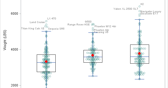
There was a recent comment on the original 'Unbox Your Box Plots', where a user wants to see the original data for the box, but only label the outliers. As noted in the comment, labeling all the scatter markers and turning on the outlier display is not ideal. But there
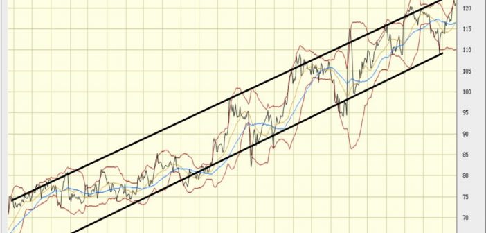
This weekend I was reviewing my portfolio of stocks as usual. Yes, I do have a small stock portfolio with a few stocks, and normally I use free stock charting software to review the stock plots. These sites allow you to view the daily stock prices along with many technical
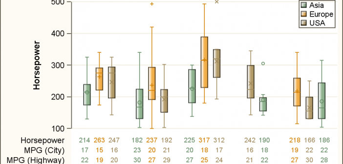
As often is the case, this article is prompted by a recent post on the SAS/GRAPH and ODS Graphics page communities page. A user wanted to create a Graph Table showing a bar chart with tabular data for each of the category values along the x-axis. The user was creatively using