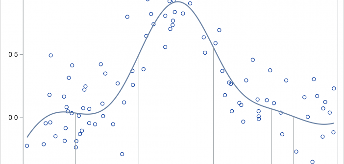
This post shows you how to run PROC SGPLOT, create smooth curves by using penalized B-splines, use ODS OUTPUT to create an output data set from PROC SGPLOT, and process it to display drop lines.

This post shows you how to run PROC SGPLOT, create smooth curves by using penalized B-splines, use ODS OUTPUT to create an output data set from PROC SGPLOT, and process it to display drop lines.
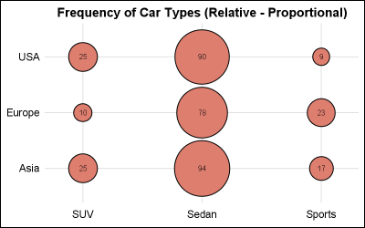
This is the 9th installment of the "Getting Started" series, and the audience is the user who is new to the SG Procedures. It is quite possible that an experienced users may also find some useful nuggets here. In this article, we will cover the basics of the BUBBLE plot.
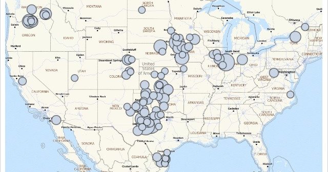
Data with a geographic component begs to be mapped. That capability is now available to all SAS users. A new mapping procedure in the fifth maintenance release of 9.4 (SAS 9.4M5) allows any user to easily plot data on a map. Unlike previous mapping applications with SAS, the SGMAP procedure
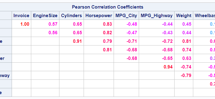
This post shows ways to display the upper or lower triangle of a correlation matrix. You can also use colors to show the magnitude of the correlations.
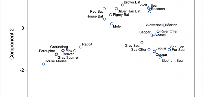
The POSITION= option in the TEXT statement provides you with a way to position text in a variety of locations relative to a point. You can use this option to fine tune label placement in a plot primarily created by using the SCATTER statement and the DATALABEL= option.

This post shows you how to animate text to create a message that appears one character at a time.
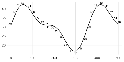
In my previous post, I described a new options to control the widths of the caps for Whiskers, Error and Limit bars. This topic could have been titled "Little things go a long way", as such details really make for a good graph. In a similar manner, another detail issue
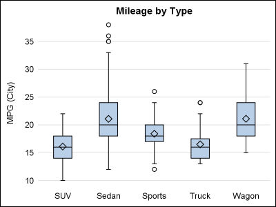
The SG procedures and GTL statements do a lot of work for us to display the data using the specified statements. This includes setting many details such as arrow heads, line patterns etc, including caps. Often, such details have a fixed design according to what seems reasonable for most use
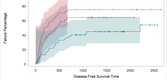
We'll take a deeper dive into understanding item stores--the files in which compiled templates are stored--and ways in which you can access them. At the end, I will show you one of my new examples: displaying percentages in the Kaplan-Meier failure plot.
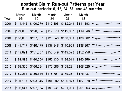
In the previous post, I discussed creating a 2D grid of spark lines by Year and Claim Type. This graph was presented in the SESUG conference held last week on SAS campus in the paper ""Methods for creating Sparklines using SAS" by Rick Andrews. This grid of sparklines was actually the