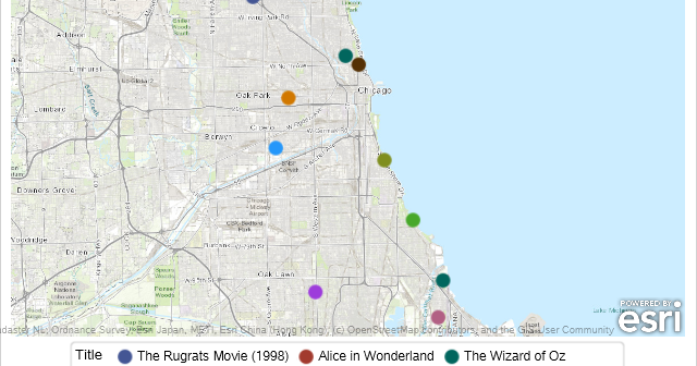
I met many SAS programmers at the 2019 SAS Global Forum who geocode addresses using ArcGIS. Did you know that street address locations and other things can be found using the SAS GEOCODE procedure? PROC GEOCODE gives you coordinates for address, ZIP codes, ZIP+4 codes and cities. You can even
English
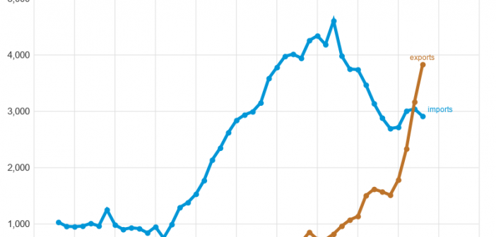
You might have seen in the news that US exports of natural gas to Europe are up 300%. And we recently crossed the threshold where we export more natural gas than we import. This seems like a momentous occasion, and worthy of a graph! But first, let me make sure
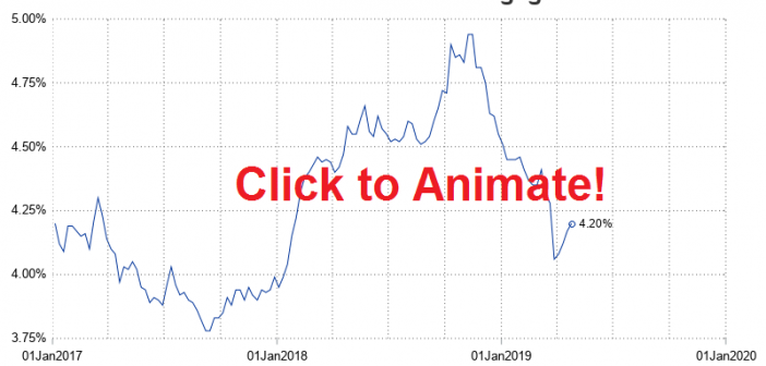
I always recommend looking at data in several different ways to get a more complete mental picture. And when the data is changing over time, one great way to view it is using an animation. Follow along for some tips & tricks to animate your own data over time. I'll
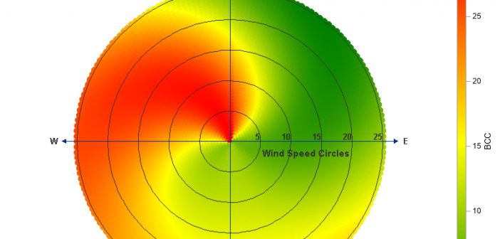
A few years ago Sanjay showed how to create a polar graph by creating a gtl template, and then plotting it using Proc SGRender. These days, Proc SGPlot has all the functionality you need to create this graph, therefore I've rewritten the example to just use SGPlot. And while I
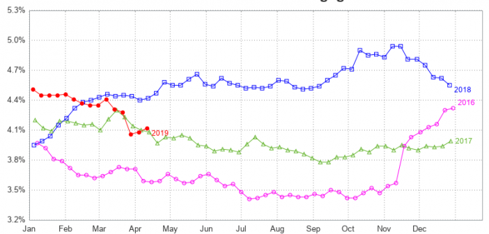
While we're on the topic of mortgage rates, let's explore another technique for plotting and comparing the rate data over several years. Last time, we plotted each year's data in a separate graph, and paneled them across the page. This time, let's overlay multiple years together in the same graph.
Did you recently lock in a mortgage rate of 3.5-5%, or perhaps even lower? How do today's rates compare to rates in the past? Let's dig a little deeper into this topic, with some graphs! But before we get started, here's a picture to get you into the mood for
In the past, I created some graphs about our record low unemployment rate (US unemployment, and state-level unemployment), but does low unemployment also mean there are jobs available? Let's have a look at the data!... Existing Graphs I knew I couldn't be the only one interested in this kind of
The past few years, I've created maps showing things you might visit and do during the big SAS Global Forum (SASGF) conference. This year the conference is in Dallas, and ... you guessed it ... I've created a Dallas map! If you're familiar with my previous maps, you know that
SAS Global Forum 2019 (SGF) is rapidly approaching - and which of the hundreds of presentations are you planning to attend? Well, no matter what types of analyses you perform with SAS software, you'll most likely want to present your findings in a really nice/informative graph! Therefore I highly recommend
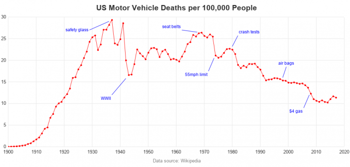
I recently saw an interesting graph that showed the number of motor vehicle crash deaths has been going down. The graph showed deaths per mile. That's a good statistic, but I wondered whether there were other ways to look at the data? An Interesting Graph Here's the graph, from an