Tips and Tricks

Data Visualization
Sanjay Matange 4
Beer, diapers and heat map

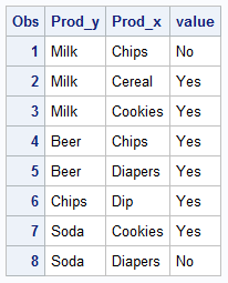
The parable of beer and diapers is often related when teaching data mining techniques.  Whether fact or fiction, a Heat Map is useful to view the claimed associations.  A co-worker recently enquired about possible ways to display associations or dependency between variables.  One option is to show the dependency as a node

Data Visualization
Sanjay Matange 4
Comparative density plots

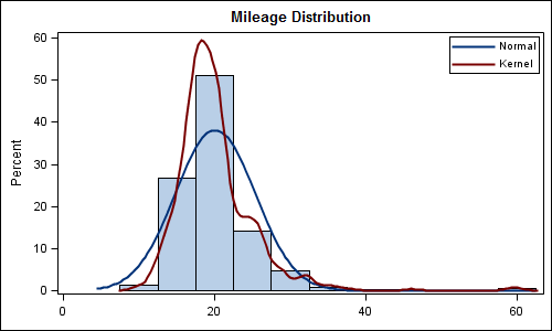
Recently a user posted a question on the SAS/GRAPH and ODS Graphics Communities page on how to plot the normal density curves for two classification levels in the same graph. We have often seen examples of a  distribution plot of one variable using a histogram with normal and kernel density curves.  Here is a simple example: Code Snippet:

Data Visualization
Sanjay Matange 7
Nested graphs

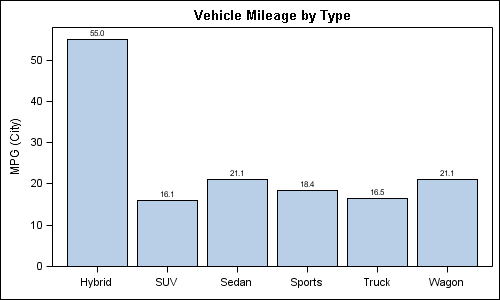
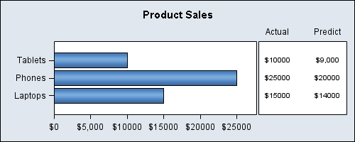
Here are a couple of bar charts showing the city mileage of cars by Type and Origin using the SGPLOT procedure from the sashelp.cars dataset. title 'Vehicle Mileage by Type'; proc sgplot data=cars; format mpg_city 4.1; vbar type / response=mpg_city stat=mean datalabel; xaxis display=(nolabel); run; title 'Counts by Country'; proc sgplot

Data Visualization
Sanjay Matange 1
Timeseries plots with regimes

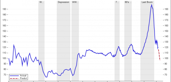
Recently we discussed the features of the Shiller Graph, showing long term housing values in the USA.  To understand the features necesary in the SGPLOT procedure to create such graph easily, it was useful to see how far we can go using GTL as released with SAS 9.2(M3). I got the data Shiller Housing index data

Data Visualization
Sanjay Matange 4
The more the merrier

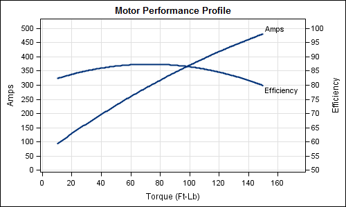
Often it is useful to view multiple responses by a common independent variable all in the same plot.  SGPLOT procedure and GTL support the ability to view two responses, one each on the Y and Y2 axes by one independent variable (X) in one graph.  Yes, you can also have X

Data Visualization
Sanjay Matange 4
Custom confidence intervals

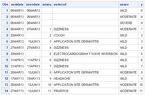
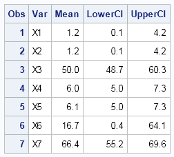
Recently a user posted a question on the SAS/GRAPH and ODS Graphics Forum about drawing a plot with custom confidence intervals .  The user has a simple data set with category, response (mean) and custom lower and upper confidence intervals.  The data looks like this: Robert Allison provided the code (proc gplot +

1 31 32 33 34 35