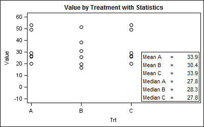
Statistical graphs often include display of derived statistics along with the raw data. Often these statistics are presented in a tabular format inside the graph. With SGPLOT procedure, a table of statistics can be added to the graph as an inset table, as shown below. Using a Stat Table: SGPLOT code:
Author
ODS Graphics components like GTL and SG procedures are designed to work with Styles to create graphs that are effective in the delivery of information and aesthetically pleasing out of the box. You no longer have to tweak the colors to ensure a nice graph. The graph derives all the
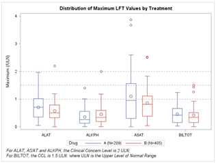
CTSPedia.org is a website of Knowledge Base for Clinical and Translational Research. On this site you can find sample graphs for statistical analysis of safety data for Clinical Research. Graphs included in this resource have been submitted by contributors, and include a graph for Liver Function for different tests by treatment.
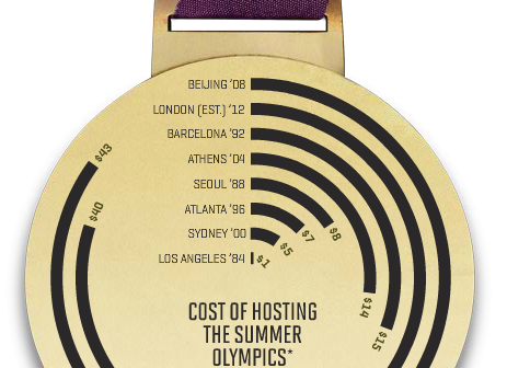
A graph in a recent article in Fortune magazine caught my eye. The graph shows the cost of hosting the Summer Olympics over the past eight events. Here is what I termed the "Medal" graph. Now, practitioners of the art of Effective Graphics would likely find some shortcomings in the graph. Clearly
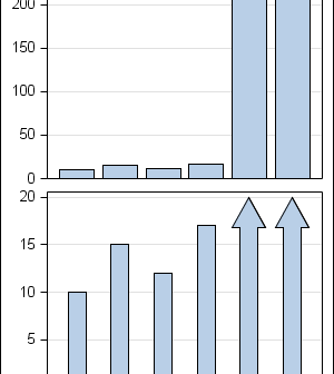
In the previous post on Broken Y-Axis, I reviewed different ways to display data as a Bar Chart, where the response values for some categories are many orders of magnitude larger than the other values. These tall bars force the display of other values to be squeezed down thus making it harder to compare
Often we want to display data as a bar chart where a few observations have large values compared to the rest. Comparison between the smaller values becomes hard as the small bars are squeezed by the tall bars. Here is an example data, and a bar chart showing the data. The large values
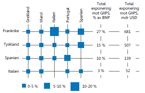
Recently, I came across an interesting graph showing Euro contries bank exposuro to GIIPS countries, as percent of GNP. Here is the graph: I thought I would see how far I can get in making a similar graph using SAS. I made up some data with response values for a Product x
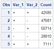
This post is a result of an intriguing question posed by a user on the SAS communities' page. How to create a bar chart where the category is a combination of two variables var_1 and var_2 (each with values of '+' and '-'), and get a X axis that shows each
At SAS Global Forum, and again at PharmaSUG, we had the pleasure of attending many papers and presentations on various topics that included graphs in the power point decks or in the papers. More often than not, the graphs exist along other text, and occupy a smaller part of the screen
PharmaSUG 2012 conference drew to a close today, concluding two and a half days packed with papers, presentations, posters, hands-on demos and super demos by SAS staff. While the weather outside was a bit chilly from time to time, the conference what hopping with many user papers on how to