Author

Sanjay Matange
RSS
Director, R&D

Sanjay Matange is R&D Director in the Data Visualization Division responsible for the development and support of the ODS Graphics system, including the Graph Template Language (GTL), Statistical Graphics (SG) procedures, ODS Graphics Designer and related software. Sanjay has co-authored a book on SG Procedures with SAS/PRESS.

Data Visualization
Sanjay Matange 2
Let them eat pie

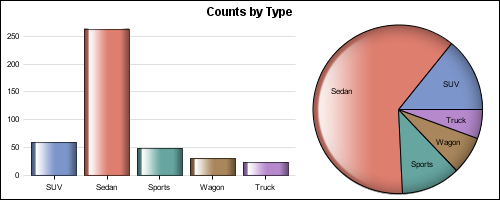
ODS Graphics system was initially motivated by the need for high quality graphs for SAS Base, STAT, and other analytical procedures.  Use of SG Procedures, ODS Graphics Designer and GTL by users too has initially focused on analytical graphs.  But just like wheels on carryon bags that started for the specific needs of flight

Data Visualization
Sanjay Matange 1
High resolution graphs

Creating a graph that looks nice, with readable, high resolution fonts is important and should be easy to do.  With SG procedures and GTL, this is easy to do with a simple option, but not the default. Creating a high resolution (image) for a graph consumes higher system resources.  When working on a graph,

Data Visualization
Sanjay Matange 6
Graphs with class

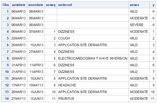
When the data is classified by multiple class variables, you can certainly create graphs using BY variables.  This results in separate graphs, one for each level of the BY variable crossings.  Each graph is scaled by its own data subset, and comparisons across BY levels is harder. When comparisons need to be

Data Visualization
Sanjay Matange 7
Dashboard graphs revisited

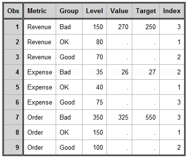
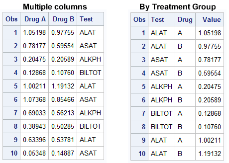
Here is the promised follow up on the Dashboard graph.  In the previous article, I posted the code to create a panel of bullet KPIs displaying three different metrics.  For each KPI, I used 5 columns of data which resulted in a wide and inconvenient structure. A more convenient data structure is

Data Visualization
Sanjay Matange 1
Dashboard graphs

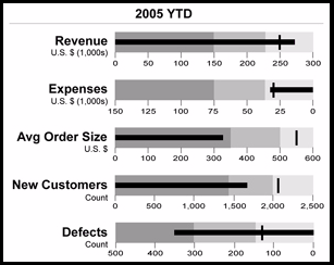
In this blog we have been discussing graphs useful for analysis of data for many domains such as clinical research, forecasting and more.  SG Procedures and GTL are particularly suited for these use cases.  So, when I came upon a dashboard image from Steven Few's Visual Business Intelligence blog, showing the

Data Visualization
Sanjay Matange 4
Beer, diapers and heat map

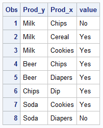
The parable of beer and diapers is often related when teaching data mining techniques.  Whether fact or fiction, a Heat Map is useful to view the claimed associations.  A co-worker recently enquired about possible ways to display associations or dependency between variables.  One option is to show the dependency as a node

Data Visualization
Sanjay Matange 4
Comparative density plots

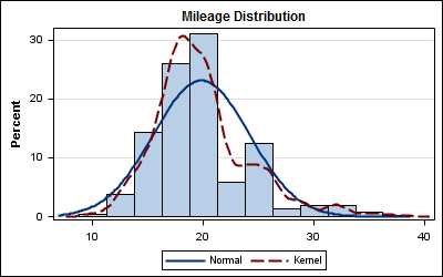
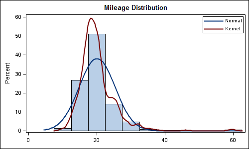
Recently a user posted a question on the SAS/GRAPH and ODS Graphics Communities page on how to plot the normal density curves for two classification levels in the same graph. We have often seen examples of a  distribution plot of one variable using a histogram with normal and kernel density curves.  Here is a simple example: Code Snippet:

1 26 27 28 29 30