Creating a graph that looks nice, with readable, high resolution fonts is important and should be easy to do. With SG procedures and GTL, this is easy to do with a simple option, but not the default.
Creating a high resolution (image) for a graph consumes higher system resources. When working on a graph, I often go through many iterations to get the right graph. Also, many STAT procedures create multiple graphs in one step. So, it is not clear that all users want to invest the increased resources necessary to create a high resolution output for every graph in the "draft" or "analysis" stage.
For this reason it was decided to assign moderate default DPI settings for applicable destination. The default DPI for LISTING is 100. When ready to publish a graph, I can get a high resolution image for only the graph I want by setting a higher DPI by using the IMAGE_DPI option on the applicable ODS destination statement:
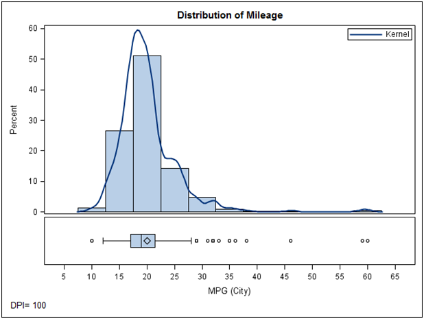
ods listing image_dpi=300;By default, a graph rendered to the LISTING destination uses the default DPI of 100 and output size of 640px x 480px. When inserted in to a Word document at full size, it looks like this:
You can improve the rendering of the graph, especially the fonts by increasing the DPI to 300, 600 or higher. When inserted in to a Word document at full size, the same graph rendered at 300 dpi graph looks like this:
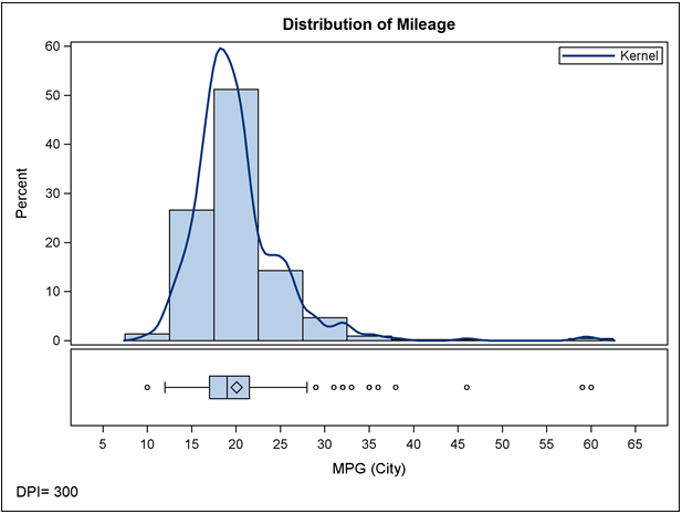
The images above are captured from a view of the Word document on the screen. Even here, the higher font quality can be perceived, and this will be clearly apparent on the printed page. The rendered fonts for the 300 dpi case are much nicer.
Often, one needs to insert such an image in 1 column of a 2 column page. In this case, the final image width is 3.2 in with height of 2.4 in. Inserting this 300 dpi image in one column looks like this:
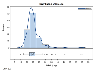
As you can see, all elements of the graph are linearly scaled down to half the original size, so a font that was 8pt in the original image is now only about 4pt and quite unreadable. To address such situations, and to create graphs with nicer readable fonts, I use the following rule to create graphs for presentations and inclusion in documents:
Render the graph to the final usage size at high dpi.
So, I would render this graph with the following settings:
ods listing image_dpi=300;
ods graphics / height=2.4in;
When inserted into a 3.2 in x 2.4 in space in the document, it looks like this:
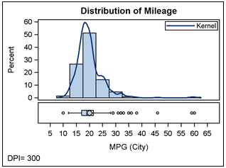
As you can see, the graph is high resolution, and the fonts are much more readable. The reason is that when a graph having a design height of 4.8in is rendered at a render height of 2.4in, the fonts and other items in the graph are scaled using the factor:
ScaleFactor= (Render height / Design height) ** 0.25
So if the render height is half of the design height (as here, since default design height is 4.8 in), the fonts are scaled by a factor of (2.4 / 4.8) ** 0.25 = 0.84. So a 8pt font is now rendered at 6.5pt, which is much more readable.
In the book "Statistical Graphics Procedures by Example" (see link on the top right), all the small graphs are rendered at 3in x 2in at 300 dpi.
When going to larger images, say for use in a Powerpoint presentation, it is best to keep the original default sizing (for most cases) and just increase the DPI. Increasing DPI, linearly scales all elements of a graph, including fonts, marker sizes and line thickness. In this case, you need a graph that is clearly visible from a distance.
Increasing the graph size will increase the area of the graph, and each element will be scaled up by a factor using the above equation. Often, this is not desirable when you want to project the same graph in a bigger size for viewing from afar. However, if your graph is more complex in nature, and you need more space to include all elements, then it is useful to increase the graph size itself. You can disable the scaling of fonts for graph size change entirely by using the NOSCALE option on the ODS Graphics statement.
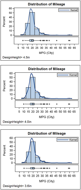
Now for some fun with these values...you can use different combinations of design height and render height to get the font scaling you want. Here is an example of the same graph with render height=2.4in, but with different design heights. As the design height shrinks, the effective font size increases. Apply the equation for ScaleFactor above and you will see why.
With SAS 9.3, PDF, PS and EMF graphs are rendered as scalable vector graphics. This means the graphs are not images, but graphical meta files. These will linearly scale up and down smoothly in the viewer.
Summary: Font scaling for DPI is linear, scaling for render height change is non-linear = (RH/DH)**0.25.
See the recent article by Prashant Hebbar on Graph Scaling for related information.
Full SAS code: Graph_Res_Graphs


1 Comment
Thanks a lot for this posting on high resolution graphs. I have just tried some of your suggestions out; for sure my graphs look very much better.