This is another in my series of blog posts where I take a deep dive into converting R graphs into SAS graphs. Today we'll be working on pie charts.
I know, I know ... you visualization 'purists' might be wagging your finger at me, and saying "pie charts are no good." I concur that a bar chart is better in most cases - for example, you can more easily compare the exact values (heights) of the bars. But, that being said, a pie chart is a visual representation that people can easily relate to, and I think it's an ~OK chart for general/casual data visualization. As long as you keep it to a very small number of pie slices - in particular, I like the 2-slice case, which is an intuitive way to show part-to-whole.
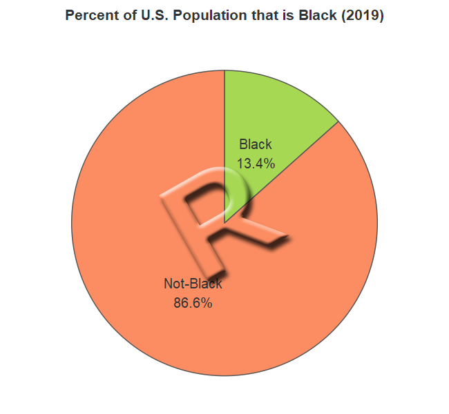
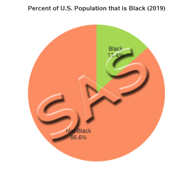
And what data did I pick for this example? ... Rather than just using simple fake data, I wanted to pick a real scenario where you might use a pie chart. Demographics came to mind, and I decided to demonstrate how to create a pie chart showing a specific race, as a part of the total population (using population estimates from the US Census).
R Pie Chart
SAS Pie Chart
My Approach
I will be showing the R code (in blue) first, and then the equivalent SAS code (in red) that I used to create both of the pie charts. Note that there are many different ways to accomplish the same things in both R and SAS - and the code I show here isn't the only (and probably not even the 'best') way to do things. If you know of a better/simpler way to code it, feel free to share your suggestion in the comments!
Also, I don't include every bit of code here in the blog post (in particular, things I've already covered in my previous posts). I include links to the full R and SAS programs at the bottom.
The Data
Since this example uses a very small amount of pre-summarized data (basically two data points), I just include it in the code. Here's how I did it in R.
my_data<-read.table(header=TRUE,text="
population race
43984096 Black
284225427 Not-Black
")
And here's how I did it in SAS:
data my_data;
length race $10;
input population race;
datalines;
43984096 Black
284225427 Not-Black
;
run;
Plotting the Data
R doesn't really have specific software for creating a pie chart. They re-purpose geom_column(), which is normally used to create a bar chart. And then plot it on a polar coordinate system. It was a foreign notion to me, and took a while to wrap my brain around which variable was used for which role, but I figured it out with a bit of trial-and-error. The scale_fill_manual() controls the colors of the slices, and the geom_color() controls the outline color. I then have to specify some theme options to get rid of the polar axes and values around the outside of the chart, and get rid of the legend.
my_plot <- ggplot(data=my_data,aes(x="",y=population,fill=race)) +
geom_col(color="#555555") +
coord_polar(theta="y",direction=-1) +
scale_fill_manual(values=c("Black"="#a6d854","Not-Black"="#fc8d62")) +
theme_void() +
theme(legend.position="none") +
In SAS, there's a specific procedure for creating pie charts (Proc SGpie) - and therefore the syntax is much more intuitive. The styleattrs controls the colors used in the slices (note that I could have used an 'attribute map' if I wanted to guarantee a certain color would go to a certain slice). One caveat, if it matters to you, is that Proc SGpie is a fairly new procedure, and is still being developed - and is therefore considered "preproduction" - for example, there's no option to control the outline color of the slices yet. If you need a production pie chart in SAS, there are other options you can use, such as SAS/Graph's Proc GChart.
proc sgpie data=my_data;
styleattrs datacolors=(cxa6d854 cxfc8d62);
pie race / response=population
startangle=90 direction=clockwise startpos=edge sliceorder=data;
Ordering the Slices
In pie charts, the ordering and positioning of the slices can sometimes be important. When I have two slices, I like to start my slice position at the 12 o'clock position - this way, if the slices are each 50% then they will occupy the left and right halves of the pie ... and anything more (or less) than 50% is easy to visually see. And when showing two pie slices (comparing part-to-whole), I like for the 'part' slice to be to the right of the 12 o'clock position.
With a 2-slice pie, you have a 50/50 chance that the 'part' slice is to the right of the 12 o'clock position. In this particular case, I found that I had to specify direction=-1 in the R code to get the slices ordered the way I wanted:
coord_polar(theta="y",direction=-1)
Since SAS has a procedure specifically designed for creating pie charts, there are several options available to control the pie slices. The SAS pie chart would normally start at the 3 o'clock position, therefore I specify startangle=90 direction=clockwise to make it start at the 12 o'clock position, and for the pie slices to proceed in the clockwise direction. SAS pie slices can either be centered on the position, or start at the edge - I specify the option to start at the edge. SGpie also provides several options ordering the pie slices (such as ascending or descending order based on the slice sizes) - I chose to order the slices in the data order, to guarantee they were always ordered consistently (with the 'part' slice to the right of 12 o'clock) no matter how large or small the slices are.
startangle=90 direction=clockwise startpos=edge sliceorder=data
Labeling the Slices
In R, adding labels to a pie chart is somewhat of a manual process. I have to calculate the percent value for each pie slice, and then use the paste() function to create a label containing the text (race) and the percent, with a carriage return ('\n') between them so they'll print on two lines. I then use the geom_text() function to overlay that information on the pie chart.
my_data <- my_data %>% mutate(perc = population/sum(population) )
my_data$slice_label <- paste(my_data$race, scales::percent(my_data$perc,accuracy=.1),sep='\n')
geom_text(aes(label=slice_label),position=position_stack(vjust=0.5),color="#333333",size=5)
In SAS, I simply use the datalabeldisplay= option to specify the two variables to include as labels.
datalabeldisplay=(percent category)
My Code
Here is a link to my complete R program that produced the R pie chart.
Here is a link to my complete SAS program that produced the SAS pie chart.
If you have any comments, suggestions, corrections, or observations - I'd be happy to hear them in the comments section!


2 Comments
Can you make a 3D plot using the ODS procs in the same manner as the old proc g3d?
sgpie doesn't provide a 3d perspective angle view of the pie chart (that's pretty much universally accepted as a 'bad' thing to do, because it distorts the sizes and angles of the pie slices). But, if you want a 'fancier' pie, with a bit of a 3d-ish look to it, you could try the dataskin=sheen option (or dataskin=gloss).