Do you find yourself on the road during the holidays, and looking for a place to eat that's still open? Or perhaps you're like me - I don't cook at home, and I'm not really into visiting family for the holidays and eating with them. Well then, you probably know about Waffle House! It's a chain of small restaurants (or rather a diner with a grill) that's open 24 hours a day, every day of the year. The Waffle House even has a reputation of staying open during weather emergencies (see the Waffle House Index).
Since I've seen Waffle House restaurants everywhere I traveled, I sort of assumed they were 'everywhere' in the United States. But when I actually got to checking, I found that was not exactly true! It appears some states don't have any Waffle Houses! So I decided to look into this a little further...
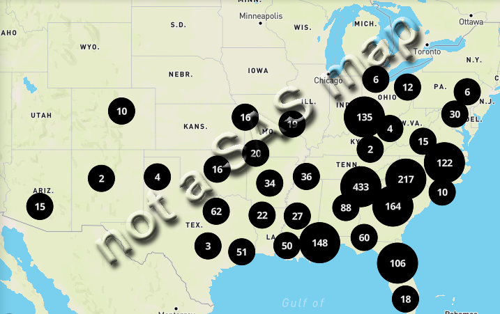
Official Waffle House Map
The Waffle House website has a screen where you can view all the Waffle House locations on a map. The main purpose of their map is to zoom-in and search for locations near you. The zooming ability is pretty cool, but the US-level map isn't particularly useful. For example, they have bubbles with summary counts ... but those summary counts aren't by state (what are they by?!?) Here's a snapshot of their map:
Location Data
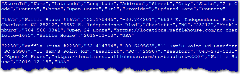
Being a map guy, and a Waffle House fan, I decided to take matters into my own hands, and try to create a better map. First, I needed the location data. I couldn't see a good/easy way to get all the locations from the Waffle House website, therefore I let scrapehero.com give me a hand with that. They provided a csv file with the street address and latitude/longitude of each location. Here's a glimpse of what the first couple lines of the csv file look like:
I used the following code to import the csv into SAS:
proc import out=my_data datafile="Waffle_House_USA.csv" dbms=csv replace;
getnames=yes;
datarow=2;
guessingrows=all;
run;
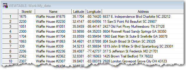
Now, with the data in a SAS table, it's much easier to read, and more manageable. Here's a peek at what the data looks like in SAS:
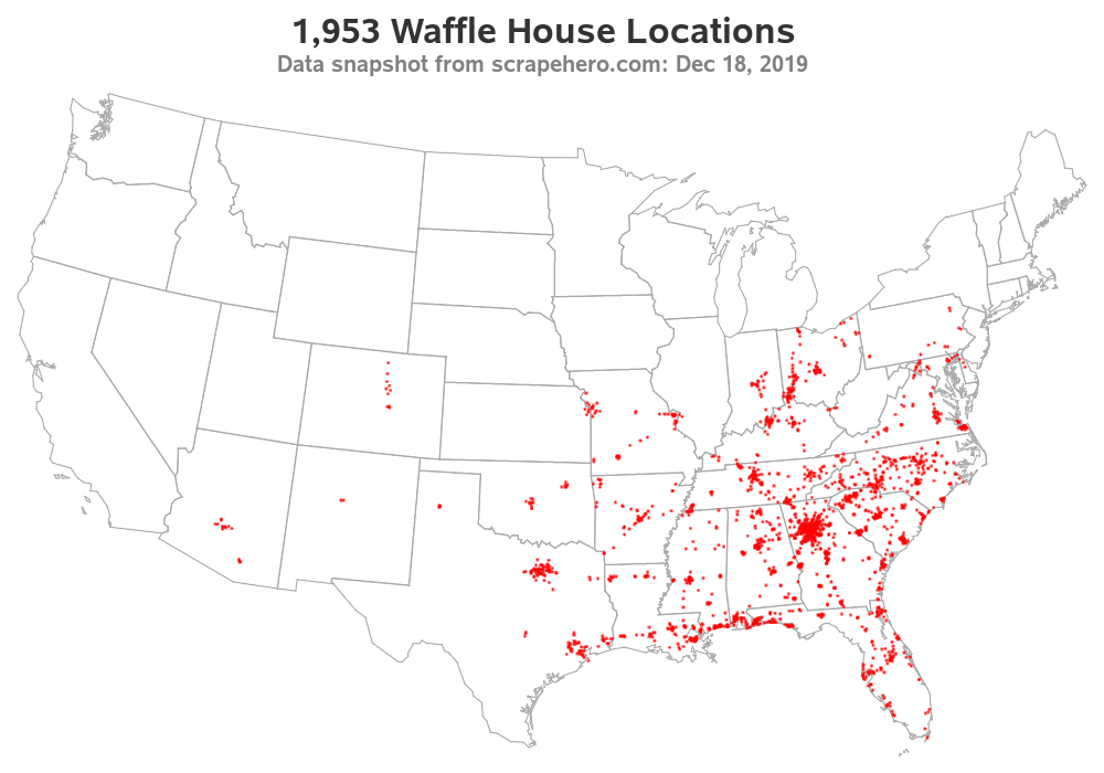
Map of Locations
For my first map, I decided to simply plot each of the locations as a dot, on a US map. Therefore I got a US polygon map and projected it in the way I wanted, and then also applied the same projection parameters to the Waffle House lat/long coordinates. I then used Proc SGmap to plot the data as red dots on a map. The map definitely shows a high concentration in Atlanta, GA (that's where the Waffle House restaurants first started).
proc gproject data=my_data out=my_data latlong eastlong degrees dupok
parmin=projparm parmentry=my_map;
id;
run;
proc sgmap mapdata=my_map (drop = lat long) plotdata=my_data noautolegend;
choromap / mapid=statecode lineattrs=(color=grayaa);
scatter x=x y=y / markerattrs=(size=3px color=red symbol=circlefilled);
run;
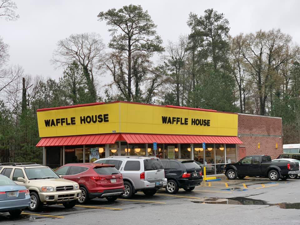
And speaking of Waffle Houses in Atlanta, here's a picture of one that my friend Margie took for me this morning (Dec 23rd). Looks like they've got quite a few customers, on this holiday week. Thanks Margie!
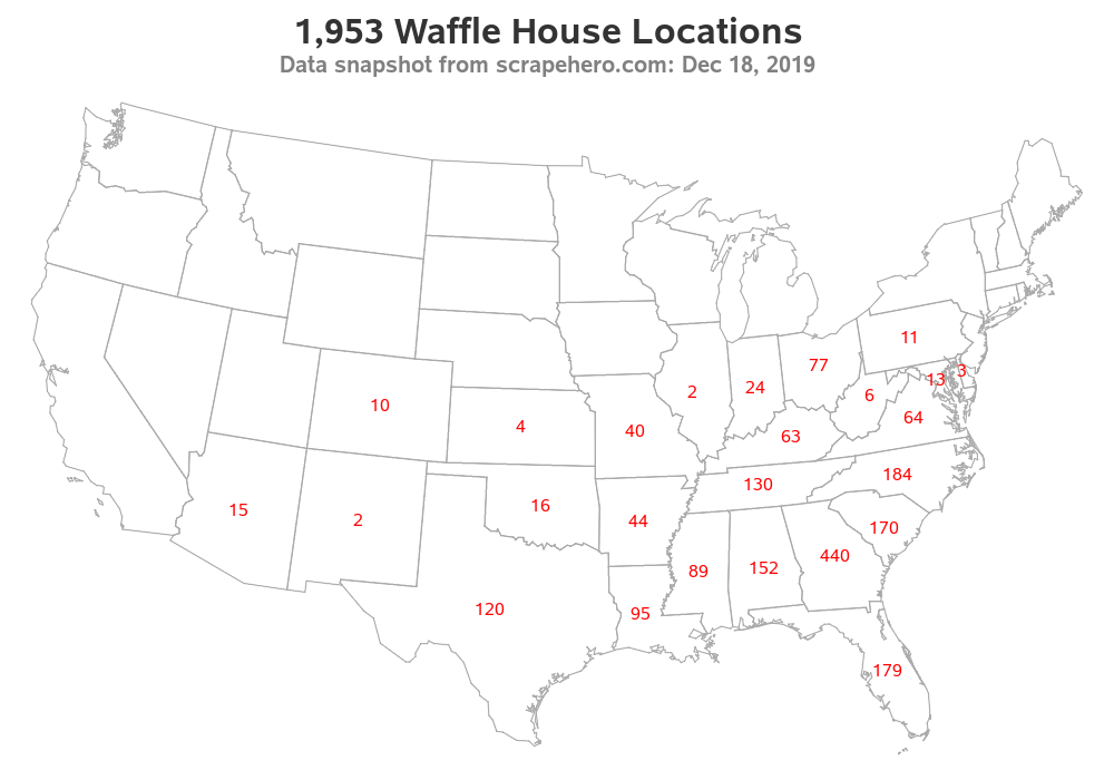
Map of Summary Counts
Next, I wanted to see how many Waffle Houses were in each state. Therefore I used SQL to calculate that summary count, and plotted the numbers as text at the centroid of each state:
proc sql noprint;
create table state_data as
select unique state as statecode, count(*) as state_count
from my_data
group by state;
quit; run;
proc sgmap mapdata=my_map (drop = lat long) plotdata=state_data noautolegend;
choromap / mapid=statecode lineattrs=(color=grayaa);
text x=x y=y text=state_count / textattrs=(color=red size=12pt);
run;
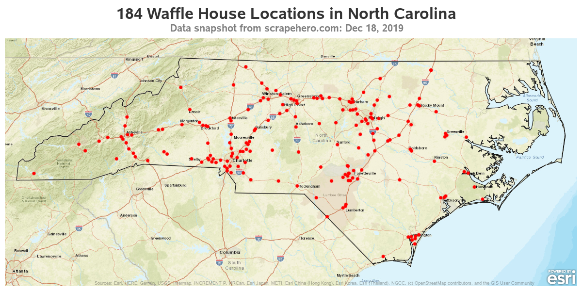
Map of North Carolina Locations
And since I live in North Carolina, I created one more variation ... this time showing just the NC locations on a tile-based street map.
proc sgmap mapdata=nc_map plotdata=my_data (where=(state='NC')) noautolegend;
esrimap url="http://services.arcgisonline.com/arcgis/rest/services/World_Street_Map";
choromap / mapid=statecode lineattrs=(color=gray11);
scatter x=long y=lat / markerattrs=(size=8px color=red symbol=circlefilled);
run;
Of course, I left out a few of the details in the code above - if you'd like to see the complete SAS code, click here. (Per scrapehero's rules, I can't redistribute the csv data, therefore if you want to actually run the code, you'll need to obtain your own copy of the csv data from scrapehero.com.)
Questions
Do you like my US map better than the official Waffle House map? What other changes/additions would you like to see in the map? And where do you recommend eating out on holidays, and days when most restaurants are closed? Feel free to leave your answer in the comments section!


14 Comments
Waffle House is one of my favorites. Everything there is good, especially the pork chops. And traveling in the South, they seem to be everywhere.
Now you've got me hungry for pork chops! 🙂
Thanks for the instructions! I was not liking my own scatter plot for a NC map I was creating since I didn't have any city names, etc. as points of reference, and I wasn't relishing the idea of creating a big annotate data set for adding all those. Using the ESRIMAP option gives me all those annotations for not much added work, which is great!
Yep - it's kinda handy that way! 🙂
I have a couple questions, although they might better be asked of SAS Tech Support:
1) How did you get ESRI map to show such a narrow, focused view of NC? I'm plotting my own NC points, and using similar code to yours, but my ESRI map shows parts of VA north to Richmond, and parts of SC south to Charleston. I'd like to limit the map to NC only, or at least similar to yours, which only goes as far south as, say, Myrtle Beach.
2) I'm using SAS 9.4M6, and I cannot get state border lines other than light gray. I've tried using your code:
choromap / mapid=statecode lineattrs=(color=grayaa); (or gray11 -- and where are those colors documented? I've never used them before). I changed to color=red, and still I only see light gray.
Per #1, you probably need to change the horizontal and veritcal size of your map, so that it is wide & short like mine. With the tile-maps (such as ESRI), they typically fill in all the available area.
Per #2, it's difficult to say for sure without seeing your exact code. If you changed the color to red, and don't see that change, then something is definitely not working right. (These shades of gray are from SAS/Graph ... grayAA is the same as cxAAAAAA, gray11 is the same as cx111111).
Thanks for the reply!
1) Yes, I forgot to change horizontal and vertical size of my map output. Once I set it with this code:
ods graphics / width=1200px height=600px;
it looked more like yours. It's nice that SAS (or ESRImap) crops the map, and doesn't just shrink it to fit.
2) I figured out how to change outline color (I'm using a Congressional District border, not actually State border right now). I had to add a dummy response variable (just created a dataset called respdata with response_var=1 and g_District=1), referenced these in PROC SGMAP, then the border color changed to red! I also changed to OpenStreetMap, because it looks a bit cleaner. I'll put the code here, if it might help:
proc sgmap mapdata=DistOutlines_NC plotdata=Points maprespdata=respdata noautolegend;
where g_District = &myDistrict;
openstreetmap;
choromap response_var / mapid=g_district lineattrs=(thickness=1px color=red) transparency=0.4 discrete;
scatter x=x y=y / markerattrs=(size=2px color=red symbol=circlefilled);
run;
The last piece of my puzzle is setting the background color of the district polygon. If I remove the "discrete" option (on choromap statement), background color is white, and if I use "discrete" option, it's blue. I'd like it to be green. So, I'm off to figure out where the blue color is coming from.
You should be able to control the color of the sgmap choropleth polygons by modifying the colors in the ODS style, such as creating a new style called 'my_style', and using that style ...
ods path(prepend) work.templat(update);
proc template;
define style styles.my_style;
parent=styles.htmlblue;
style graphbackground / color=cxcccc99;
class graphcolors /
'gdata1'=cx336633
'gdata2'=cx993333
'gdata3'=cx848421
'gdata4'=cx29636b
;
end;
run;
Thanks, that worked!
I added PROC TEMPLATE code similar to yours (with just a definition for 'gdata1'=cx00ff00, and the following line before my PROC SGMAP --
ods html style=styles.myStyle;
and the polygon's interior color changed to a semi-transparent green.
As a side comment, recently I had a similar type of mapping task. I found great utility in using the open street maps data to extract the same type of information.
http://download.geofabrik.de/
While I used python, SAS shouldn't have too much trouble reading the raw OSM files (download osm.bz2 files to get them)
and contain the same information with out having to purchase it from a third party.
Yes - with SAS Proc SGmap, you can just change the 'esrimap' line in the code to just 'openstreetmap'. I tried it both ways, but esrimap lets you choose from several different maps, and I liked the esrimap a little better so I went with that one! 🙂
Hi,
First up, thank you so much for sharing the code for this blog. I am a bit of a novice when it comes to working with SAS maps. I have collected the waffle house data-set myself and am trying to replicate the maps. I am getting an error when I try to run the following proc gproject statement:
proc gproject data=my_data out=my_data latlong eastlong degrees dupok
parmin=projparm parmentry=my_map;
id;
run;
I am getting:
NOTE: Using default parameters for entry MY_MAP from data set WORK.PROJPARM. Use NOPARMIN option
to disable this feature.
ERROR: All observations have missing values.
I am guessing that the column names are probably not matching between my "my_data" and your version of "my_data" data-sets. Do you mind sharing the column names that you have in your my_data data-set. Do I need to have the id column in the my_data?
Thank you!
Arkapravo.
Since you're using the "latlong" option in the proc gproject, then you must have variables called 'lat' and 'long'.
It works! Thanks a lot Robert... 🙂