I saw an article that claimed Donald Trump recently tweeted 123 times in one day. This got me wondering how many times he typically tweets during a day, and whether this number has changed over the years. This seems like it might be a good topic to analyze with a graph, eh!?!
My Prior Graph
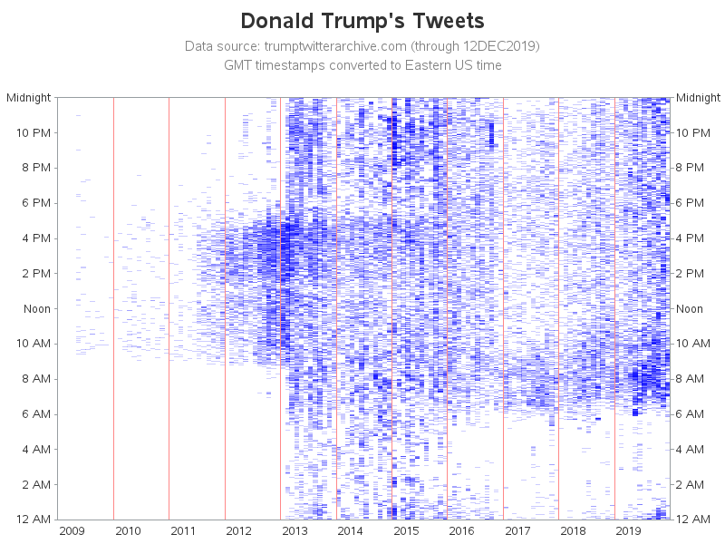
A couple of years ago, I blogged about a graph I created to help analyze when Trump tweeted. Here's an updated copy of that graph, including the current data. Looks like 2019 is a little 'darker' than the previous two years ... but it's difficult to say with certainty.
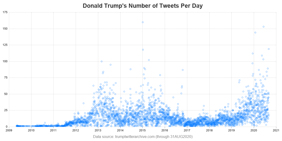
But the above graph doesn't tell me how many times Trump tweeted each day. So, let's create a new graph...
The Data
I got the latest version of the data from the trumptwitterarchive, and imported it into SAS again (using the same code as I had for the graph above). I then wrote some SQL to summarize the data, and get the daily tweet counts. Note that the time span of these tweets is both before, and after, Trump became president.
proc sql;
create table summarized_data as
select unique date, count(*) as daily_tweet_count
from my_data
group by date;
Basic Graph
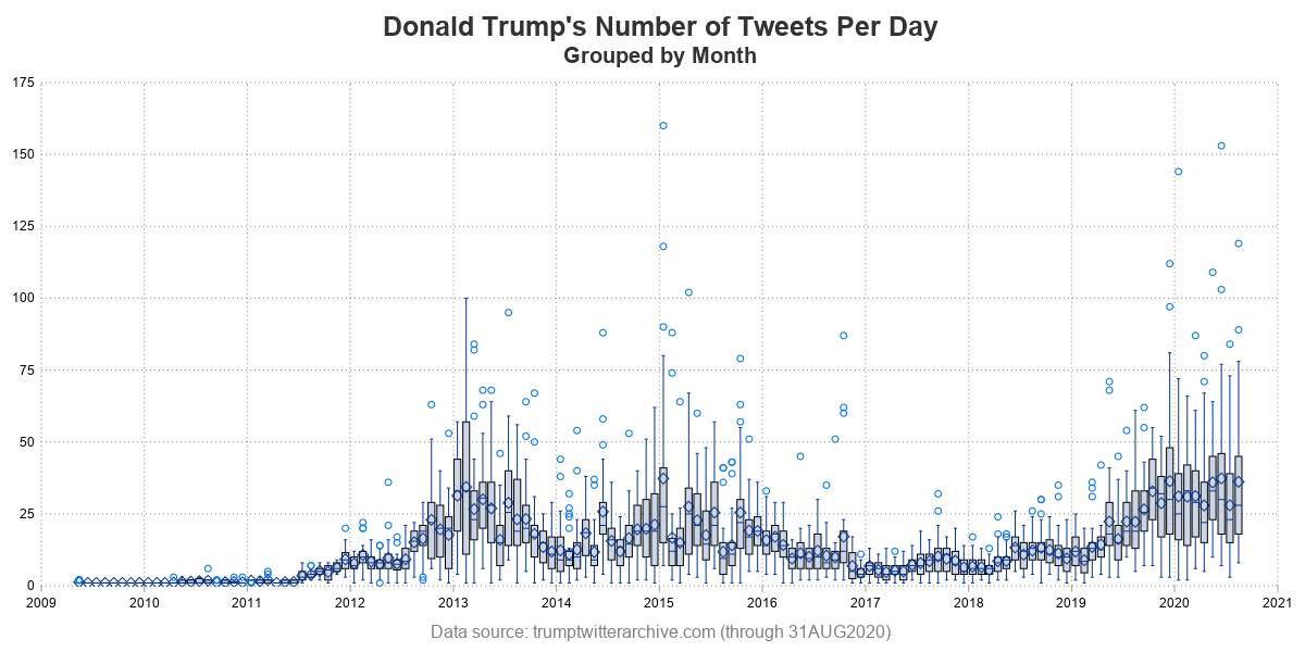
I was able to create a plot of the summarized data, using fairly minimal code. (here's a link to the full code, if you'd like to see all the little details and options). This simple graph shows that Trump had a lot of tweets per day back in 2013-2015, and that his numbers settled down for a few years, have been increasing again in 2019.
proc sgplot data=summarized_data noborder;
scatter y=daily_tweet_count x=date;
Box Plot
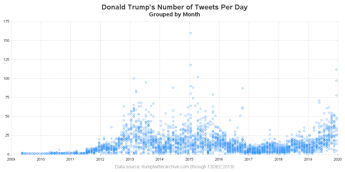
The plot above is a great first-look at the data. But I started thinking to myself "It sure would be nice to have a box plot, summarizing all the daily values for each month." But the problem is, all the values within a box in a box plot must have the same x value ... and each of my data points have a unique x (the daily date). Therefore I added a monthly date values to each data point (I basically just 'round' off each date value to the 15th of the month).
data summarized_data; set summarized_data;
month_date_string='15'||put(date,monname3.)||put(date,year4.);
format month_date mmyys10.;
month_date=input(month_date_string,date9.);
run;
This next plot isn't the box plot, but just an intermediate plot to show you how the data is arranged now, when I plot it using the 'rounded' date value. In this plot, you can see how all the ~30 markers for each month are now lined up along the same x value.
And now I can finally create my box plot! ... Or, somewhat ...
proc sgplot data=summarized_data noborder;
vbox daily_tweet_count / category=month_date
outlierattrs=(color=cx0276FD size=7px);
xaxis display=(nolabel noline) offsetmin=0 offsetmax=0
grid gridattrs=(pattern=dot color=gray88);
yaxis display=(nolabel noline noticks) offsetmin=0 offsetmax=0
values=(0 to 175 by 25)
grid gridattrs=(pattern=dot color=gray88);
run;
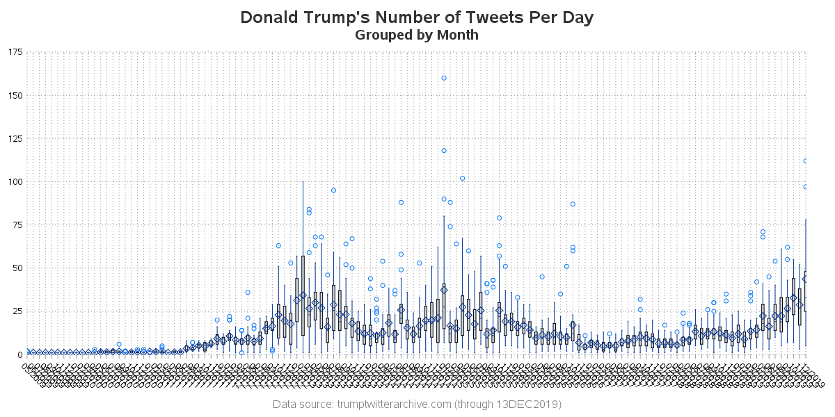
I got the box for each month - but what happened to my x axis (along the bottom of the graph)? Why is it labeling every box's month? Well, box plots just kinda work that way by default - they assume that when you're using a box plot, that each box is kind of a categorical/discrete thing. But in my case, my x axis is time (dates), and therefore I don't really need/want every value to be labeled. I just need a few recognizable milestones plotted along the axis. Fortunately, sgplot's axis statement let's me specify type=time, so the graph knows to treat the x axis that way. And by adding that one simple option (type=time), I now get a nice/beautiful/clean box plot!
xaxis display=(nolabel noline) offsetmin=0 offsetmax=0
grid gridattrs=(pattern=dot color=gray88)
type=time;
Bonus
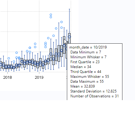
If you like to get into the nitty-gritty details of the data, you might also like to view the interactive version of the chart. It has mouse-over text showing the detailed statistics for each monthly box. Here's an example:
Twitter / Tweets ?
If you've read my previous blog posts, you might have noticed that I often include a 'random' photo from one of my friends, that is somehow related to the topic at hand. It was a bit difficult to come up with a photo related to Twitter, but here's what I came up with ... When you post messages on Twitter, they're called tweets. And baby birds also make a sound called a tweet. Therefore here's a cute picture of a baby bird tweeting! 🙂 Thanks for letting me use your photo, John!


7 Comments
Sorry - didn't mean any disrespect!
(and I guess technically, lots of tweets were made when he wasn't president!) 🙂
There's something you can see in the first graph which includes time of day that is not apparent from the daily or monthly summaries. I'm pleased to see that the President of the United States of America is getting more sleep than he used to, although night-time tweeting is creeping up again..
One other possibility for the nighttime tweets is that he's in a different timezone (world traveling) when he's making those tweets! 🙂
Hi,
Very nice graphs again.
I have one remark (and this is something that has been bothering me since the early SAS/Graph days): the label for the year is positioned *at* a tick mark, which always has me doubting whether that is the first or maybe the last month of that year, or maybe the middle of the year. I would like to have the label *in between* the tickmarks.
Does the sgplot axis statement have something for that?
And, regarding timezones, for a discussion on SAS date and times, timezones and relevant functions and formats: come to my presentation at the next SGF. Wednesday, 11:00 AM (local time then; which is 17:00 at my current timezone ;-))
Nice to see!
I've been looking at the same data starting with his first month as president and going to May of 2020. Looking at monthly frequency, data fit a second degree binomial function of months elapsed with an R squared of .92! The only other variable I used that added significantly to the prediction was seasonality. Number of favorites or retweets from the previous month added nothing. Trump seemed to tweet more in fall and less in spring/summer. It only added about 2% prediction. Golf?
The rate for May was 37 tweets per day. The prediction is that in September there will be an average of 43 tweets per day, and in December 54.
I wonder if he will tweet more, or less, once his campaign goes into full-speed in the 2 or 3 months prior to the election?
Would 2016 be a predictor of 2020?