You've probably heard of the famous Rosetta Stone. It had the same decree written on it in both ancient Egyptian and Greek, and was an essential key to help modern historians decipher and translate the ancient Egyptian hieroglyphs. To help the 'old timers' (like me) shift from using SAS/Graph to the newer ODS Graphics, I thought it might be useful to create a few examples showing how to generate the same graph in both - and I decided to call these examples ... you guessed it, my 'Rosetta Graphs'!
Data Preparation
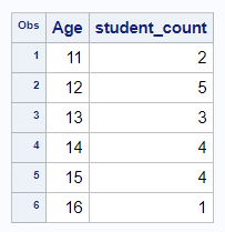
For my second Rosetta Graph example, I will focus on a simple bar chart. For simple bar charts (as opposed to histograms, or fancy analytic bar charts) I find that I usually have 1 data observation per bar, or the data is pre-summarized so that I have 1 data observation per bar ... or even if it's not pre-summarized, I like to summarize it myself. In my mind, having 1 data observation per bar keeps things simple. You could let the SAS bar chart procs summarize the data for you, but that requires slightly different code (which I plan to show later, in a histogram example).
In this example, I'll be using data from the sashelp data library, so you can easily reproduce what I'm doing. I use Proc SQL to summarize the data - there are many other ways to summarize data in SAS, but SQL is my favorite. Once we summarize the data, we'll use the same summarized dataset in both charts.
proc sql noprint;
create table my_data as
select unique age, count(*) as student_count
from sashelp.class
group by age
order by age;
quit; run;
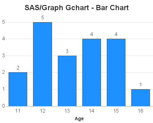
SAS/Graph Gchart - Bar Chart
You could create a very similar bar charts using less code ... but I'm trying to demonstrate all the bits-n-pieces you might sometime want to customize, so you can see how these things were done in SAS/Graph and also in ODS Graphics. I'll show both sets of code & charts first, and then explain the differences.
goptions device=png xpixels=500 ypixels=400 ctitle=gray33 ctext=gray33 htext=12pt;
axis1 label=none style=0 major=none minor=none offset=(0,5pct);
axis2 label=(font='albany amt/bold');
pattern1 v=solid color=dodgerblue;
title1 h=18pt ls=1.5 "SAS/Graph Gchart - Bar Chart";
proc gchart data=my_data;
vbar age / discrete type=sum sumvar=student_count outside=sum
width=10pct space=10pct coutline=gray44
raxis=axis1 maxis=axis2 noframe
autoref cref=graydd clipref name="bar_gchart";
run;
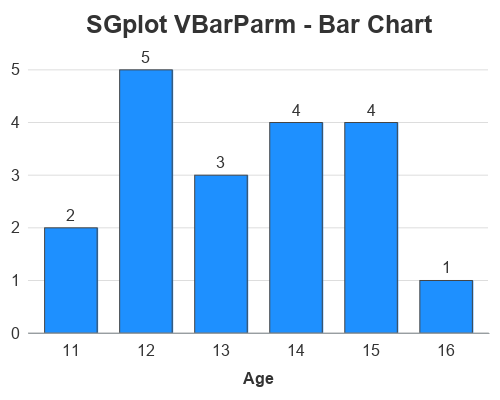
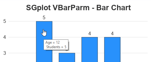
ODS Graphics SGplot - Bar chart
ods graphics / imagefmt=png imagename="bar_sgplot" width=500px height=400px noborder noscale;
title1 c=gray33 h=18pt "SGplot VBarParm - Bar Chart";
proc sgplot data=my_data noborder;
vbarparm category=age response=student_count /
datalabel=student_count datalabelattrs=(color=gray33 size=12pt)
barwidth=.7 fillattrs=(color=dodgerblue)
outlineattrs=(color=gray44);
yaxis display=(nolabel noticks noline)
valueattrs=(color=gray33 size=12pt)
grid gridattrs=(color=graydd);
xaxis display=(noticks)
labelattrs=(color=gray33 size=12pt weight=bold)
valueattrs=(color=gray33 size=12pt);
run;
Code Explanation
Each bullet below describes some aspect of the chart, and describes how it was coded in both Gchart and SGplot. If you want to easily find these commands and options in the code above, I recommend using your browser's Ctrl+f functionality to find the text.
- To control the type (png) and size (500x400 pixels) of the graph, I used goptions (xpixels, ypixels, and device) in the gchart code. I specified these things in the "ods graphics" line (width, height, and imagefmt) for sgplot.
- The title1 statement is very similar in both. I did not have to specify any extra line spacing (ls=1.5) in the sgplot, because there's already adequate white-space above the title.
- In gchart I specify the name of the output png file using the name= option after the plot statement's '/'. In sgplot I specify it via the ods graphics imagename option.
- In gchart, we used vbar age, whereas in sgplot we use vbarparm category=age (note that you use sgplots vbar, rather than vbarparm, if you want it to summarize the data for you).
- In gchart we use type=sum sumvar=student_count (gchart always wants to summarize the data for you, therefore you have to tell it to do a sum, but it's only a sum of 1 pre-summarized data point for each bar), whereas with sgplot's vbarparm (which is specifically designed to work with pre-summarized data) you only have to specify response=student_count.
- In gchart, I am able to control the color and size of all the text by using htext and ctext on the goptions statement, whereas in sgplot I hard-code the size and color of each individual piece of text (using labelattrs and valueattrs). Alternatively, you could control all the sgplot text from a central location by customizing the ODS Style ... but I prefer not to mess with the styles.
- In gchart I make the bottom axis label bold by specifying label=(font='albany amt/bold') in the axis2 statement. Whereas in sgplot I use labelattrs=(weight=bold) in the xaxis statement.
- In gchart I specify color=dodgerblue in a pattern statement, whereas in sgplot I specify fillattrs=(color=dodgerblue) as an option on the vbarparm statement.
- In gchart I use style=0 on the axis1 statement to make the left axis line 'go away', whereas in sgplot I specify display=(noline) on the yaxis statement (and I have to also specify noborder on the sgplot statement).
- In gchart I use the noframe option on the vbar statement to make the top & right axis lines to away. In sgplot I use the noborder option on the sgplot statement.
- In gchart I use autoref to turn on the of reference lines. In sgplot, you use the grid option on the yaxis.
- In gchart I use width=10pct to control the width of the bars and space=10pct to control the spacing between the bars. In sgplot I specify barwidth=.7 to tell the bars to take up 70% of the space it could potentially use. (This is probably the biggest and most difficult change for me to get used to with bar charts!)
- In gchart I use outside=sum to place a label at the top of each bar showing the number of students. In sgplot I use the datalabel=student_count option.
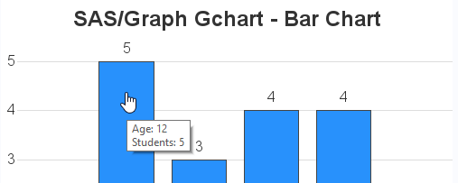
Bonus Round - mouse-over text!
Although in this simple example, there was plenty of room to completely label each bar (with the age at the bottom, and the number of students at the top of each bar), it is often not feasible to fully label the bars like that. In those cases I like to add mouse-over text. Below I describe how to add mouse-over text in both gchart and sgplot.
Gchart mouse-over
With gchart, I have to add a variable to the dataset containing HTML tags for the mouse-over text, and then point to that variable with the html= option. The advantage is that I can specify the exact text I want - the disadvantage, of course, is that I have to add a variable to my data.
data my_data; set my_data;
length my_html $300;
my_html='title='||quote('Age: '||trim(left(age))||'0d'x||'Students: '||trim(left(student_count)));
run;
proc gchart data=my_data;
vbar age / discrete type=sum sumvar=student_count outside=sum
width=10pct space=10pct coutline=gray44
raxis=axis1 maxis=axis2 noframe
autoref cref=graydd clipref
html=my_html
name="bar_gchart";
run;
SGplot mouse-over
With sgplot, you use the imagemap option in the ods graphics statement, and then mouse-over text will automatically be generated for each of the variables used in the plot. For this simple example the automatic mouse-over is adequate, but in a more complex example you might want to specify custom mouse-over text. You can use the tip=() option to specify the variables you want to appear in the mouse-over text. Note that the text will always be preceded by the variable name ('variable ='), and I don't know of a way to completely get rid of it. Also, if you have more than one line of mouse-over text, the 2nd line is always indented. I prefer the flexibility and total control of gchart, but sgplot mouse-over text is easier to use.
ods graphics / imagefmt=png imagename="bar_sgplot" width=500px height=400px
imagemap tipmax=2500 noborder noscale;
Hopefully you're finding my 'Rosetta Graphs' useful. If you have any suggestions on specific types of graphs you'd like to see, let me know (in the comments section).


