We recently had some severe storms come through North Carolina, which even spawned a tornado in Wake county (the county where I live and work). This got me wondering when and where we've had tornadoes in NC in the past ... and, of course, I had to create a map!
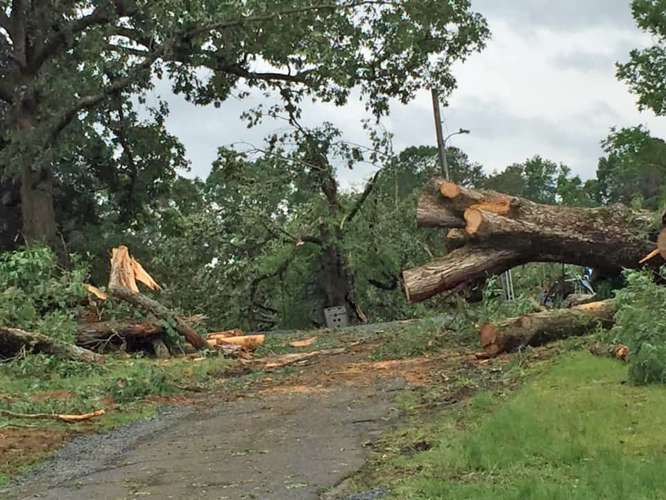
But first, here's a picture my friend Kim took, showing some of the storm damage in Cottonville, NC (just east of Charlotte).
When it comes to weather-related data, I often turn to the NOAA website. I found links to the annual tornado data for the entire US available on this page. And since they were in simple ASCII text format, I was able to easily read the data directly from the web into SAS (without having to manually download the files, and save them onto disk). Here's an example of the code I used for one of the files:
filename f2017 url 'https://www.spc.noaa.gov/wcm/data/2017_torn.csv' lrecl=2048;
proc import datafile=f2017 out=f2017 dbms=csv replace;
getnames=yes;
run;
There are many variables in the data, but the ones I was most interested in were the starting and ending coordinates of each tornado:
- 16-(slat) Starting latitude in decimal degrees
- 17-(slon) Staring longitude in decimal degrees
- 18-(elat) Ending latitude in decimal degrees
- 19-(elon) Ending longitude in decimal degrees
I used the following annotate commands to draw a simple line connecting the starting point to the ending point, to represent each tornado.
lat=slat; long=slon; function='move'; output;
lat=elat; long=elon; function='draw'; color='red'; output;
I then projected the lat/long coordinates, using the same projection parameters I had used on the NC map, so the annotated 'tornado lines' would be in the correct (projected) location on the map.
proc gproject data=anno_tornadoes out=anno_tornadoes latlong eastlong degrees dupok
parmin=work.projparm parmentry=my_map;
id;
run;
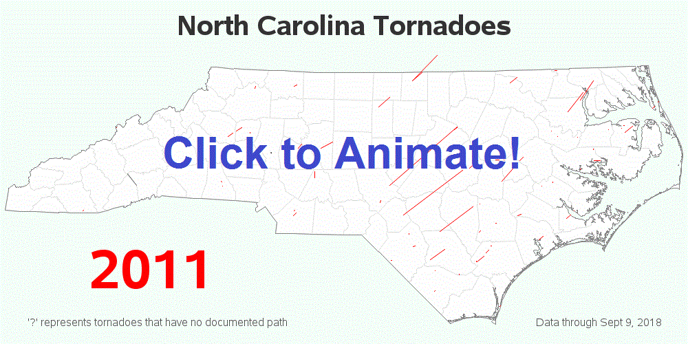
I used the following code to generate a separate map for each year ('by year'), and then let SAS combine all the yearly maps into a single animated gif image. (Click here to see the full code files used to import the data, and draw the maps.)
proc gmap data=county_data map=my_map all anno=anno_outline;
by year;
id state county;
choro state / levels=1 nolegend
coutline=graye5 cdefault=white
anno=anno_tornadoes
html=my_html;
run;
Here's a snapshot showing one year of the animation - click the image to see the full animation from year 1950 to 2018 (with mouse-over text for the county names).
Have you (or someone you know) ever experienced a tornado? Do you have any advice for staying safe in a tornado (especially something that most people don't know)? And do you see any trends in the map animation (either geographical, or time-related)? Feel free to discuss in the comments...


