Flooding has been in the news the past few days, and that makes me want to analyze some data! I hang out at Jordan Lake (here in central North Carolina) a lot, so I decided to download the data for that lake, and do a graphical analysis. If you're interested in Jordan Lake, or interested in techniques for plotting lake-level data, follow along!...
Jordan lake is a source of water, and a source of recreation, for my city (Cary, NC). But more importantly it is also a means to help control flooding for all the areas downstream. When we get a large rain event, they adjust the flow at the dam to hold back as much water as they safely can in the lake, and then release it gradually over time. And when they hold water in the lake, the lake level goes up ... sometimes way up!
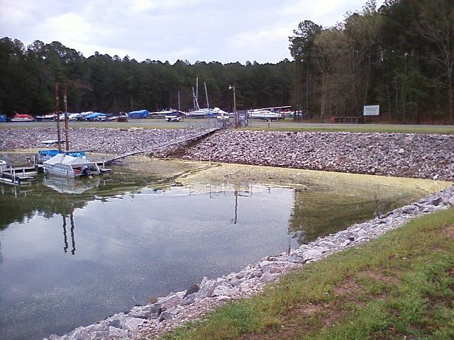
Here's a picture of the Jordan Lake marina (Crosswinds Boating Center) at the normal water level (that film on the lake is good-old NC pollen!). When the water level goes up about 13-ft, it gets above the level of the crushed-rock banks and floods the parking lots and trailer storage lots. When that happens, they have to move many of the trailered boats to higher ground, plug the drain-holes for the boats that are left in the trailer lot, shut off the electricity to the floating docks, and close the marina (it's quite an ordeal!).
If I've been counting correctly, I think the marina has been flooded & closed four times this past 'winter' season. Let's plot the data and see if I'm remembering that correctly!
The Raw Data
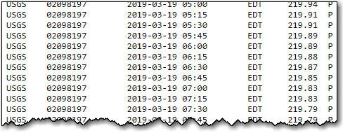
First, I found a USGS web page that lets me download the lake-level data by specifying the lake, and date range, as parameters on the URL. Here's a portion of the text data for Jordan Lake, so you can see what it looks like:
Plot (this past year)
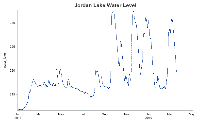
I imported the data into SAS, and created a simple plot of the past ~year of data. And there are indeed four prominent 'peaks' in the graph.
title1 c=gray33 h=15pt "Jordan Lake Water Level";
proc sgplot data=my_data (where=(datetime>='01jan2018:00:00:00'dt));
scatter x=datetime y=water_level / tip=none
markerattrs=(symbol=circlefilled size=1px);
xaxis display=(nolabel);
run;
Plot (with reference lines)
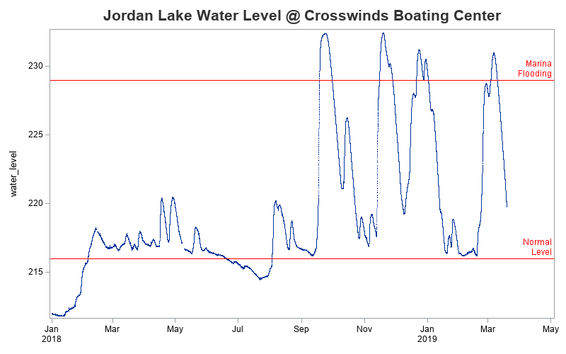
But did those 4 peaks flood the marina? Were they 13 feet above the normal water level? We need some points of reference ... therefore let's add some reference lines to the graph! The normal lake level is 216-ft, and from past experience I know that the marina parking lot starts flooding at about 229-ft. Therefore I added the following two refline statements to my graph code:
refline 216 / axis=y lineattrs=(color=red pattern=solid)
labelloc=inside labelpos=max splitchar=' '
label="Normal Level" labelattrs=(color=red);
refline 229 / axis=y lineattrs=(color=red pattern=solid)
labelloc=inside labelpos=max splitchar=' '
label="Marina Flooding" labelattrs=(color=red);
Plot (10 years of data)
Now we've confirmed that there were indeed four "flood events" that closed the marina this past winter. But is that unusual? How does it compare to past years? The USGS website provides data back to year ~2010, so let's add all that data to the plot. We should then be able to see whether or not four floods in 1 season is typical.
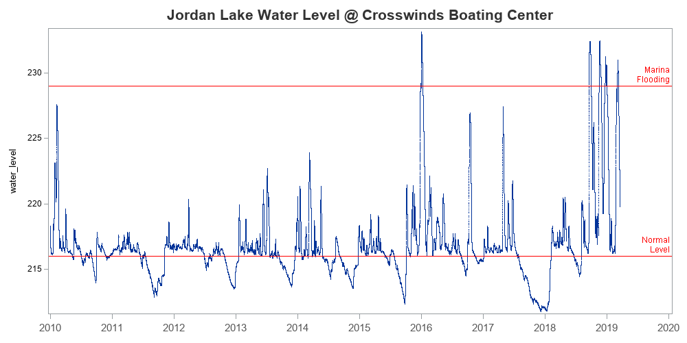
Not just wow, but Wow! ... Other than the four flood events this past winter, the marina has only been flooded one other time since 2010! It appears this year has been quite extraordinary, with an unprecedented amount of flooding.
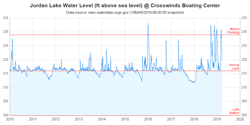
Final Plot
Now that we've got the basic graph knocked out, let's add a few finishing-touches.
- I happen to know that the water level under the docks is approximately 200-ft, therefore I think it makes sense to use that as the starting point for the y-axis in the graph - this way you get a visual impression of how deep (or shallow) the water is at the marina.
- Also, people not familiar with lake level readings might not know that it is "feet above sea level" (they might think the value is the water depth), therefore I added text to the title to make that more obvious.
- I added dotted grid lines, and y-axis values along the right-hand side of the plot.
- I added a second title with the data source and timestamp.
- And as a final finishing-touch, I shaded the area under the line (using a band statement). I think it's neat to make the area under the line look like water, since it represents water.
How does this compare to flooding in your area? If you're a SAS programmer, and you'd like to try plotting the data for one of your local lakes, here's a link to the complete SAS code I used.


3 Comments
So enjoy reading your stories Robert! I always learn something new. With the amount of rain we’ve had in the area this winter, I am not surprised with your findings.
I love the way your data story built a little suspicion and drove us to asking questions that you answered with the visuals.
It appears you have figured out the "trick" I use, to keep my blogs interesting! 😉
Glad you liked it! 🙂
I just moved to the area late Jan so this is good info for me, I live close enough that the flooding alters my commute in the mornings.