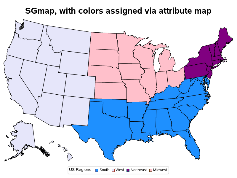
In a previous blog post, I showed how to layer colored areas on a SAS map to show both countries, and the areas within countries that had cases of Ebola. But as the Ebola epidemic has spread, more data has become available, and in this blog I show how to
Author
I always recommend looking at data in several different ways, to get a more complete picture of what's really going on - such is the case with the member 'ratings' on dating websites. Let's take a look at some data from a different angle... In a recent blog post, I
With Amazon Prime's 2-day shipping, I seldom go to physical stores any more. How do they deliver items so quickly? Let's analyze some data to find out... There are very few services/memberships that I truly feel like I'm getting "a good deal" for my money - and Amazon Prime is
What age women do men prefer on dating websites? - Let's have a look at the data... When I first started using computers in the early 80s, I thought it would be great to have everyone take a survey, and then let computers show you who your best matches were.
Is the type of car you drive more likely, or less likely, to get a speeding ticket? Let's analyze some data to find out! Do red cars attract more attention from the police, and get more tickets? How about cars with a 'racing stripe'? Or cars with a big chromed motor,
Have you heard the old saying that "Banks only loan money to people who don't need it"? Let's analyze the data and see if that is true!... I'm very much a car-guy, and I love learning about all the new vehicles, and love the new-car feel ... and even the smell. It's hard to not like a
If you're a SAS user, chances are you're a bit of a science/technology/engineering/math nerd -- and also a fan of The Big Bang Theory. Therefore this SAS analysis on The Big Bang Theory should be right up your alley! Yesterday (September 22) was the start of the 8th season for the TV series,
Admit it - you were fascinated by the 3D pipes screensaver! How many CPU cycles did we let our machines burn up, drawing and re-drawing those silly pipes!?! What was your personal favorite CPU-hungry screensaver? (let us know in a comment!) Well, speaking of pipes, the proposed Atlantic Coast Pipeline
It's easy to plot events that happened at a certain time, but what about events that extended over a range of dates, such as recessions? ... This blog post teaches you a nice trick to use for that! Let's say you have a plot of the labor force participation rate
If you're a really big company, with many locations around the country, how do you keep track of all that? ... With a great map, of course! I recently read a CNN article about the Community Health Systems network being hacked - exposing the names, Social Security numbers, physical addresses, birthdays
Find out which state you'll live in, if the US state borders are redrawn so we have 50 states with equal population! (Don't worry! - This is just a fun/hypothetical "what if" blog!) To get you in the mood for this topic, here's a picture of one of the many
With Discovery Channel's Shark Week starting on August 10, I decided to sink my teeth into some shark-attack data - I even found there were some shark attacks in the Midwestern US! Read on to learn the details... To get you into the shark mindset, here is a photo of an
In this blog post, I put some classic rock song data under the SAS Analytics microscope, to see if I could get a better picture of exactly what is considered 'classic rock' these days... Michael Raithel recently pointed me to an interesting article/study about 'classic rock' music, and invited (or is
The sun has gone eerily quiet, in the middle of what should be the height of the 11-year sunspot cycle... Here's a superb photo of some sunspots that Stephen A. Carr posted to the Telescope Addicts Facebook group - a group which I follow with great interest. (Thanks for allowing
SAS is great at helping make important business decisions - how about helping decide where to take your next vacation?... Here's a picture from one of my favorite vacations with my buddy Joe. As you can see, I like "nature vacations." Can you guess where this one was? (leave a comment with
I bet a lot of SAS users know where the phrase "Live Long and Prosper" comes from ... but can we use SAS software to also help analyze 'how long'? This blog posting shows several different kinds of SAS graphs that can help answer such a question! Let's start with
SAS software can be used for many things - here's how you could use it to help save endangered sea turtles! You've seen SAS used to track endangered wildlife by the shape of their footprints, and help run Texas Parks & Wildlife. Now, how about tracking the movements of (and thereby helping
This blog post describes a neat example of some cool SAS capabilities, and also teaches you a little more about the state where SAS software is made... Here at the SAS headquarters in Cary, NC, the main TV news channel is WRAL TV5. And my favorite segment during the news is Scott
In light of the recent reports that glaciers in Antarctica are melting, what SAS graphs might be useful in analyzing the data?... When floating sea ice melts (such as at the North Pole), it doesn't raise the sea level - but when ice on land melts (such as glaciers at
All my friends seem to be having twins these days (below is a picture of my friend Holly's twins, for example) - I wondered if I could use SAS to analyze this twinning trend ... When I was growing up, way back in the day, twins seemed to be rarity.
With tornadoes in the news lately, I wondered how I might could use SAS to analyze tornado data. How about animating 60 years of tornado path data? ... I was using Google to search for ways to analyze tornado data, and found an example on ustornadoes.com that animates the tornado
Last night, here in the U.S., an outbreak of deadly tornadoes tore across several states. Unfortunately, nobody knows how to predict a tornado with certainty, but let's brainstorm on how SAS Software can help analyze the data in the aftermath of a natural disaster like this... Being a graph guy, the first
As I was doing my taxes, I wondered where the government is spending my tax dollars. And being a SAS user, I decided to find out using a graph ... I did a few Google searches on "tax graphs" and found one on the CNN web site that I liked - it
With all the recent news reports about the missing Flight 370, I wondered what other airplanes have disappeared without a trace ... and I used SAS to visualize that data! There was in interesting infographic on the Bloomberg website that sort of answered my question, but their map just had
Did you know that this Friday is Pi Day? How are you planning to commemorate this special day? :) Next year's Pi Day might even be more special than usual, being that it will contain: March 14, 2015 - 9:26:53. And if you realize the coolness of that (3.141592653), you might be
In the Breaking Bad TV series, Walter White has an impressive lab where he secretly makes the illegal drug methamphetamine (meth). Wouldn't it be cool to use SAS to show the locations of all the clandestine meth labs in the US?!? Let's do it!... In this blog, I show you
Michele Ensor recently posted a wonderful blog with a graph of the 2014 Winter Olympics medal count. I'm going to further refine that graph, making it an Olympic graph ... on steroids! :) Here is Michele's graph: First, let's give it a few simple cosmetic changes. I always like to have
Teacher pay, and the possibility of a raise, has been a hot topic in North Carolina lately. So I decided to look around and see if I could find any good data related to teacher salary, and then try to determine the best way to present that data graphically. I found that
We get very little snow in Wake County, NC (SAS Headquarters) - therefore when we do have snow, it's a big deal and they close the schools. Which made me wonder ... how much snow does it take to close schools in the rest of the US? Last week we got our
In a previous post, I showed you how to send graphs with charttips & drilldowns in an email ... but what if you also need to send the graphs that you're drilling-down to? You guessed it - SAS also has a slick trick for doing that! When you create SAS graphs