Admit it - you were fascinated by the 3D pipes screensaver! How many CPU cycles did we let our machines burn up, drawing and re-drawing those silly pipes!?! What was your personal favorite CPU-hungry screensaver? (let us know in a comment!)
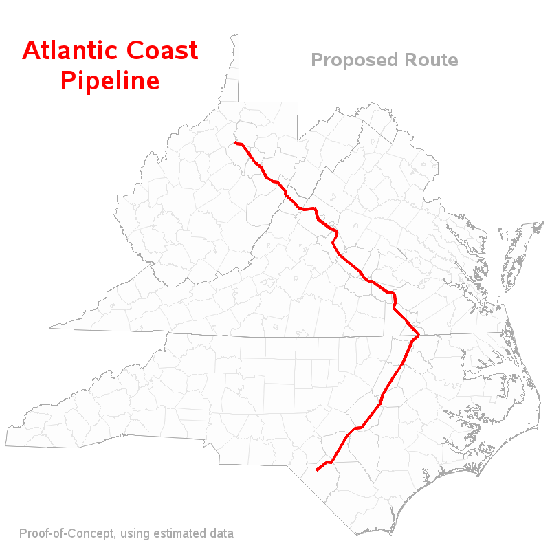
Well, speaking of pipes, the proposed Atlantic Coast Pipeline (for natural gas) has been a big item in the news here in North Carolina lately. It would start in West Virginia, go through Virginia, and end at the southern side of North Carolina near Lumberton.
There's been a lot of interest lately from SAS users wanting to perform analytics on utility, road, railroad, and other similar data, and then visualize the data on a map. This pipeline seemed like a great opportunity to create a proof-of-concept example and show some of the things SAS can do with this kind of data!
So I went to Dominion's website and looked at their official maps, and estimated the latitude/longitude coordinates along the proposed route. I then used Proc Gmap to create a map of the 3 states of interest, and annotated the proposed route as a line on the map:
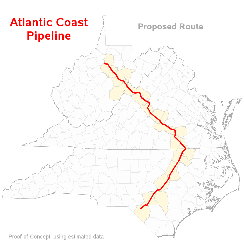
Next, I used Proc Ginside to determine which counties the lat/long points along the proposed route went through, and shaded those counties a different color on the map:
I then took a list of all the cities in these three states with population of 18,000 or more, and used Proc SQL to create a dataset with pairings of every city to every point along the pipeline. I then used the geodist() function to calculate the distance between each city and each point along the pipeline, and then selected just the pairing with the minimum distance (ie, the minimum distance from the city to the pipeline). I then annotated a marker and label for each city within 30 miles of the pipeline.
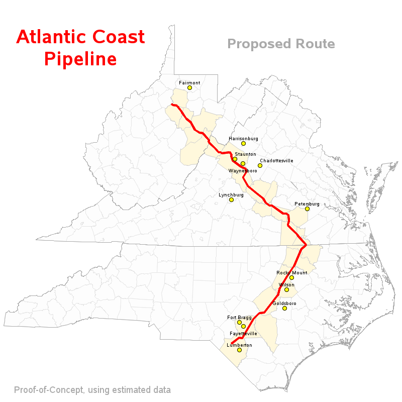
And, if you click the map above, you can see the interactive version, with html hover-text for the counties and cities along the proposed route.
Now that you know what's possible in SAS, do you have any data you'd like to plot using this technique? Feel free to leave some comments with your ideas! And here's the sas code if you'd like to experiment with it!
