All Posts

Graduate and undergraduate students are eligible to apply for the SAS Student Ambassador Program, which covers the cost of travel expenses and registration fees paid to attend SAS Global Forum 2010. What’s the “catch?” You must complete an application and submit a presentation abstract and working draft by midnight October
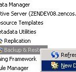

A user who is a member of the "SAS Administrators" group and has been granted the role "Management Console: Advanced" can create a Metadata Backup job via SAS 9.2 Management Console. Right Click on 'Backup and Restore' Task under 'Metadata Utilities'. Then select the Backup task created and choose either
The SAS 9.2 XML engine is very very very slick. I created an xml map to generate a dataset from xml generated during a metadata getobjects job to then run call execute statements for a proc metalib update. "Wait, you did what??!@#?&" you ask? Here are my simple steps. This


Most modern programmer text editors allow you to see multiple views of the document you're working on. The SAS program editor within SAS Enterprise Guide is no exception, although we've done a pretty good job of hiding this feature. Read on and learn how to easily "divide and conquer" your

Have you ever submitted a SAS program or query only to immediately regret it? It usually happens just as you finish clicking the mouse or lift your finger from the F8 key: you realize that your program has a horrible flaw that's going to make it run for hours or

In a previous posting I showed an example of how you can use the GKPI procedure in SAS 9.2 to create dashboard-quality charts. Here's a more formal sample that you can use, including a custom task that you can use in SAS Enterprise Guide 4.2 to point-and-click your way the

Geoff posted a nice article on his blog about how you can read and write Microsoft Excel spreadsheets programmatically from within SAS, without using DDE. I've previously written about how it's difficult to continue using DDE from SAS when you have a distributed environment (SAS on a server machine, Excel
You might be the sort of person who loves to wait indefinitely. You visit the DMV regularly to tweak your auto registration. You queue up in the supermarket checkout line behind the customer most likely to require "price checks". You map your daily commute along the routes that offer the
Recoding values is one of the most common data prep tasks that folks need to do before they can analyze and report on data. In SAS, the most elegant way to handle this is by applying a SAS format. A SAS format allows you to "bucket" a bunch of raw

Elisa Priest, a doctoral student in epidemiology at the University of North Texas, was selected as one of nine SAS Student Ambassadors for 2009. She also won the "Best Contributed Paper" in the Statistics Section. Her presentation, Easier Exploratory Analysis for Epidemiology: A Grad Student How-To Paper, was very well

That's a wrap! Alan Hoffler provides a takes a last look back at SAS Global Forum 2009. We hope to see you next year at SAS Global Forum 2010 in Seattle. Find out more at http://www.sas.com/sasglobalforum/2010. Web Links: SAS.com:http://www.sas.com/apps/webnet/SGF2009VideoBlog/index.html?videoID=isgf09ep33
SAS Senior Software Manager and co-author of SAS for Dummies Chris Hemedinger talks about his experiences at SAS Global Forum 2009. Web Links: SAS.com:http://www.sas.com/apps/webnet/SGF2009VideoBlog/index.html?videoID=isgf09ep32
SAS Research Statistician Rick Wicklin talks about the new SAS interface with R in SAS/IML Studio. Web Links: SAS.com:http://www.sas.com/apps/webnet/SGF2009VideoBlog/index.html?videoID=isgf09ep31
SAS Software Developer Zach Marshall talks about the exciting new features in SAS 9.2 in Base SAS to call Web Services. Web Links: SAS.com:http://www.sas.com/apps/webnet/SGF2009VideoBlog/index.html?videoID=isgf09ep30
Frank Capobianco talks about why Teradata is at SAS Global Forum 2009 and the excitement surrounding in-database processing. Web Links: SAS.com:http://www.sas.com/apps/webnet/SGF2009VideoBlog/index.html?videoID=isgf09ep29