All Posts


Some handy folks at SAS got together and created a series of videos to help you get started with the SAS 9.4 installation. It starts with the basics that explain what you should do with your Software Order Email. Step two provides videos for creating or moving the software depot.

I am passionate about teaching. My colleagues would probably say this is the understatement of the year. And it likely has something to do with the fact that both of my parents were teachers. I started my teaching career at the university level and after many years an unexpected opportunity


SASuser power! Does this phrase conjure up any images for you? I visualize SAS users across the globe, addressing messy data, combating fraud, and making use of business analytics to provide insight and add business value for organizations around the world. We, SASusers are powerful! With the Potential of One
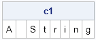

Sometimes it is useful in the SAS/IML language to convert a character string into a vector of one-character values. For example, you might want to count the frequency distribution of characters, which is easy when each character is an element of a vector. The question of how to convert a

This week's SAS tip is from Kevin D. Smith and his new book PROC TEMPLATE Made Easy: A Guide for SAS Users. Kevin is a software developer at SAS with extensive experience supporting PROC TEMPLATE and underlying ODS technologies. We're excited that Kevin decided to write his book and hope


Fall is rolling around, which means time to plan and attend at least SAS regional conferences. I’m heading to the Southeastern SAS User’s Group (SESUG) conference in beautiful St. Petersburg, Florida. While I do love the conference, they had me at St. Pete Beach!
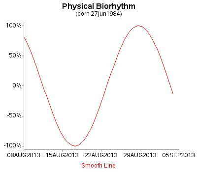

Do you know (right off the top of your head) the simple SAS/GRAPH code you would use to create line graphs? ... If not, then this tutorial is for you! A line plot is basically a scatter plot where the markers are connected. A line plot should only be used

With the popularity of SAS Grid Manager, this question often comes up: which clustered or shared file system should we use with the multiple nodes of the SAS Grid? This is a question that needs to be thought through very carefully because the amount of time and effort to fix


Ways We Excrete Toxins You learned in the previous Chews Strategically post, Foods for Natural Detox, that certain foods provide important nutrients that assist the liver in transforming toxins so they can be excreted from the body. After the toxins are transformed into water soluble substances they are excreted through
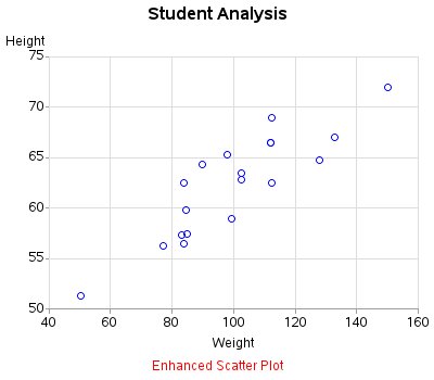
Scatter plots are probably the simplest kind of graph, and provide a great way to visually look for relationships between two variables. But, do you know (right off the top of your head) the simple SAS/GRAPH code you would use to create them? ... This tutorial leads you step-by-step through the

With registration for the Midwest SAS Users Group well underway, I reached out to conference chair George Hurley to get the scoop on what makes MWSUG a can’t-miss event for SAS users. As a veteran MWSUG attendee, he’s an absolute expert in what makes it such a rewarding opportunity for
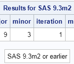
Recently I wrote about how to determine the age of your SAS release. Experienced SAS programmers know that you can programatically determine information about your SAS release by using certain automatic macro variables that SAS provides: SYSVER: contains the major and minor version of the SAS release SYSVLONG: contains the

Recently my boss came across a graph where a time series plot was modified to include a "thickness" response. We wondered if this would be a good addition to the GTL / SG Series plot statement. What would the result look like, and what are the pros and cons? So, I took up
Over the past few releases, SAS has offered high availability for servers through various failover techniques. So I’ve been wondering how metadata clustering differs and why does SAS 9.4 provide it. The “why” is an easy question to answer. Today’s SAS software is used in a wide array of business-critical applications
SAS 9.4 was released a month ago, and we are excited about all the new features in SG Procedures, GTL and Designer. I wrote an article on SAS 9.4 graph features last month, and promised more to come. What then could be better than this Tech Talk video hosted by our