All Posts


Do you have an Uncle Louie? Yep - we all do! You know what I mean - this guy: When my wife and I were planning to get married, we had all sorts of big decisions to make. Where would our future home be? How many kids would we have?
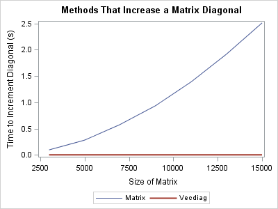

I was recently asked about how to use the SAS/IML language to efficiently add a constant to every element of a matrix diagonal. Mathematically, the task is to form the matrix sum A + kI, where A is an n x n matrix, k is a scalar value, and I is the


It's time for a fall fraud roundup. Bad deeds swirl around like so many dry leaves, and I'd like to highlight a few of them this week. It can happen anywhere, even in sports, and no, I'm not picking on those shoplifting Dallas Cowboys here. An MLS referee was suspended for workers' compensation
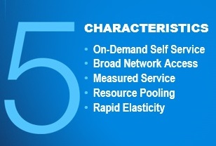

If someone asks you whether SAS runs in the cloud, there are exactly two wrong answers: "yes" and "no". Instead, this question should spark a discussion. It should be a discussion about which of the five characteristics of cloud computing they are interested in. The answers will point you in


Have you ever wondered why sometimes a SGPLOT or GTL graph has markers drawn beyond the extreme tick and value on an axis and sometimes not? And, if you prefer your graphs to always have tick values on the axis that cover the whole range of data, how can you


Data has value IF you can analyze it, said participants at a big data analytics roundtable at the Premier Business Leadership Series in Las Vegas. In attendance were executives from some of the largest Communications companies in the world including from the US, Canada, Turkey, Japan, Australia and the Philippines as well


For those of you who have followed my SAS Administration blogs, you will know that setting up your IO subsystem (the entire infrastructure from the network/fibre channels in your physical server, across your connections, to the fibre adapters into the storage array, and finally to the physical disk drives in


Meet Pam Cole, Senior Manager of the Recreation and Fitness Center and this week's contributor to the Inspirations blog. Pam has been at SAS Institute for over 20 years and has worked in fitness for over 25 years. An avid Tarheel fan, Pam graduated from UNC-Chapel Hill with a double major in


In sports these days, there's a lot more data to keep track of than just the score! How can you make sense of it all? Being the Graph Guy, of course I recommend graphing it! Here's an example that's up close and personal for me - dragon boat racing... Below


The INFORMS 2014 Annual Meeting will be held In San Francisco from November 9-12; conference hotels are the Hilton San Francisco and the Parc 55 Wyndham. More than 35 SAS staff will participate, and SAS will have three adjacent booths representing SAS/OR (and all of Advanced Analytics), JMP, and the SAS

With big data, data governance challenges escalate in many ways: The diversity of data sources means that there are minimal standards for data structure, definition, semantics and content. The lack of control over data production means that you can’t enforce data quality at the source as you can do with


This post will violate the “what happens in Vegas stays in Vegas” rule, because last week I had the pleasure of attending and participating in the Analytics 2014 event there and want to share some of what I heard for those who couldn’t attend. I was joined by over 1,000

It has been three months since the introduction of the SAS/IML File Exchange, so I thought I'd give a short update on recent submissions and activity. (Note: The File Exchange was merged into the SAS Community Library in 2022.) Users have submitted eight new articles. The application areas include experimental
One of the key benefits of using a horizontal bar chart is the ability to display statistics for each bar. This is a popular feature for the HBAR statement with the SAS/GRAPH GCHART procedure. So, let us review the options available to us to create such graphs using SGPLOT. The

Marketers are walking a tightrope today with data privacy issues: Data can simultaneously bring customers and brands together and further drive them apart. Recent data breaches, potential changes in data-privacy legislation and regulations loom large as customer expectations concerning marketing data continue to rise. As a result, today’s complex data