All Posts


The financial sector has always been subjected to regulatory compliance laws and directives. Consumers, lawmakers and politicians would expect no less. But it's fair to say that the financial sector has witnessed a "hockey stick" trend regarding new regulations in recent years.
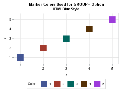

Suppose you create a scatter plot in SAS with PROC SGPLOT. What color does PROC SGPLOT use for the markers? If you specify the GROUP= option so that markers are colored by a grouping variable, what colors are used to represent the various groups? The following scatter plot shows the

Back in 2013, I wrote a paper for the SAS Global Forum, reviewing the attributes that go towards making a good graph. In this paper, I covered many recommendations from industry thought leaders that can help enhance the effectiveness of graphs to deliver the intended information. One of the aspects that


Last night I dropped a check into my son’s school’s American Heart Association Fund Raiser and this morning we kicked off #NationalWearRedDay at the RFC with our annual Wear RED for Heart Health Breakfast Run. What’s the deal with all heart health awareness this month? Heart Disease Not only is it


El próximo domingo, si los pronósticos de los expertos se cumplen, disfrutaremos de un juego espectacular: un duelo sin cuartel, entre Halcones de Atlanta y Patriotas de Nueva Inglaterra, para conseguir el mítico trofeo Vince Lombardi. En la National Football League (NFL), los equipos –y sus estructuras de negocio– ya
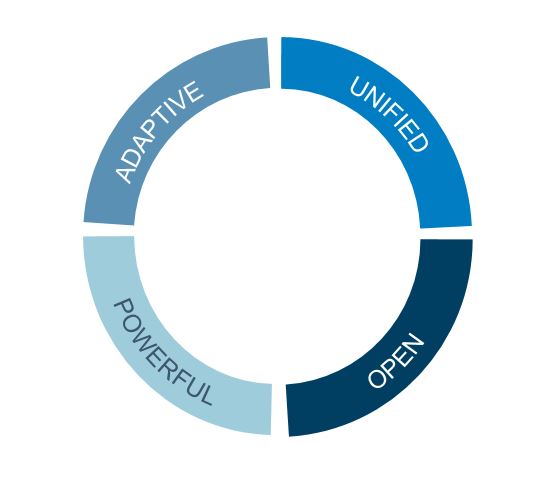

Having addressed the adaptability and power of an analytics environment in my last two posts, I thought I'd close out this mini-series of blogs by providing the business and technology implications of three attributes that need to define any truly open and unified analytics environment: Cohesion Business: The platform enables


I will begin with a short story. Like many employers, McDougall Scientific, my employer, requires its employees to review, with their co-workers and managers, what they learned at a conference or course. They are also asked to suggest applications of their learnings so that McDougall might realize value from the


It was just a few years ago that the idea of an Internet of Things (IoT) seemed far off, something out of a science-fiction movie. After all, why would a vehicle need to talk to the road? Why would our utility meters need to talk to the central office? The


Strengthens arms, shoulders, back, core and quadriceps Four-Limbed Staff Pose (Sanskrit: Chaturanga Dandasana) Start on hands and knees and then move into Plank. Wrists are under shoulders and you’re engaging quadriceps and pressing through heels as if you’re stepping on the floor. Core is engaged and drawing in towards spine.


.@philsimon says that, once again, there's quite a bit to learn from Amazon.


Definir las prioridades de negocio y gestionarlas con analítica conduce a un camino exitoso. Ante la transformación digital que viven las organizaciones de las diversas industrias del mercado, el CIO se convierte en ese agente de cambio que habilita el camino hacia la innovación y éxito de la organización. Cuestionarse


Looking for ways to add some variability to your routine? Try these row options. You can choose one or all as you focus on your back while keeping your core engaged. The row incorporates almost every muscle involved in moving your shoulder and your elbow. It also relies on muscles of
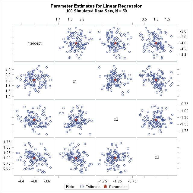
In a previous article, I showed how to simulate data for a linear regression model with an arbitrary number of continuous explanatory variables. To keep the discussion simple, I simulated a single sample with N observations and p variables. However, to use Monte Carlo methods to approximate the sampling distribution


SAS® Federation Server provides a central, virtual environment for administering and securing access to your data. It also allows you to combine data from multiple sources without moving or copying the data. SAS Federation Server Manager, a web-based application, is used to administer SAS Federation Server(s). Data privacy is a

A diario, las empresas compiten aguerridamente entre sí para atraer nuevos clientes, conservar los que ya tienen y asegurar su lealtad por mucho tiempo. Sin embargo, no es una tarea fácil, especialmente cuando los consumidores están más conectados e informados que nunca y su entorno es cada vez más competitivo.