Search Results: symbol= (103)

Data Visualization
Sanjay Matange 4
Simpler is better

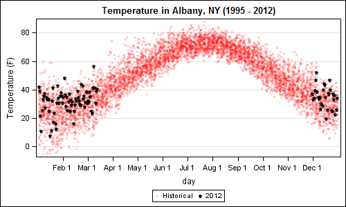
A recent article in the SAS and R blog was about current winter temperatures in Albany, NY.  The temperature data for the recent winter (Dec 2011 - Mar 2012) was plotted on a polar graph. Robert Allison posted an article on displaying the same data as a Polar Graph using SAS/GRAPH .  Here is his

Data Visualization
Sanjay Matange 6
Bar-Line graph

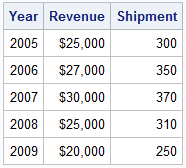
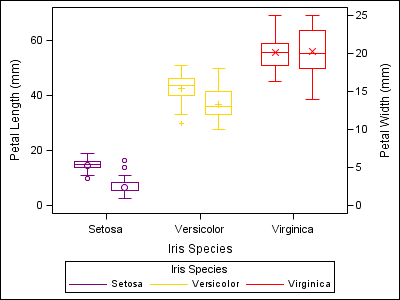
A user recently posted a question in the SAS communities forum about  how to best display two measures by one classifier using a Bar-Line graph, where the scale of the two measures is vastly different.  This got me thinking about various different ways to represent such data.  Here are some of my thoughts,

Data Visualization
Sanjay Matange 6
Graphs with class

When the data is classified by multiple class variables, you can certainly create graphs using BY variables.  This results in separate graphs, one for each level of the BY variable crossings.  Each graph is scaled by its own data subset, and comparisons across BY levels is harder. When comparisons need to be

Data Visualization
Sanjay Matange 4
Custom confidence intervals

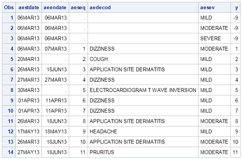
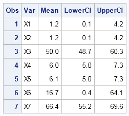
Recently a user posted a question on the SAS/GRAPH and ODS Graphics Forum about drawing a plot with custom confidence intervals .  The user has a simple data set with category, response (mean) and custom lower and upper confidence intervals.  The data looks like this: Robert Allison provided the code (proc gplot +

Data Visualization
Sanjay Matange 4
Map overlays

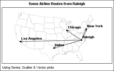
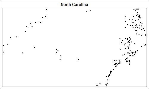
In Simple maps can go a long way, we discussed some techniques to create simple outline maps from map datasets in the MAPS library using GTL.  Now, let us take this a step further to do something more useful with this feature. For some graphs, the map information is an essential part of the

1 8 9 10 11