Search Results: seriesplot (23)

Data Visualization
Debpriya Sarkar 12
UpSet Plot using GTL

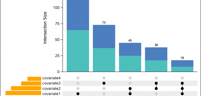
An UpSet plot is used to visualize intersections of sets. In this post, we will illustrate techniques to create this plot using the Graph Template Language (GTL). We assume that you are familiar with GTL. From the point of view of construction, we leverage the LATTICE layout available in GTL

Data Visualization
Sanjay Matange 1
Clinical Graphs: A1c Plot

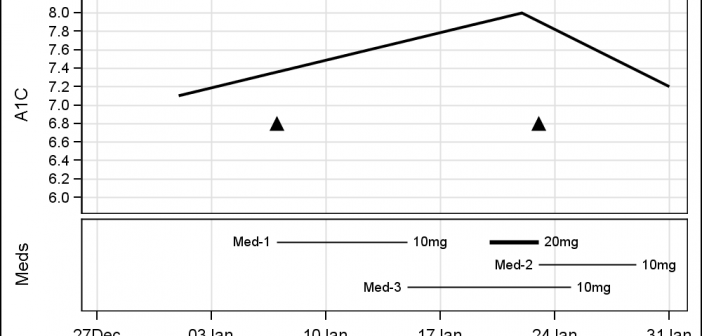
Last week I was visiting San Diego for the SANDS conference.  I always enjoy this conference as I get to interact closely with the users to hear of their pains and innovative solutions to creating Clinical Graphs. In the conference Ed Barber asked about displaying A1c data along with some

Data Visualization
Sanjay Matange 5
More on Spaghetti Plots

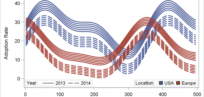
In her article Creating Spaghetti Plots Just got Easy, Lelia McConnell has provided us a glimpse into some new useful features in the SAS 9.4M2 release.  The term Spaghetti plots generally refers to cases where time series plots have to be  identified by multiple group classifications.  The support for the

Data Visualization
Sanjay Matange 7
Multi-Group Series Plots

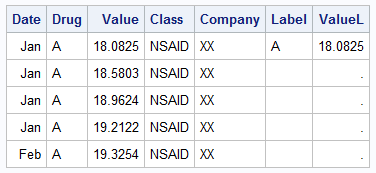
The series plot is a popular way to visualize response data over a continuous axis like date with a group variable like treatment.   Here is some data I made up of a response value by date, treatment, classification and company that makes the drug.  The data is simulated as shown in the attached program

Data Visualization
Sanjay Matange 5
The BLOCK Plot

When you hear of a Scatter Plot or a Series Plot, you have a picture in your mind what we are talking about.  But one of the plot statements available in GTL, and soon with SGPLOT, is the BLOCK plot.  I am sure this leaves many users scratching their heads, wondering

1 2 3