Search Results: graphs in column (120)

Data Visualization
Sanjay Matange 2
LFT Panels

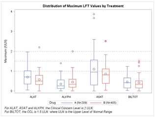
CTSPedia.org is a website of Knowledge Base for Clinical and Translational Research.  On this site you can find sample graphs for statistical analysis of safety data for Clinical Research.  Graphs included in this resource have been submitted by contributors, and include a graph for Liver Function for different tests by treatment.

Data Visualization
Sanjay Matange 4
Broken Y-Axis

Often we want to display data as a bar chart where a few observations have large values compared to the rest.  Comparison between the smaller values becomes hard as the small bars are squeezed by the tall bars.  Here is an example data, and a bar chart showing the data. The large values

Data Visualization
Sanjay Matange 2
Let them eat pie

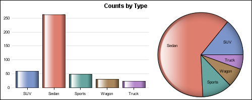
ODS Graphics system was initially motivated by the need for high quality graphs for SAS Base, STAT, and other analytical procedures.  Use of SG Procedures, ODS Graphics Designer and GTL by users too has initially focused on analytical graphs.  But just like wheels on carryon bags that started for the specific needs of flight

Data Visualization
Dan Heath 9
Roses are red, violets are blue...

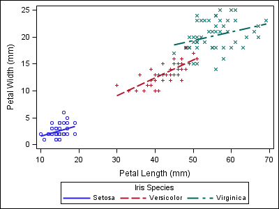
This classic start to a romantic poem assumes that the correct colors are always assigned to the correct flowers; but, for those who create graphs for reports, consistent color assignment can be more of a challenge than an assumption. This challenge is particularly true for the display of group values.

Data Visualization
Sanjay Matange 4
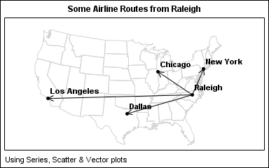
Map overlays

In Simple maps can go a long way, we discussed some techniques to create simple outline maps from map datasets in the MAPS library using GTL.  Now, let us take this a step further to do something more useful with this feature. For some graphs, the map information is an essential part of the

Data Visualization
Sanjay Matange 5
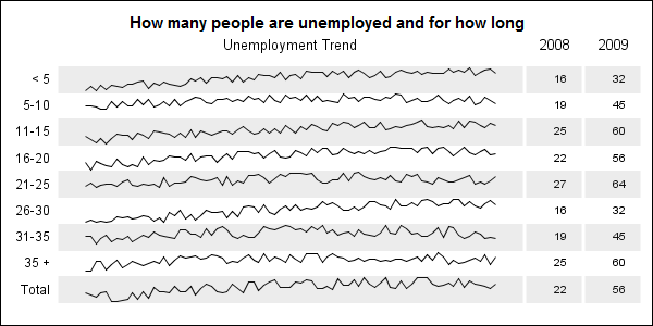
Adding a spark to your data

When viewing time series data, often we only want to see the trend in the data over time and we are not so concerned about the actual data values.  With multiple time series plots, forecasting software can find clusters to help us view series with similar trends. Recently I saw a graph showing the trend of unemployment

1 10 11 12