The SAS/GRAPH® Annotate Facility is often viewed as a mysterious programming abyss that many SAS users do not wish to dive into, in part because of some not-so-obvious pitfalls that they might experience when using it. I view annotation as a frequently misunderstood and needlessly feared but powerful tool that
Tag: sas/graph
If you haven’t tried them for your web applications and other graphics needs, you’ll want to read further! Scalable Vector Graphics (SVG) output is vector graphics output you can display with most (if not all) modern web browsers. Because SVG graphic output is scalable, you can zoom in on the
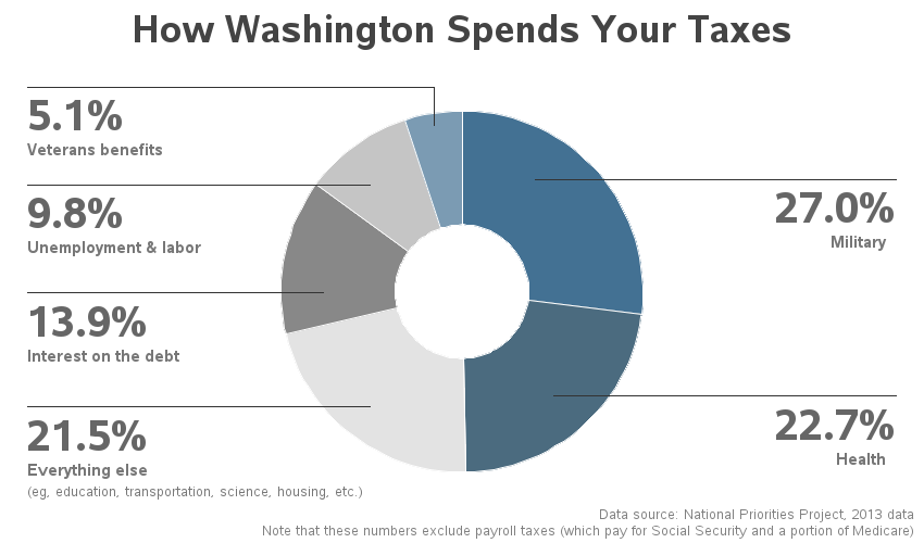
As I was doing my taxes, I wondered where the government is spending my tax dollars. And being a SAS user, I decided to find out using a graph ... I did a few Google searches on "tax graphs" and found one on the CNN web site that I liked - it
Did you know that this Friday is Pi Day? How are you planning to commemorate this special day? :) Next year's Pi Day might even be more special than usual, being that it will contain: March 14, 2015 - 9:26:53. And if you realize the coolness of that (3.141592653), you might be
Michele Ensor recently posted a wonderful blog with a graph of the 2014 Winter Olympics medal count. I'm going to further refine that graph, making it an Olympic graph ... on steroids! :) Here is Michele's graph: First, let's give it a few simple cosmetic changes. I always like to have
Teacher pay, and the possibility of a raise, has been a hot topic in North Carolina lately. So I decided to look around and see if I could find any good data related to teacher salary, and then try to determine the best way to present that data graphically. I found that
In a previous post, I showed you how to send graphs with charttips & drilldowns in an email ... but what if you also need to send the graphs that you're drilling-down to? You guessed it - SAS also has a slick trick for doing that! When you create SAS graphs
The farther you try to forecast into the future, the less certain you are -- how can you represent that graphically? One way is to draw a shaded/colored "confidence interval" around your forecast line, but this is something a lot of SAS users have trouble with. That's why I decided to create
Data on punched-cards, SAS software delivered on tape, jobs in the queue on the mainframe, printouts on green-bar paper ... we really appreciate all our SAS users, but if any of the above are part of your "SAS memories" we especially appreciate you! I guess I'm a computer geek, because
There are 2 kinds of people in the world -- those who dread change, and those who look forward to it. Which kind of person are you, when it comes to upgrading your SAS software?!? With most software (such as Windows OS, Facebook, Gmail, etc) I tend to fall into
SAS 9.4 allows you to create html5 output with your graph inline (as part of the html), providing a great way to email your SAS/Graph output! Previously, if you used ods html and dev=png to create graphs, you had to deal with two files -- a png file (containing the graph)
This graph certainly makes it clear! I can see right through your lies! Clearly, you know what you're talking about! We need more transparency in our organization! What was that all about, you might ask?!? ... I was just getting all the obvious puns out of the way, so I
"It slices, it dices ... it helps test laboratory mices!" In a joking way, this is a perfect description of SAS software, don't you think!?! :) And to prove it, this blog contains a collection of 32 examples, showing a variety of ways SAS can be used to graph data
"It's a floor wax, and a dessert topping" - this pretty much describes SAS/Graph! (bonus points if you know where this quote came from!) Some people think of SAS as just a quality control tool. Others think of it as just a sales & marketing tool. And yet others think
Your biggest problem with maps used to be learning how to fold a paper road map. Today, with the advent of GPS, Google Maps, and location-specific data, the bar has been raised! ... you now need to know how to plot your data on a map! Below are several examples of different kinds
There's an old expression "easy as pie." Have you ever tried to bake a pie??? ... It's not so easy, LOL! And neither is using pie charts correctly! :) Below are several examples of different kinds of pie charts you can create with SAS/GRAPH. And at the bottom of this
Do you know how to create a bar chart using SAS, and when to use what kind of bar chart?!? If the answer doesn't come to you "easy as pie" then this blog is for you! Below are several examples of different kinds of bar charts you can create with SAS/GRAPH.
Do you know (right off the top of your head) the simple SAS/GRAPH code you would use to create line graphs? ... If not, then this tutorial is for you! A line plot is basically a scatter plot where the markers are connected. A line plot should only be used
Scatter plots are probably the simplest kind of graph, and provide a great way to visually look for relationships between two variables. But, do you know (right off the top of your head) the simple SAS/GRAPH code you would use to create them? ... This tutorial leads you step-by-step through the
ODS graph styles provide users with an easy way to control things such as the colors and fonts used in a graph, freeing the user from having to specify these properties in their code. A lot of thought was given to picking colors that work well together, and look good. The
The 2013 SAS Global Forum is around the corner in San Francisco and the anticipation is building. Early indications are that attendee registration is up from last year, and we are looking forward to a great conference starting Sunday, April 28. It is great to see the large and diverse offering
I haven't seen an official definition of 'infographic' that I really like ... but in my mind it's something 1/2 way between data visualization & artwork. It borrows elements from graphs & dashboards, and combines that with an artistic poster. If you perform a Google image search on infographic you'll see
A big part of "winning" these days (be it sports or a business) is performing analytics better than your competition. This is demonstrated in awe-inspiring fashion in the book (and movie) "Moneyball." And on that topic, I'd like to show you a few ways SAS can be used to analyze sports data
SAS macro variables are a great way to store a calculated value, so you can use it later in your code. They are not just limited to the data step -- you can also use macro variables in title statements, axis statements, etc. By default, the macro variable will be padded with
Have you heard the expression "Talk Turkey"? Well then, what better (tongue-in-cheek) thing to do around the Thanksgiving holiday, than talk some turkey using SAS Graphs! ;) I don't usually decorate my graphs with images and pictures (they typically make the graph more difficult to read), but when it comes
I have to say that I've never heard of the Bubble option, so I looked it up on support.sas.com (my go-to place for searches on customer problems or to simply to learn something about SAS). The search led me to documentation for the statement options in SAS ODS Graphics. So, I assume the
By now, most of you probably already know how to add drill downs and hover text to your SAS graphs. But did you know you can add pop-up images and graphs? Here are a couple of examples ... In this first example, when you hover your mouse over each state, you
Do you use SAS for analytics and Microsoft Excel for graphs? Why not use SAS for your graphs too?!? Then you could completely automate the entire process in one SAS program, with no manual steps! A lot of people use Excel to create their graphs because "it's what they know." What if somebody
I believe I would have interviewed AnnMaria De Mars even if you hadn't sent me scads of e-mails and tweets suggesting her as a perfect candidate for the SAS Rock Stars series. I "met" AnnMaria when I started looking for SAS users on Twitter – nearly three years ago while