If you asked me to sum up my experience as an intern at SAS® this summer in one word, it would probably be this:
“Growth.”
During my time at SAS, I was exposed to a myriad of challenges and experiences that helped facilitate my professional and technical development, from networking with current SAS employees to learning how to use new tools and technologies in my work. As an aspiring data scientist looking to gain tangible industry experience, I was tasked with a unique opportunity: integrating SAS Viya® and open-source code (Python) into a Machine Learning project to combine their strengths within the context of predictive modeling, and to show off the variety of ways this integration can be accomplished.
Data Selection
My first challenge was selecting an impactful and relatable dataset. After sifting through a plethora of datasets, I settled on data from the LEAP study, publicly available through the Immune Tolerance Network. This study explores the impact of exposure therapy on peanut allergy outcomes. As a Biostatistics student, I was comfortable working with medical data, and as a Peanut allergy sufferer, it hit close to home. The data also contained a diverse variety of variables, ranging from demographic data to immunoglobulin levels, which would make for an interesting story to tell with the data—after all, what drew me to Data Science in the first place is using data to coax out undiscovered narratives. But most importantly, the data was unwieldy and messy—what better opportunity to develop good data cleaning skills?
Data Cleaning
According to an online course I completed at the start of my internship, around half of a Data Science project is spent on data cleaning and preparation.
When I first heard this, it seemed like a vast overestimate. However, once I dug into my project, I began to realize that my doubt was misplaced. The data I chose required significant tidying up before I could use it to generate predictions.
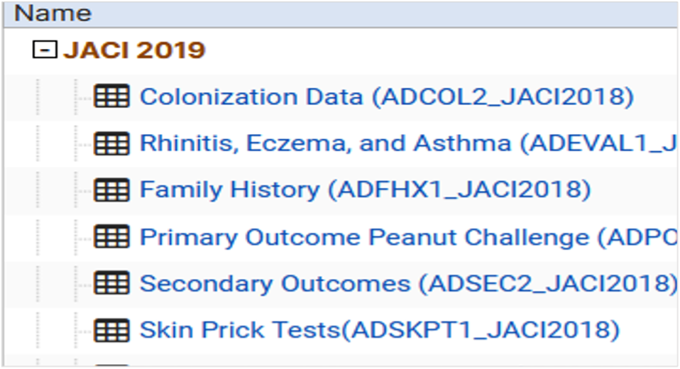
The data itself was separated into 47 different datasets, all containing different variables I wanted to analyze, making it necessary to join these datasets and extract only the columns I needed. I also needed to educate myself on best practices for dealing with missing values in the data, including various imputation techniques, without introducing bias.
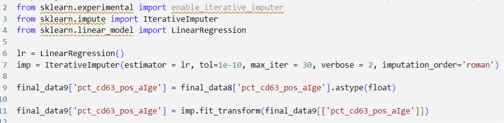
I decided to use Python for data cleaning due to my prior programming experience, and my goal to integrate Python with SAS Model Studio. It would provide a way for me to transition from a familiar programming language to the new-to-me SAS technology I hoped to use.
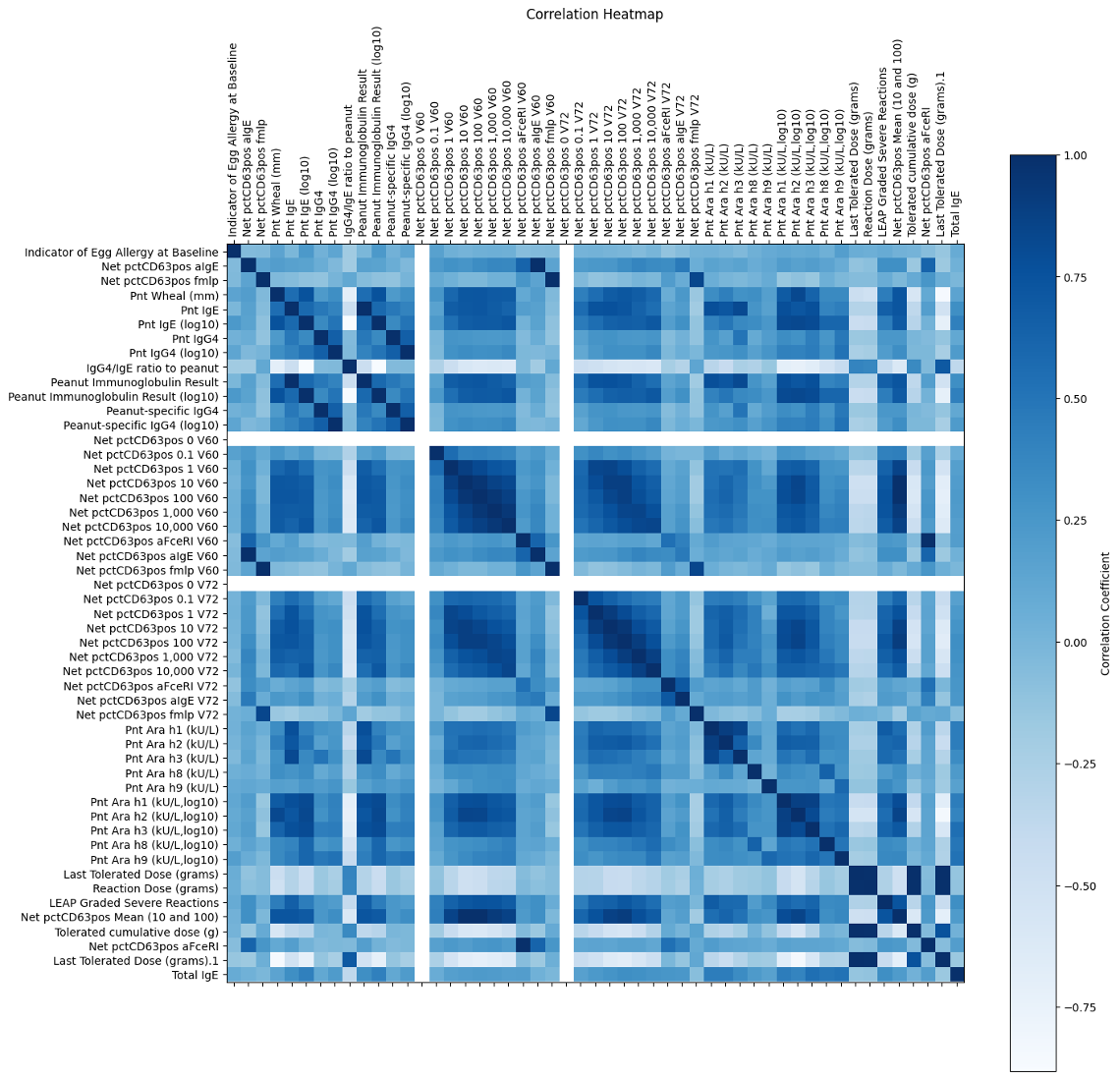
The data were high-dimensional, so I split them up into two datasets: demographic data and data with predictors identified from previous publications. The first focused on demographic information such as sex and race that I would use to examine the generalizability of my results. The second contained predictors that I selected based on a literature review of various medical and machine learning publications related to peanut allergy prediction. After that, I was finally ready to visualize.
Data Visualization
I utilized SAS Visual Analytics to quickly and easily create visualizations for my demographic dataset. Upon inspecting graphs and charts, I discovered that the participants of the LEAP study were primarily Caucasian and Male, which would limit the generalizability of my models to a diverse population. This also provides an opening for future work within the realm of allergies/immunology to compensate for the racial and gender disparities present in the LEAP study (and many others).
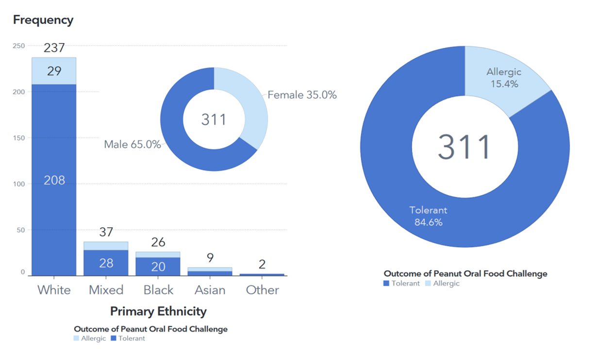
My visualizations also revealed that only 15.4% of the participants in my analysis were allergic to peanuts. This highly imbalanced data would pose a significant challenge in my later model building, so I had to educate myself on techniques to address it.
Modeling
Prior to my internship, I hadn’t heard of SAS Model Studio. When my mentor, Dr. Christa Cody, first pulled up a SAS Model Studio pipeline on her laptop and told me I’d be making one of my own, I was bewildered. I had no idea what all the boxes and lines meant; my Machine Learning experience lied primarily in object-oriented programming languages where everything is coded sequentially.
However, Model Studio was surprisingly intuitive to use, and its point-and-click interface allowed me to experiment with various parameter tunings and validation methods without spending lots of time figuring out how to translate them into code. Also, with the push of a button, Model Studio performs autotuning and automatically uses whichever hyperparameters produce the best model outcome. In Python, I had to accomplish something similar by writing an entire for-loop!
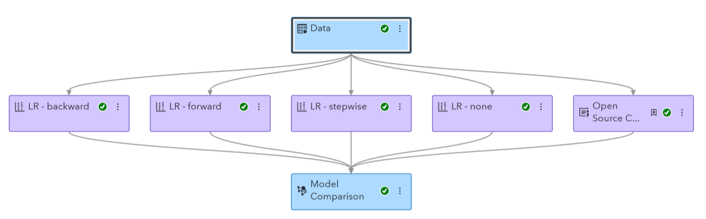
I ended up running a Logistic Regression and Decision Tree. I chose these models for their interpretability, which is important for medical data. I ran these models in both SAS Model Studio and Python to compare the results. In the end, SAS Model Studio created a better decision tree, and Python created a better Logistic regression. These disparities are likely because Model Studio does not support oversampling rare outcomes like Python does, so I had to use k-fold cross validation instead. The two also likely have different default values for certain parameters, further contributing to differences.
Connecting Python and SAS
Up to this point, I had combined the power of Python and SAS Viya to work on my project, but the only entity uniting them was the data. I decided to take things one step further and allow the technologies themselves to interact.
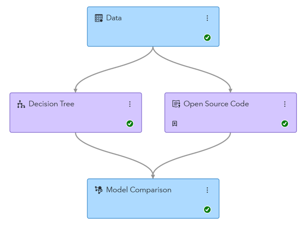
I accomplished this in two ways. First, I utilized an “Open Source Code” node in SAS Model Studio to add my Python code to the pipeline, which previously contained only models generated by SAS software. This allowed me to utilize the “Model Comparison” node to assess the relative performance of both the Model Studio and Python models, having statistics such as accuracy, area under the ROC, and F1 statistic all in one place.
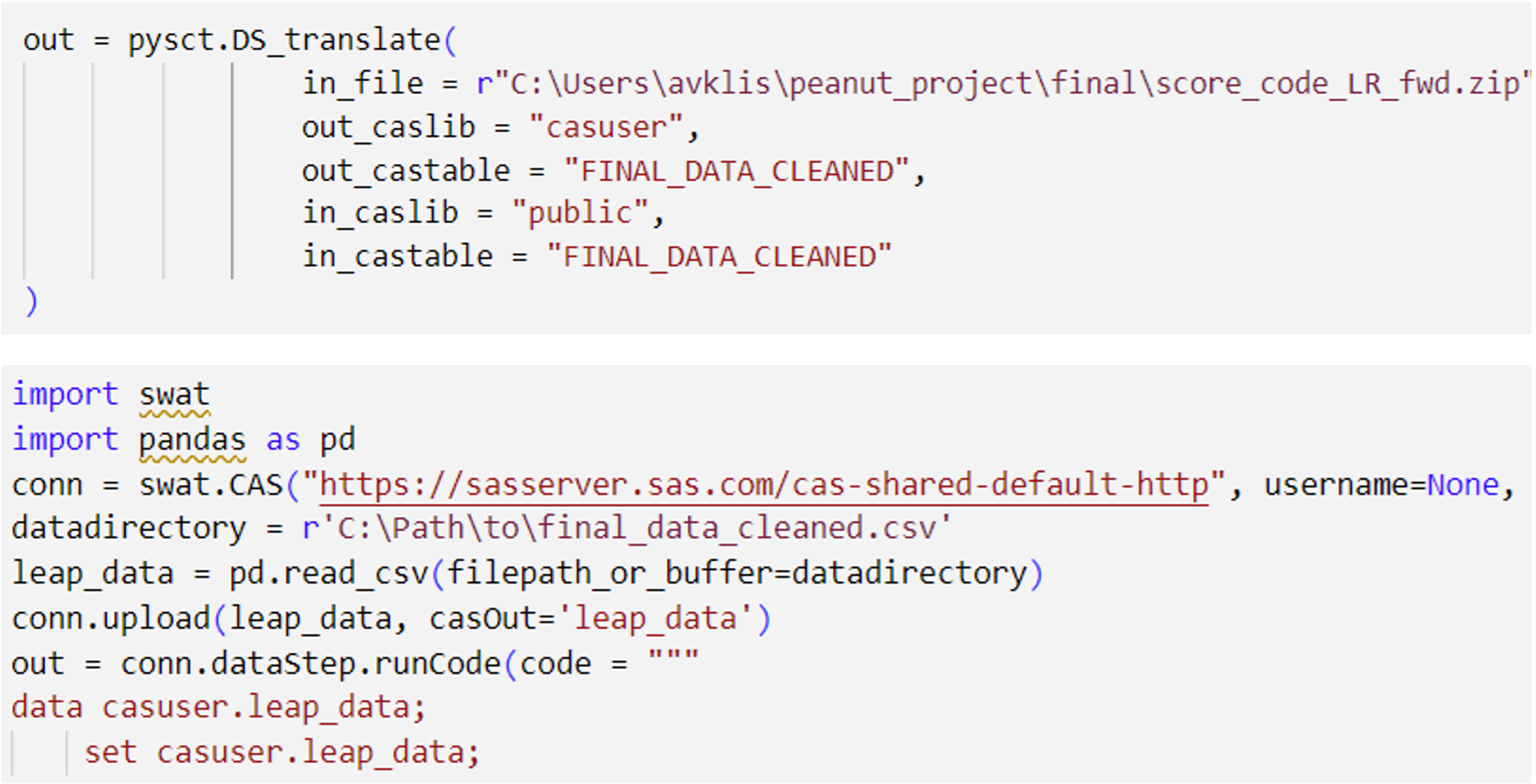
Second, I downloaded the Score Code for my models in SAS Model Studio, and with the help of a handy Python wrapper whose code can be found here, I utilized the SWAT package in Python, which interfaces with the CAS server, enabling me to run the models generated by SAS Software via Python in my IDE of choice (I like to use VSCode).
Final Thoughts
Initially, the thought of a point-and-click interface for Machine Learning confused me—why cut out coding, the fun part? But I saved so much time by allowing SAS Model Studio to automatically tune hyperparameters and compare evaluation metrics to choose a champion model, rather than doing everything manually. SAS Model Studio was an indispensable tool that allowed me to experiment with different parameters for my models without having to locate documentation on how to code them myself. It really allowed me to focus on the models themselves, rather than the syntax of whichever programming language was encapsulating them.
Together, Python and SAS Model Studio made a perfect pair. I’m excited to see how this dynamic duo can be used in future work to gain meaningful insights from data, and I’m honored that I had the opportunity to experience firsthand the power that it holds.