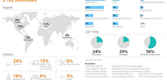
You might have seen a SAS Global Forum infographic floating around the web. And maybe you wondered how you might create something similar using SAS software? If so, then this blog's for you - I have created my own version of the infographic using SAS/Graph, and I'll show you how
Author
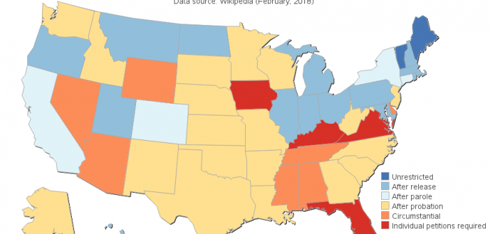
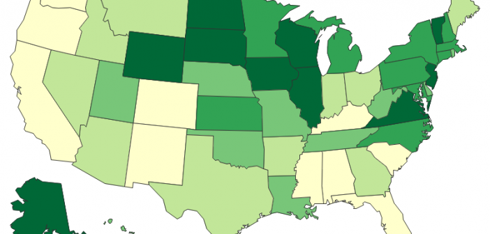
Can felons vote? This seemed like a simple question, but I realized that I wasn't 100% sure of the answer. Therefore I looked into the data ... and apparently "it depends". Follow along and see how I created a map to help answer this question. But before we take the
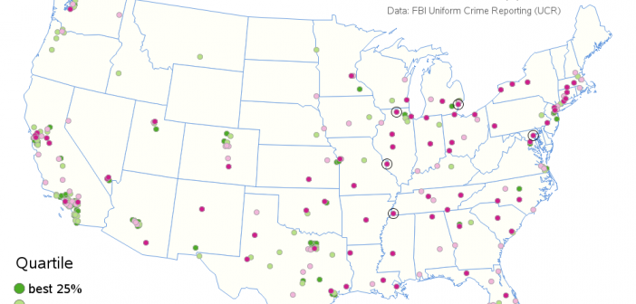
For the past few years, I've been hearing from many news sources that Detroit is the most violent large city in the US. If the news is saying this, then the data should corroborate it, eh? Well, of course I decided to check for myself... When comparing crime data across
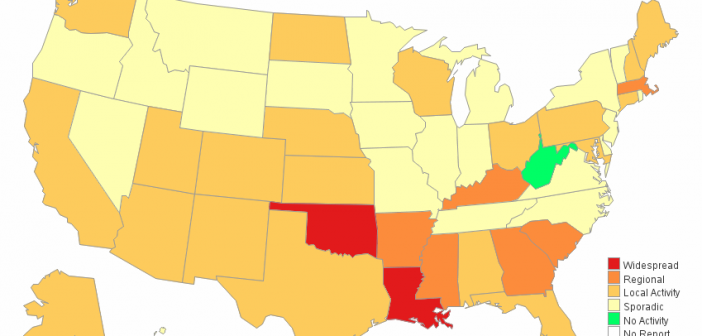
The flu seems to be especially potent this year. "How potent is it," you might ask? ... Well, let's plot some data on a map to help find out! Here in the US, the Centers for Disease Control and Prevention (CDC) compiles data about diseases, and provides reports and graphs
Have you, or someone you know, gotten the flu this year? Word on the street is that this year's flu might be particularly bad, and the data seem to be corroborating that so far. You don't want to take my word for it? -- well then, let's have a look
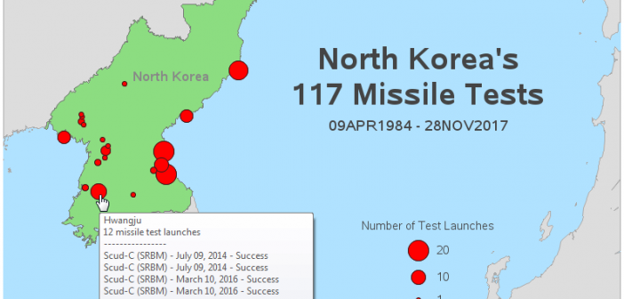
Data doesn't always have to be 'big data' to be interesting. For example, I recently ran across a small, but very interesting, database containing all of North Korea's missile tests. The data was a bit difficult to digest in the formats provided, therefore I decided to try my hand at
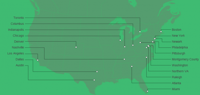
Amazon recently announced the 20 finalists in their search for a location to house their new 2nd headquarters (nicknamed 'hq2'). They showed a map on their web page, but I wanted to create my own map, with a few improvements ... Here's their official map. It's not terrible, but it
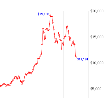
With all the talk about Bitcoin in the news lately, I decided it was time I created a Bitcoin graph! Follow along as I track down the data, create a graph, and then polish up that graph to make it shine. But before we get started, here's a little example
Have you ever played the lottery? Have you ever heard people bragging about all the money they've won? Does it make you want to play? ... We've had an Education Lottery here in North Carolina for over 10 years, but I still didn't really know much about it - therefore I
As marijuana has become legal in several states, it's been a frequent topic of interest in the news. And as with any interesting topic, I like to find useful ways to visually analyze the data. In this case, let's have a look at the price of marijuana, and how it